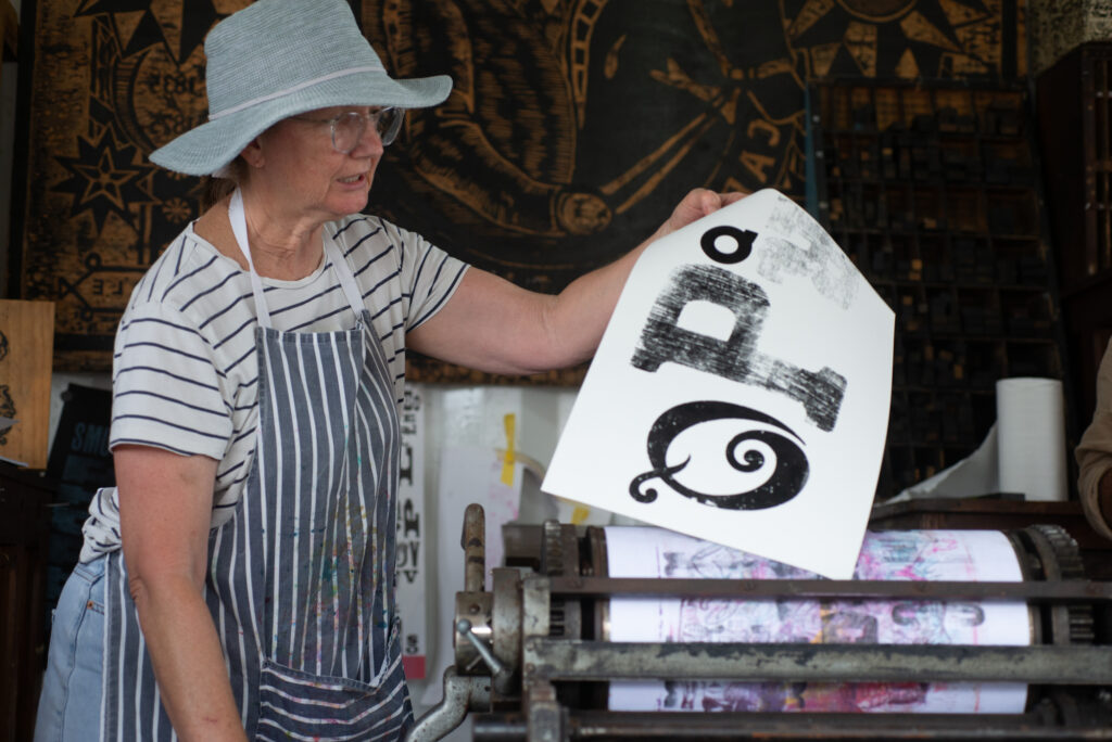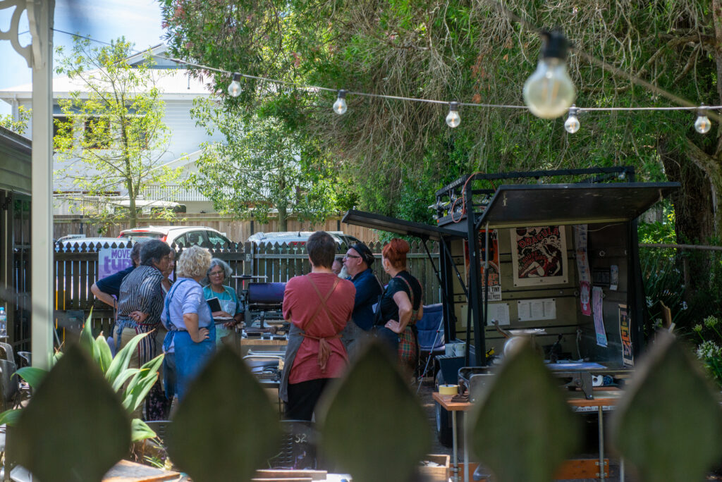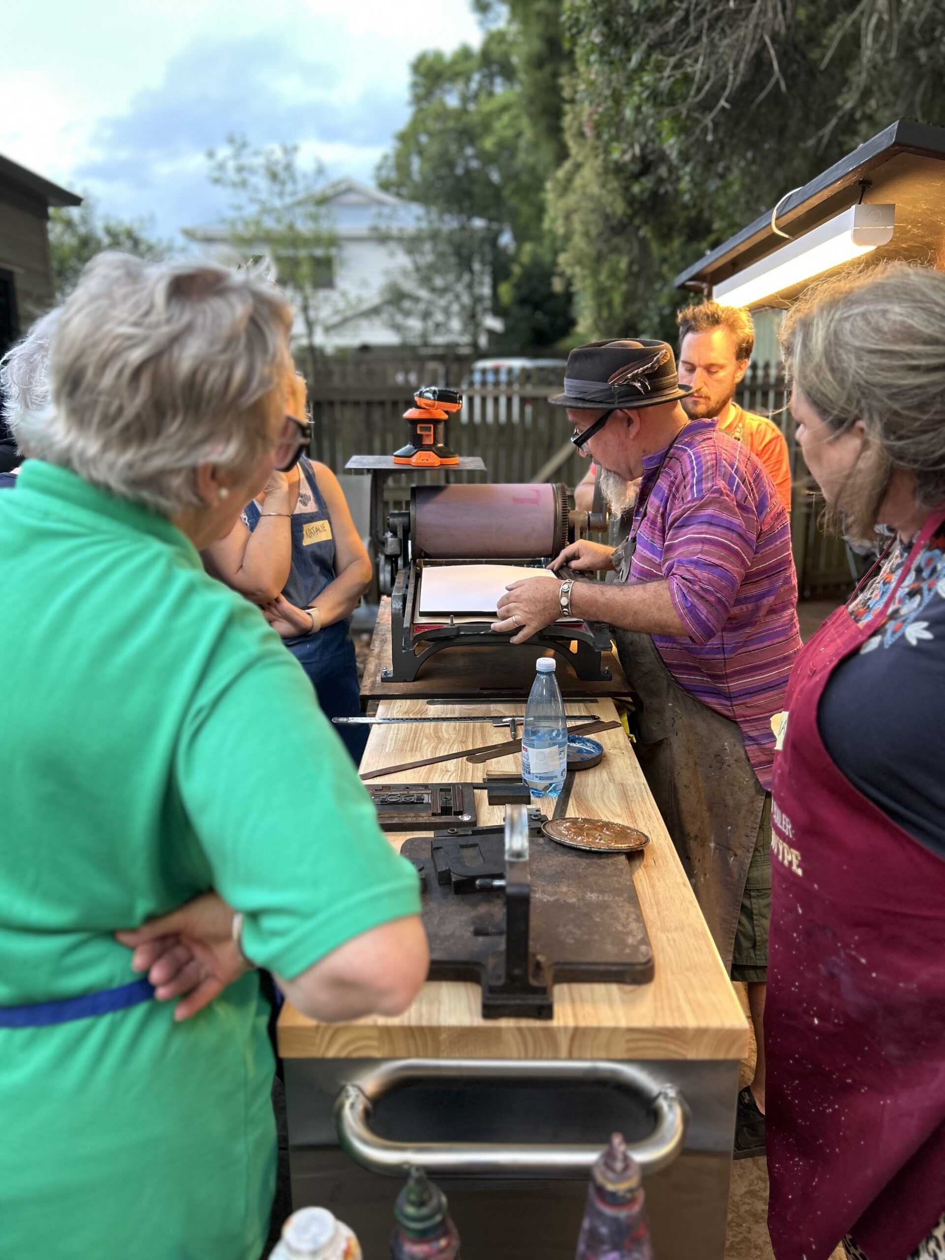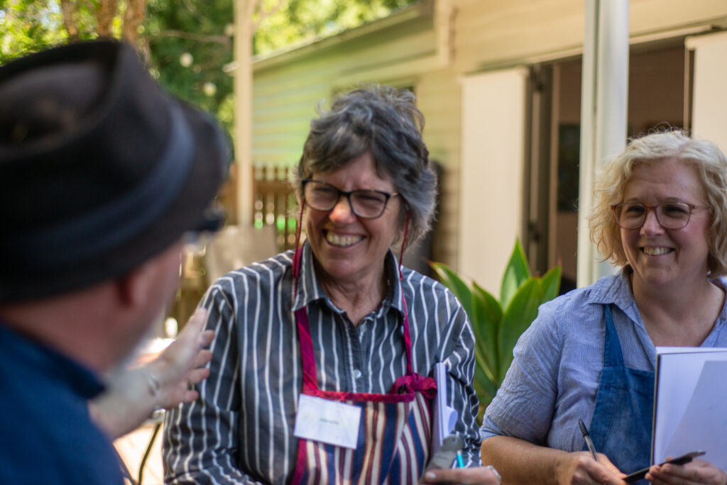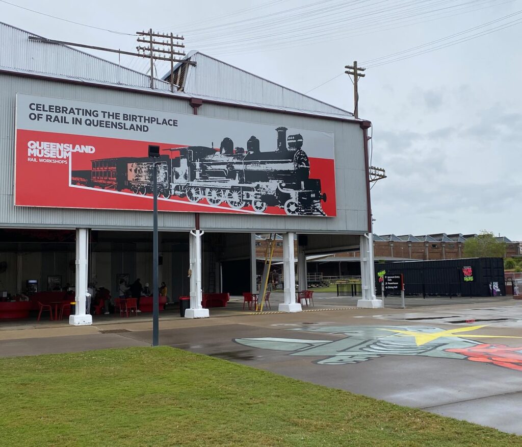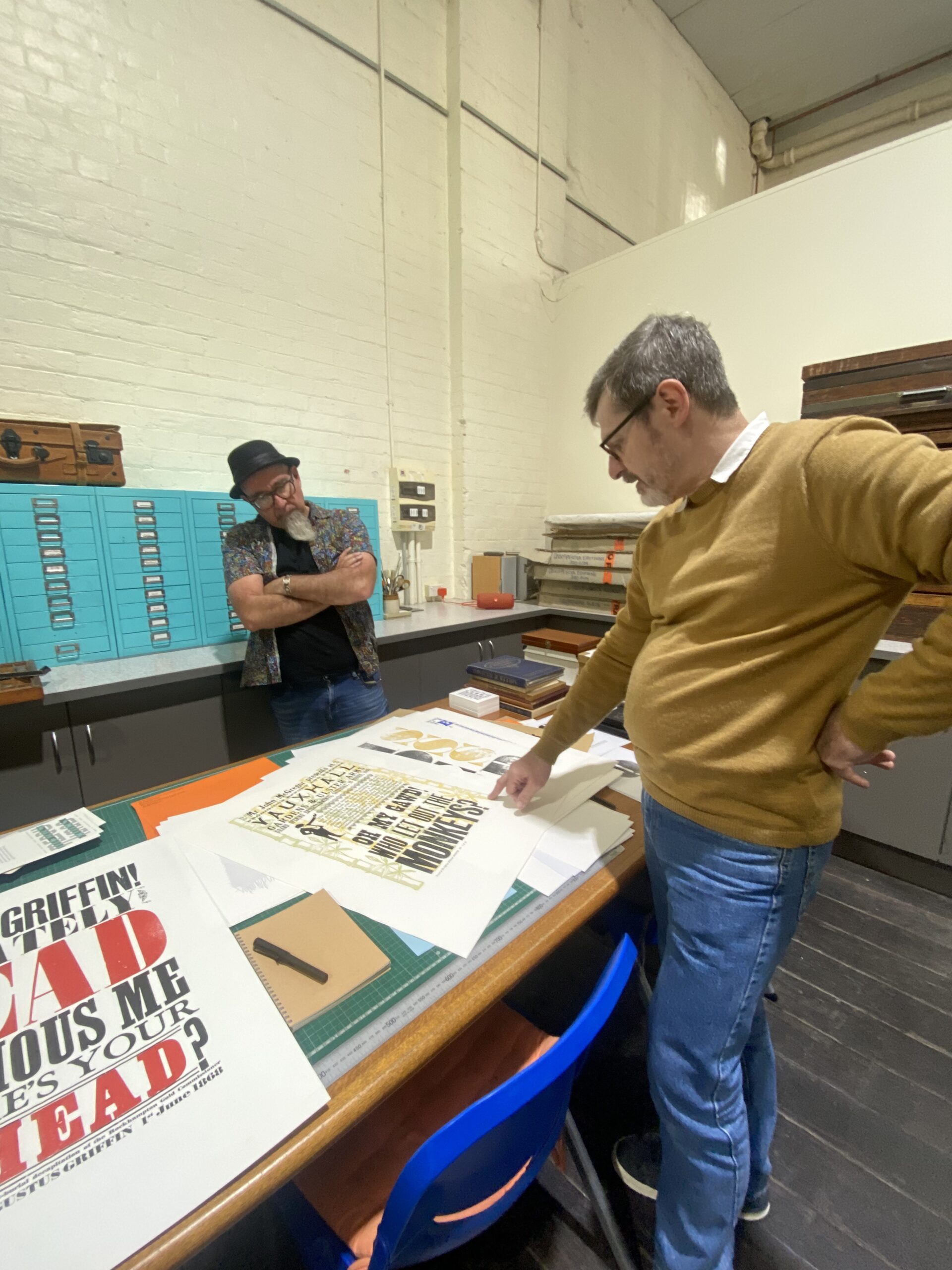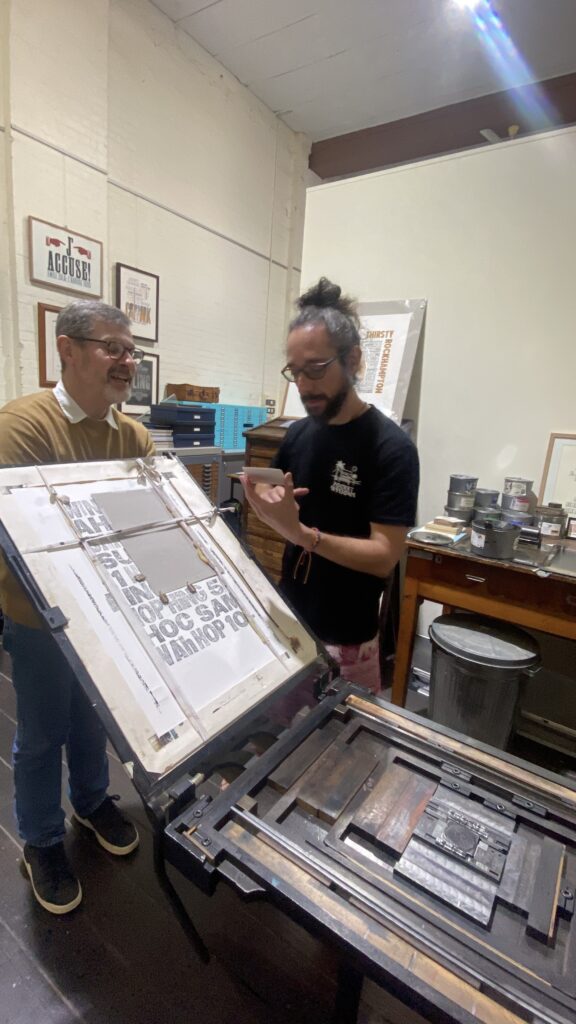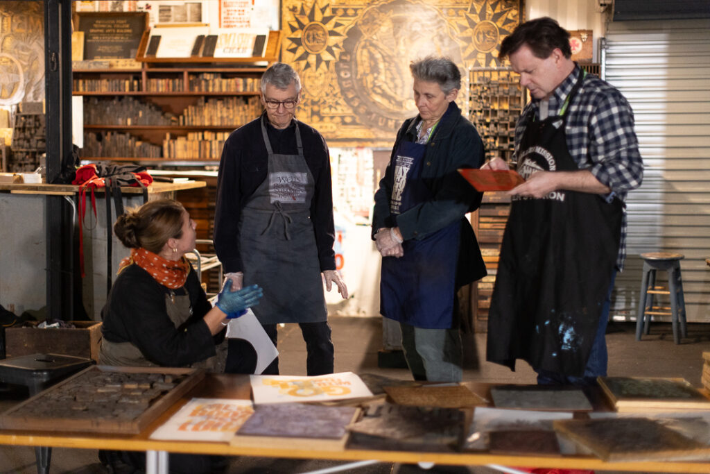

Printmakers and designers Clint Harvey and Dzintra Menesis visit Langridge Colour in Melbourne to ask what remains of the pigment knowledge that once underpinned Australia’s printing ink industry.
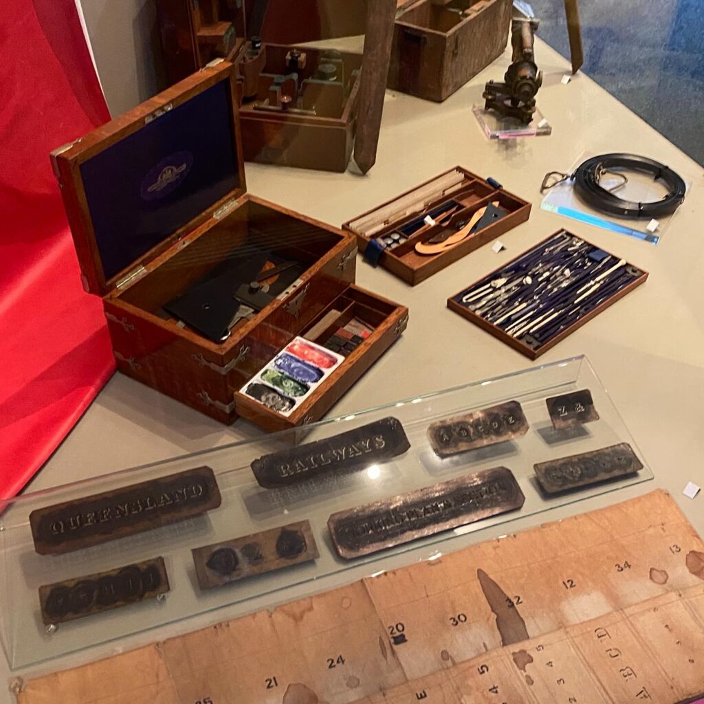
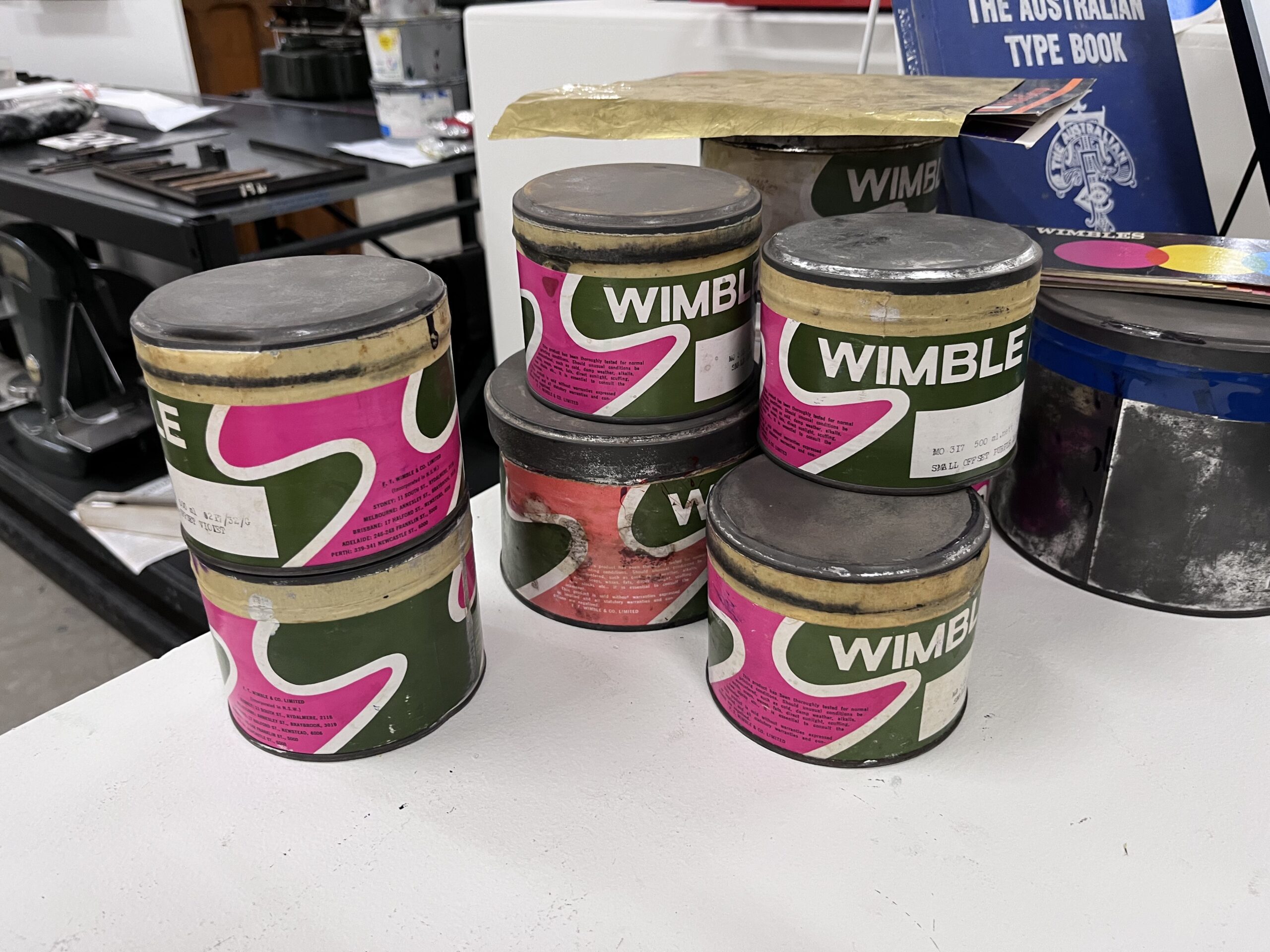
In 2025, as Research Scholars at the Powerhouse Museum in Sydney, Clint and I spent the better part of a year inside questions about the origins of pigments and the realities of access to natural materials in Australia. Our project, Wimbles Inks Reimagined, took us deep into the archive of F.T. Wimble and Co., Australia’s first commercial printing ink manufacturer. Arriving in Melbourne in 1867 with inherited English printing ink formulae, Frederick Thomas Wimble spent his career adapting those recipes to Australian conditions, generation by generation. His 1930s ink recipe book revealed a world where natural pigments and early synthetic chemistry existed side by side.
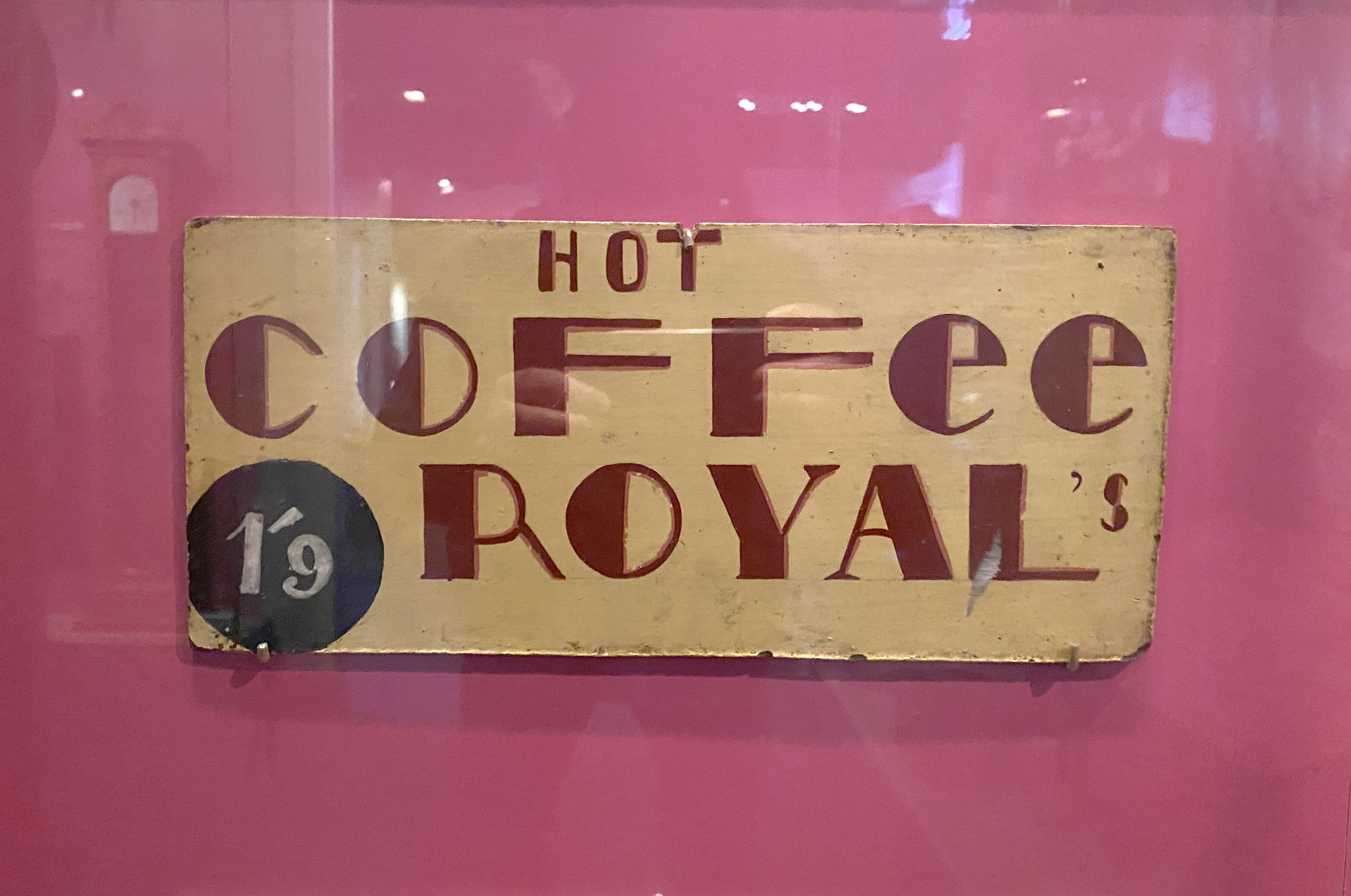
Wimble’s early ink recipes drew on natural earth colours, such as umbers, burnt sienna and lamp black. Understanding those materials, their origins, their chemistry and their availability, became essential to understanding the printing inks themselves. The further we went into that history, one question continued to arise: what does access to those same materials look like in Australia today?
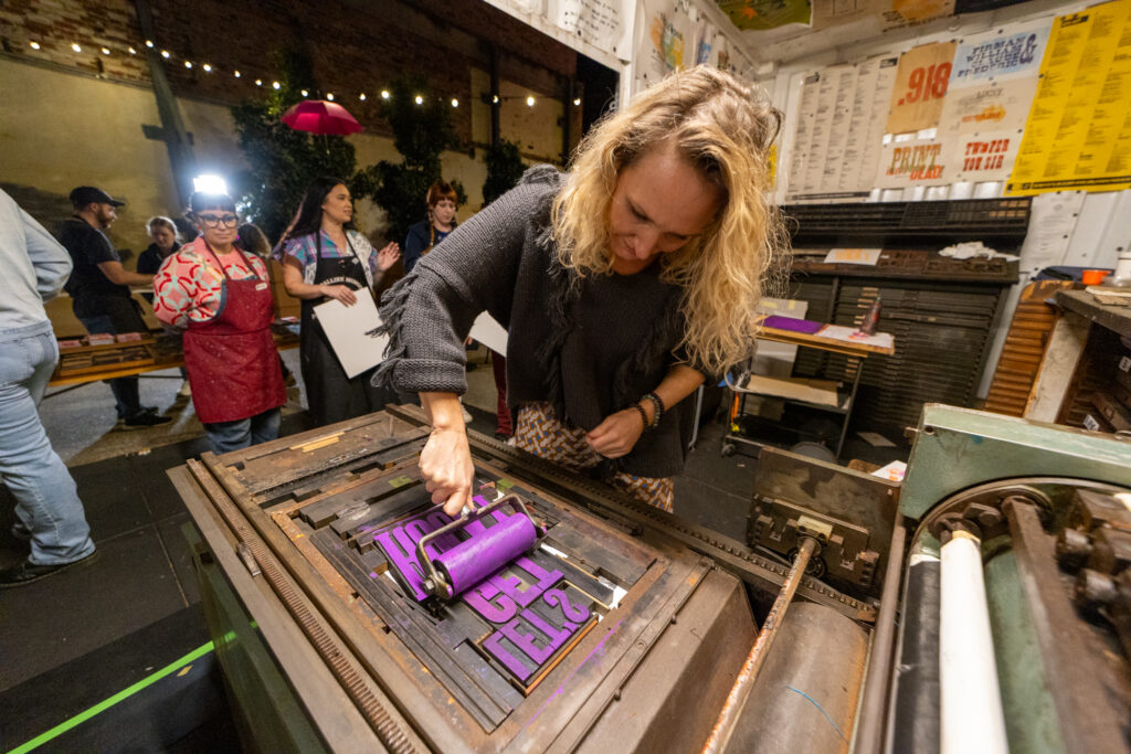
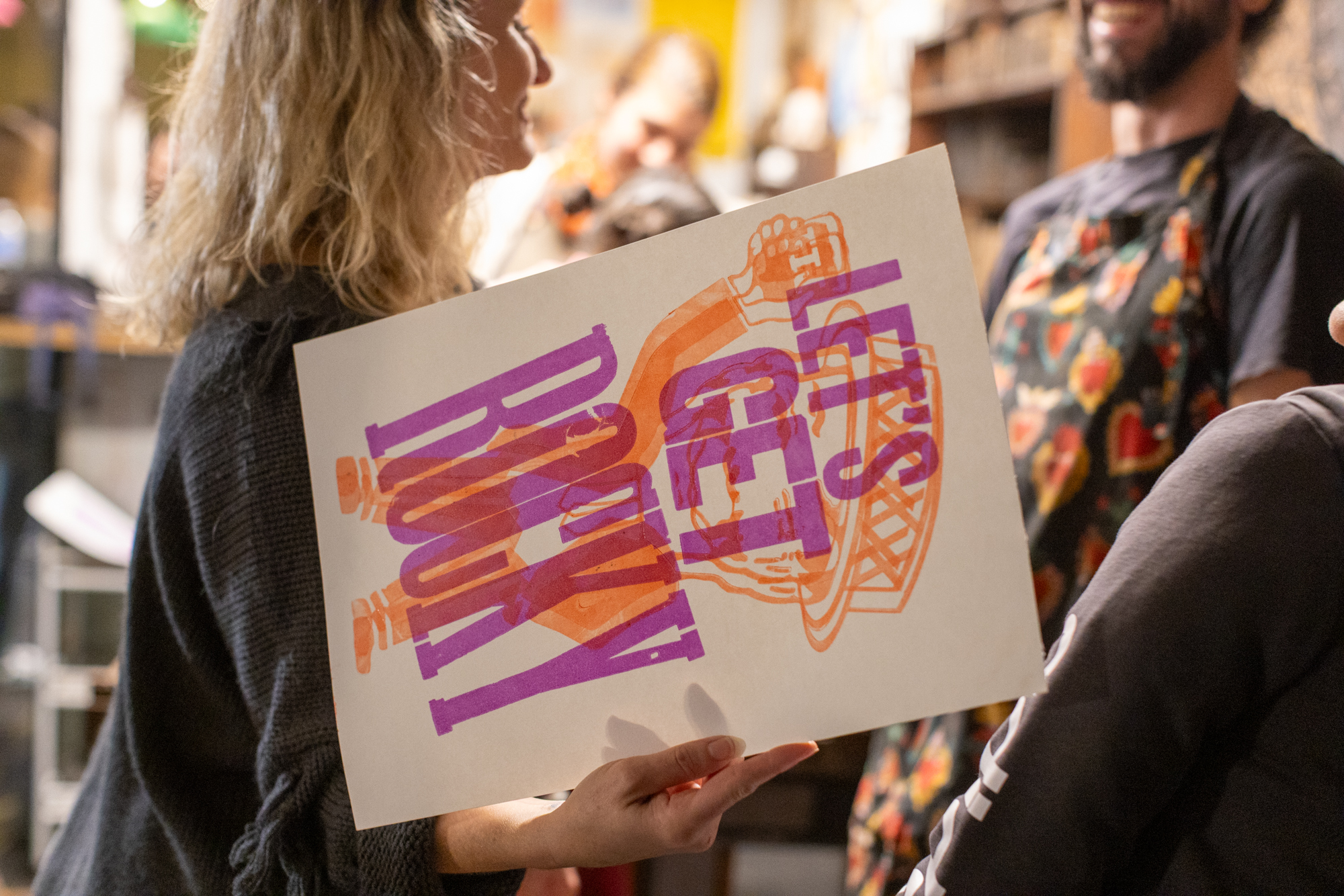
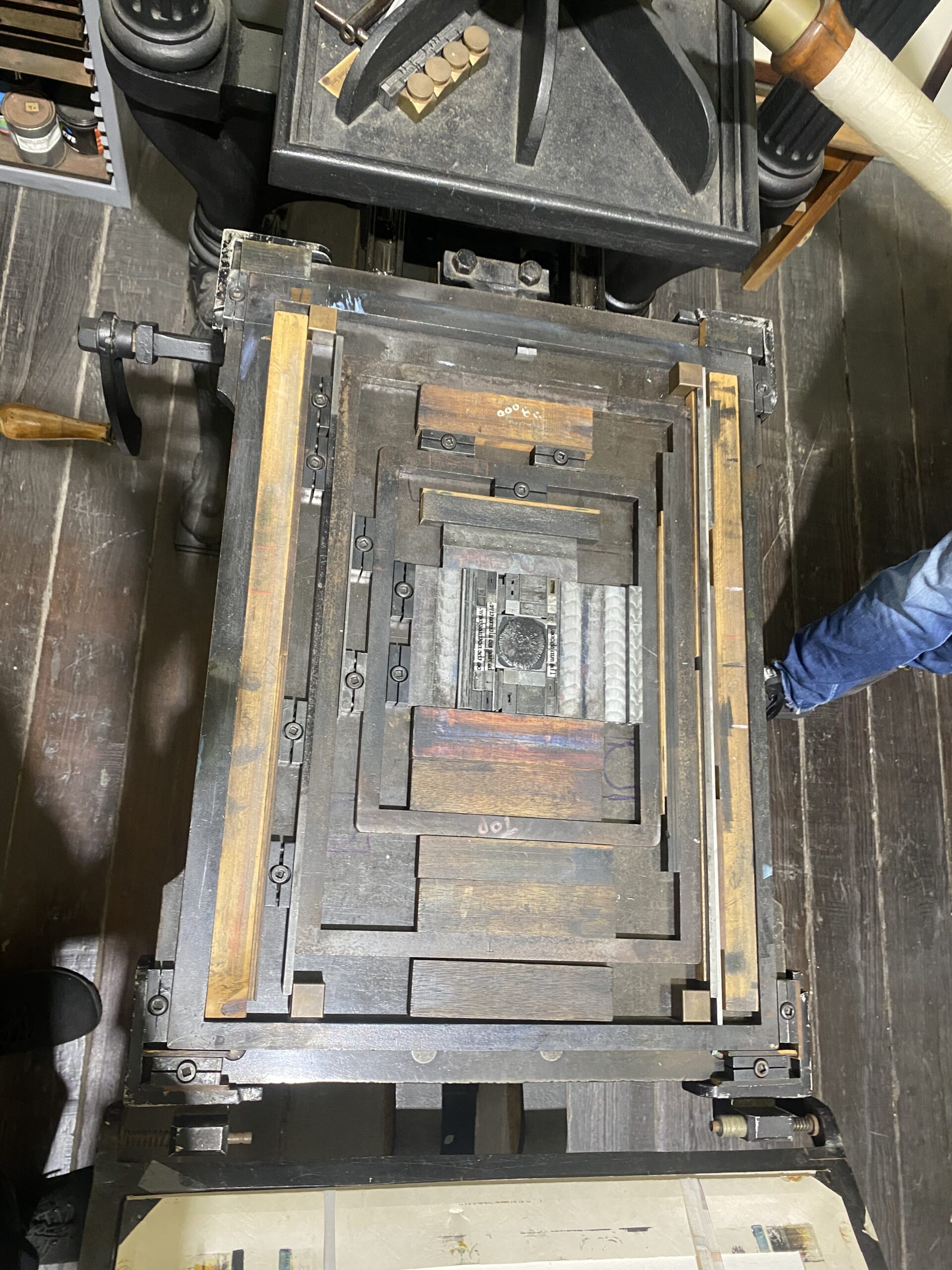
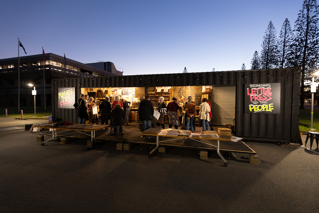
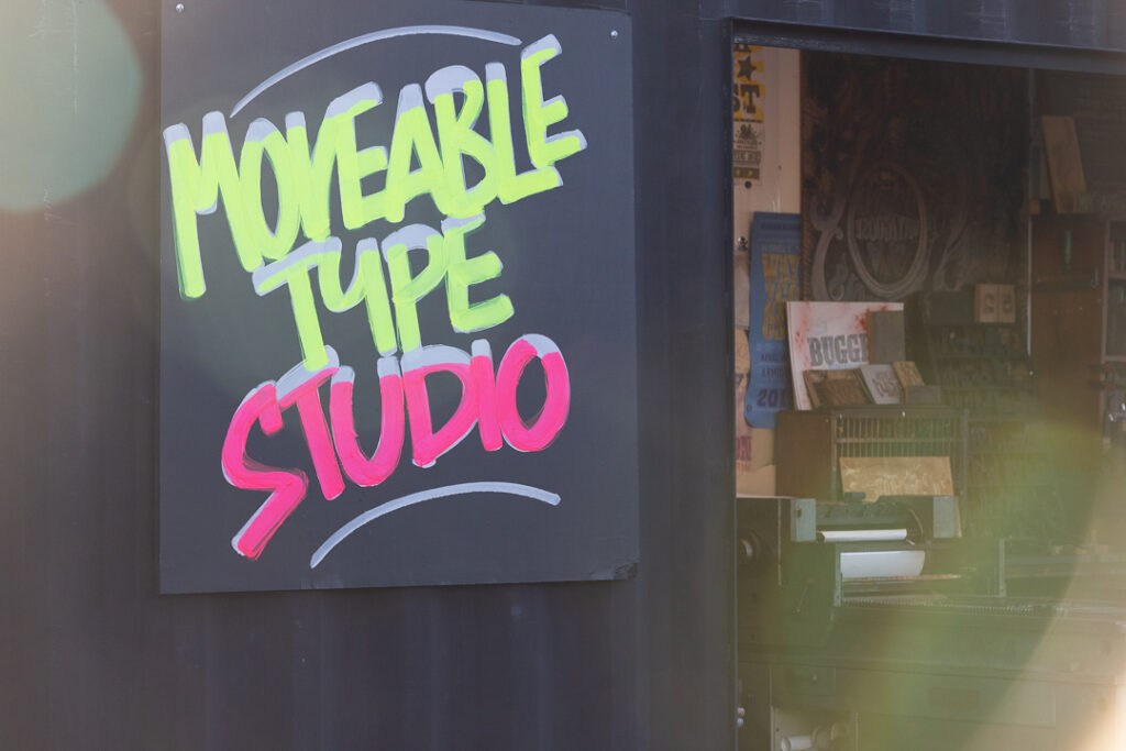
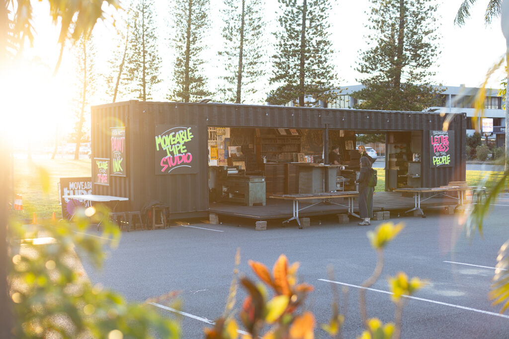
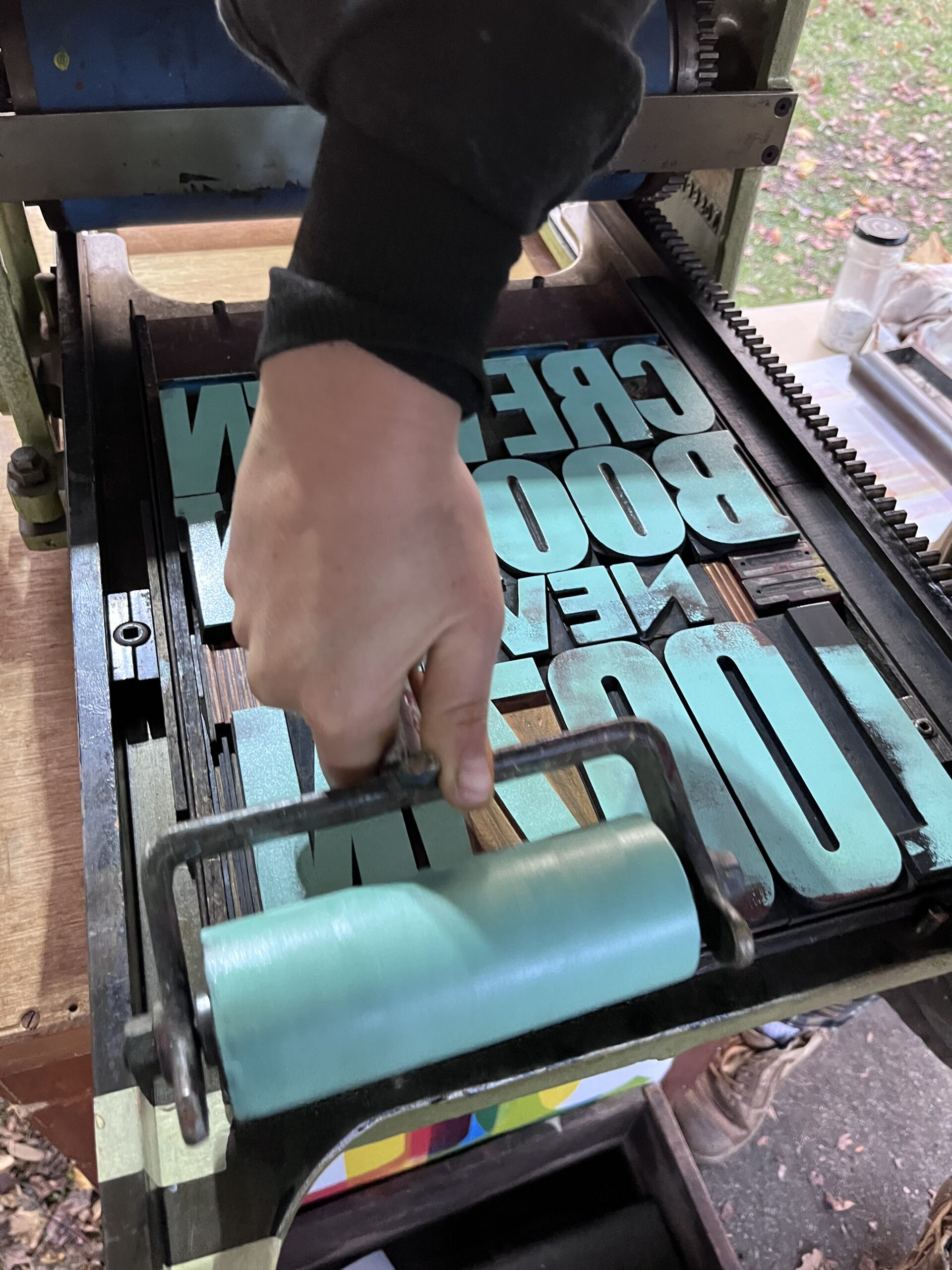
Letterpress printmaking now sits within the arts rather than the trade landscape, and while small scale boutique inks are still available in Australia, the industrial base that once supported the craft has disappeared. What was a local printing ink industry was absorbed into international conglomerates across the twentieth century, and the manufacturing knowledge that sustained it has largely gone with it. Yet one of the closest contemporary equivalents to that work, practitioners still managing pigment sourcing, binder chemistry and the underlying logic of artists colour manufacture in this country, can be found in artist oil paint production. That realisation sent us to Melbourne, to Langridge Colour, and to David Coles.

Langridge Colour is the engine behind St. Luke Artist Colourmen, and the source of the high-grade oil paints and fine dry pigments that have informed our own studio experiments. We came to discuss our research with someone who has spent thirty years making artist paints in Australia, and to understand from the inside what that actually involves.
What it involves, it turns out, is this: fifty-kilogram sacks of raw pigment lined up like grain in a mill. Vats of turpentine. A giant German cocoa press, retrofitted for paint. Jars of malachite, vermilion, lapis lazuli, sitting on a shelf as though it were perfectly ordinary to have a fistful of semi-precious stone in powdered form within arm’s reach. We left feeling like we’d been handed a set of keys we hadn’t known we were missing.
The Man Behind the Cocoa Mill
David Coles founded Langridge Colour within three months of emigrating to Australia in 1992. He grew up surrounded by the trade: his father a commercial illustrator, his mother running an art shop, his grandfather a sign writer in Wales with barrels of pure pigment on the floor of his hardware store. He trained at Bristol Art School in the early 1980s, where learning to make his own materials changed the direction of his practice entirely. By the time he arrived in Australia, he already had a deep grounding in European artist materials manufacture. What Australia required was that he adapt his approach.
The light here is different in ways that matter to a paint maker. In Australia, particularly outside the coastal cities, sunlight falls on a dry continent with little atmospheric moisture to filter it. Colours that read one way in a northern European studio read entirely differently here: more intense, more direct, with less of the cool diffusion that European painters had spent centuries calibrating their palettes around. David rebuilt his colour range around what Australian light does to pigment. It is a point of difference that no offshore manufacturer can replicate from a distance, and it is part of what makes Langridge Colour genuinely distinct from imported alternatives.
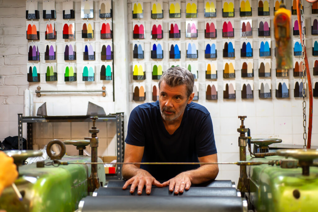
David is also the author of Chromatopia, a book tracing the history of colour across millennia and continents. Anyone with a serious interest in the material history of pigment should have it close at hand. When we met with David, he introduced us to Oli, his lead manufacturer. The culture of the Langridge Colour paint factory was immediately apparent. Everyone on the team is an art graduate or practising artist. In an era where specialist manufacturing knowledge in Australia has been quietly contracting for decades, a factory floor staffed by people who understand the materials they are working with, and care about the difference, is not something to take for granted.
The Golden Thread

The phrase that stopped both Clint and I mid-conversation was one David used almost in passing: a golden thread of knowledge, the practical, hard-won understanding of materials that passes from one maker to the next. It’s a lineage carried through use rather than theory, and one that becomes harder to hold onto as the landscape of art education and industry shifts.

David still makes verdigris from copper and a chemical reaction. He has a private plot for madder growing out the back of the factory. He keeps lead white available at St. Luke’s because restoration conservators cannot do their work without it. This is what it looks like when material history survives through use rather than sitting in an archive waiting to be cited.
The pattern felt familiar. Over a century earlier, F.T. Wimble brought English printing ink formulae to Australia and spent years adapting them to local conditions. A hundred years later, David Coles arrives from England with formulas and experience built in a different hemisphere, and the same process unfolds.
For our historic printing ink research, this framing clarified something important. The Wimbles’ proprietary ingredient names, their adaptation of inherited recipes, their gradual shift toward an Australian way of working: all of it is the same kind of thread. Sitting with David gave us the manufacturing logic behind that transition, something no document could have offered.
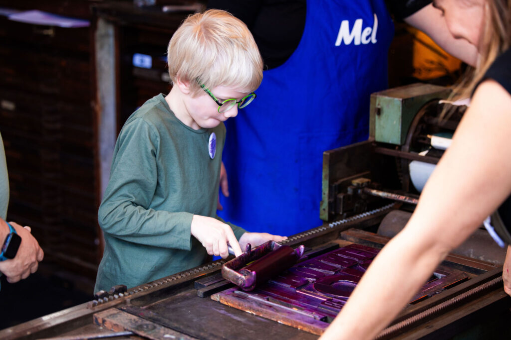
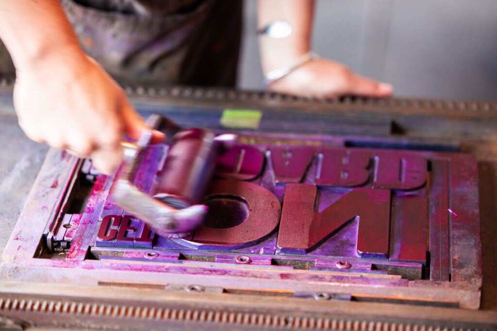
Inside the Factory: Pigment, Process, and the Leneta Card
The tour moved through the warehouse, starting from raw materials and working toward the finished paint tubes. Standing in front of the huge pigment sacks, David described the art materials world plainly: ‘A fight for a knife in the mud’, an earnest description of the competitive and deeply technical and guarded territory that serious colour manufacture actually occupies, and a reminder that reputation in this field is built slowly and lost quickly.
David walked us through why the shift away from natural pigments happened historically. Cheap labour, the engine of natural pigment production, was largely gone after World War I. Without it, the arduous recipes of the old world became unviable. Manufactured synthetic pigments filled the gap and in many ways improved on what they replaced. Synthetic iron oxides are superior to natural equivalents for dispersion within polymerised oils: more consistent, more controllable, less variable batch to batch.
Australian earth pigments are worth pausing on here. Ochre has been central to cultural and creative practice on this continent for over 65,000 years, and accessing it at commercial manufacturing scale today is not straightforward. David sources his ochres from Europe, including through direct visits to open-face mines in France. It is an honest response to the realities of responsible sourcing in 2026, and it is part of why the dry pigment sacks lining the Langridge warehouse walls carry no Australian earth colours among them.
The finished result is tested by hand on a Leneta card: a controlled, repeatable substrate with both a white and black ground, designed specifically for comparing paints, inks, and coatings under consistent conditions. Two strips of paint are drawn across the surface reveal immediately whether dispersion is even and the pigment is reading true. Titanium white is David’s control colour, the fixed reference point against which every other colour in the range is calibrated. But even with a standardised recipe and a consistent process, the source material itself can shift the result. A new batch of imported zinc, a different season’s ochre: the Leneta card will tell you that you are not making the same paint, regardless of what the recipe says.
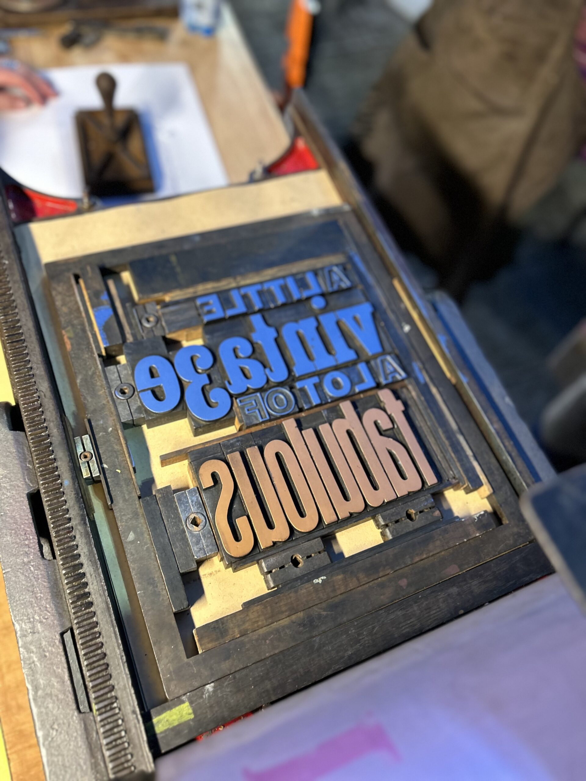
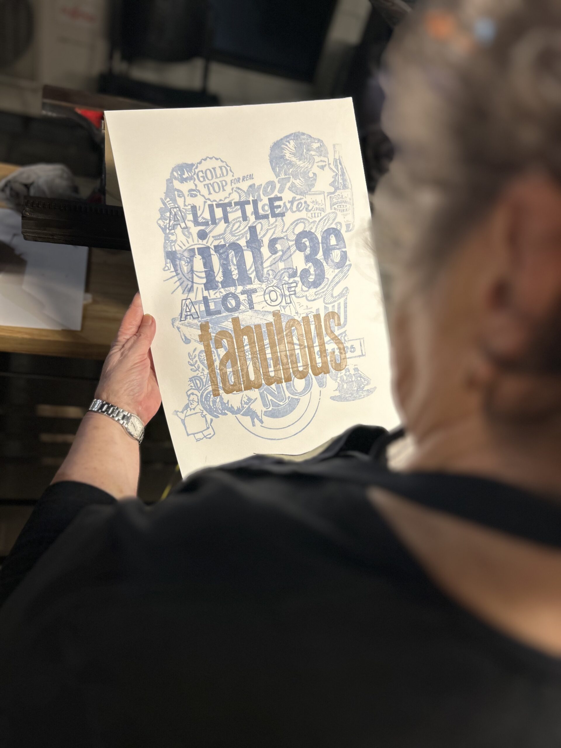
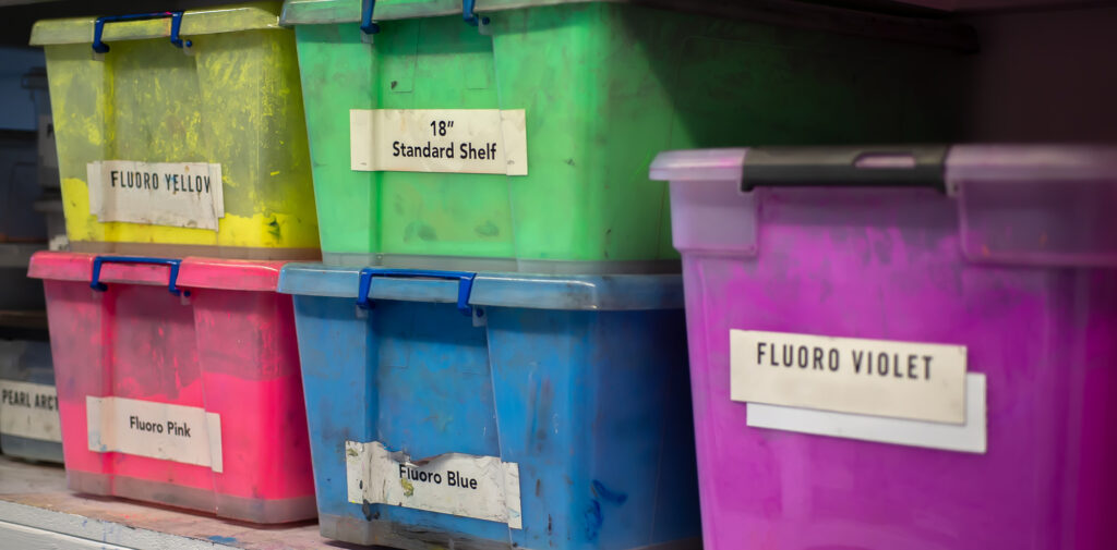
The cocoa mill sits at the centre of the operation: a fifty-year-old German machine, originally built for chocolate, retrofitted for paint. Before anything reaches it, pigment particles are wetted out in a planetary mixer, so that the pigment is roughly dispersed in the binding oil. From there, the colours go through multiple passes on the mill, ranging from 3 to fourteen passes dependent on the specific pigment.

This is why David is particular about single pigment paints. Artists mixing colours need clean, predictable starting points. A paint carrying shoulder colours, the secondary hues that sit within a pigment’s optical range, will turn grey when mixed rather than producing the clean result the artist is working toward. The recipe is the structure. The raw material is the variable. The Leneta card is where those two things meet.
Oil Paint and Printing Ink: Closer Than You Think

For printmakers, the factory section above is not background reading. It is directly relevant to every ink decision you make. The same principles of dispersion, pigment loading, and binder compatibility that govern an artist oil paint, in part also govern a letterpress printing ink. The variables David is managing in his factory are the same variables Wimble was managing in his, with different chemistry and different equipment but the same underlying logic: get the pigment evenly dispersed into the binder, keep it stable, and make sure what you are putting on the substrate is consistent.
What separates printing ink from artist oil paint is primarily tack: the grab the ink needs to transfer cleanly from roller to type to paper under pressure. Wimble managed this with rosin and heat-bodied linseed oil. Contemporary letterpress inks achieve tack through refined stand oils and carefully selected varnishes, but the underlying principle has not changed in five hundred years. The chemistry inside the system has become more controllable and consistent.
What the decline of Australian printing ink manufacture means in practice is that this shared knowledge base has become far harder to access locally. The people who once understood both sides of that equation, paint chemistry and ink chemistry as part of the same manufacturing conversation, are fewer than they were. David is one of the practitioners who still holds that understanding.
David was also generous in engaging with our specific questions. Natural iron oxides, he confirmed, carry their own drying properties: manganese within black ochre and umbers. For anyone formulating printing inks with natural pigments this matters, because it means the pigment itself is contributing to the drying behaviour of the ink rather than relying entirely on added metallic driers. He pointed to cobalt driers as the preferred option for oil-based work, all key insights for our research.
What Your Materials Are Actually Made Of

I wrote in my notes that day: felt like being inside Willy Wonka’s Chocolate Factory. Storage rooms filled with rare colours. Lapis lazuli in chunks as big as a fist. Genuine madder root pulled from a pot in the courtyard with the enthusiasm of someone who had been waiting for the right moment to show it to someone. It was genuinely joyful. But the Willy Wonka comparison only goes so far. That factory was sealed off, a secret. David’s operation is built around transmission. He spent three hours walking us through his operation, moving fast, correcting himself when he thought he had oversimplified, pulling out materials to make abstract concepts immediate and physical.
Many artists and printmakers working today are not in a position to be precious about materials. The economics of creative practice in Australia are not easy, and reaching for the most affordable ink or paint on the shelf is a rational response to real financial pressure.

But there is a different way to think about it. A paint or ink with serious pigment load, formulated by someone who understands the chemistry behind every ingredient, does more with less. You use less of it to achieve the result you are after. The colour mixes cleanly because it is built from a single pigment with no unwanted shoulder colours muddying the mix. It behaves predictably because the person who made it tested every batch on a Leneta card and adjusted until it was right. The higher upfront cost starts to look different when you consider what you are actually buying.
What David Coles has spent thirty years building at Langridge Colour is a manufacturing practice where the integrity of the material is the product. Understanding that changes how you look at what is on the shelf in front of you, and what questions you think to ask about it. We left Melbourne with more questions than we arrived with. Which is, for research like ours, exactly as it should be.
Written by Dzintra Menesis. Photography by Clint Harvey