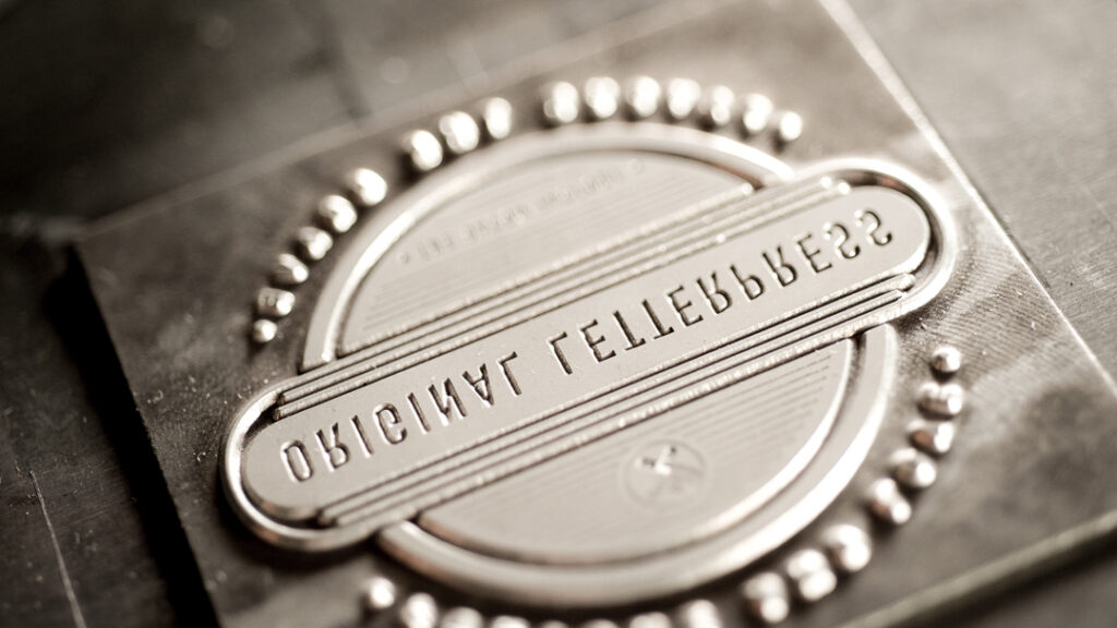
Over one hot, stormy Brisbane weekend, Moveable Type Studio partnered with bookmaker Michelle Vandermeer of Shelbyville Bookbinding to deliver a two-day workshop introducing participants to the slow, deliberate craft of letterpress printing and Coptic bookbinding. What unfolded was an ambitious, rewarding, and deeply hands-on experience that reminded all of us why heritage processes endure, and why they’re worth preserving.
Day One: Letterpress with Moveable Type Studio
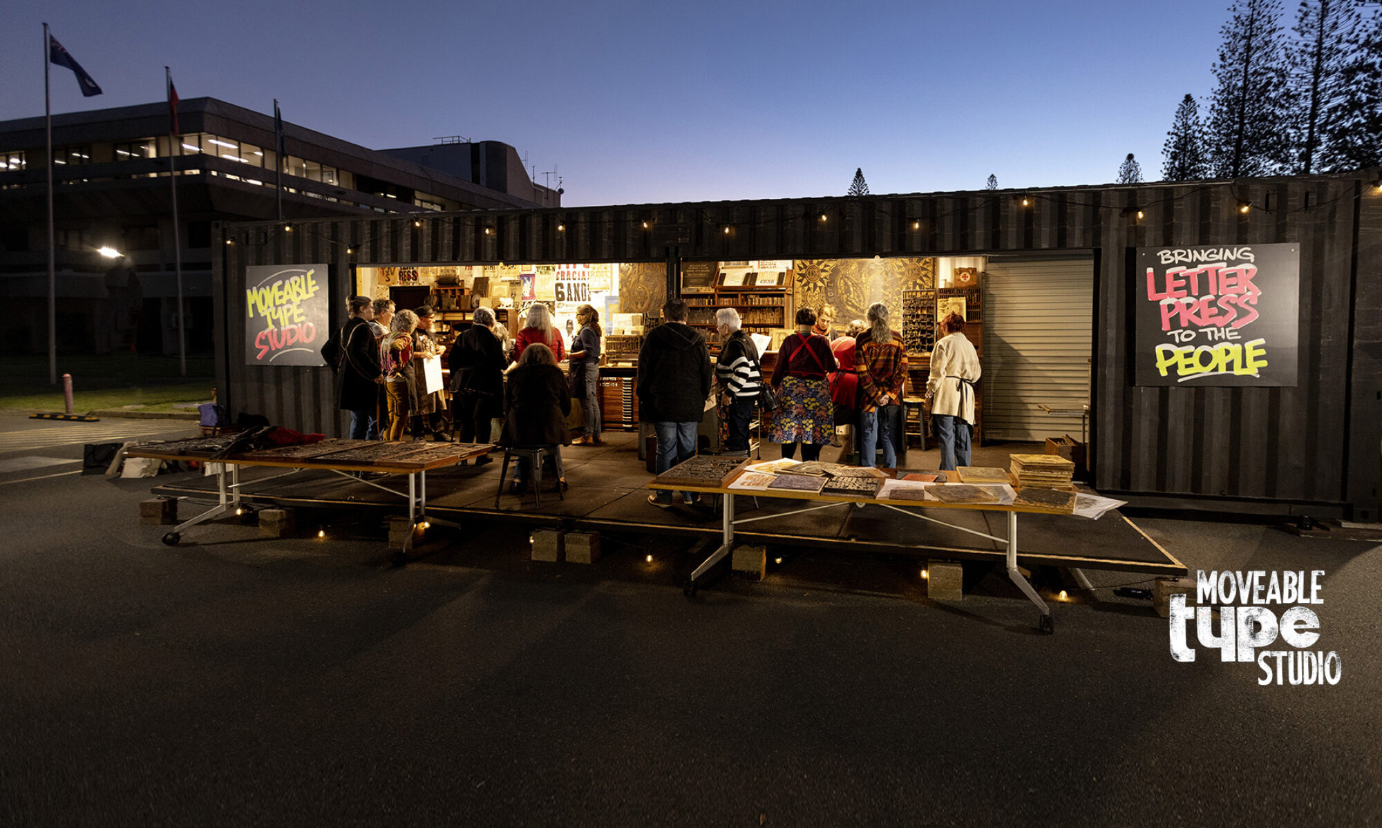
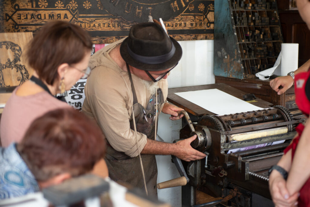
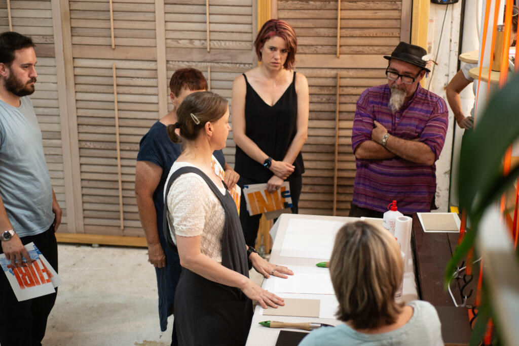
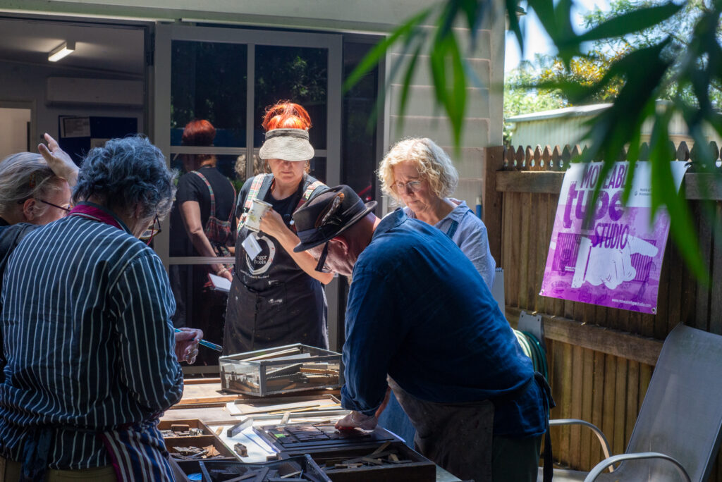
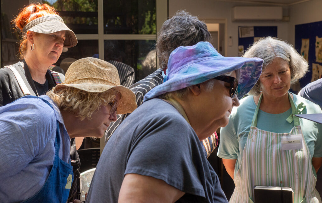
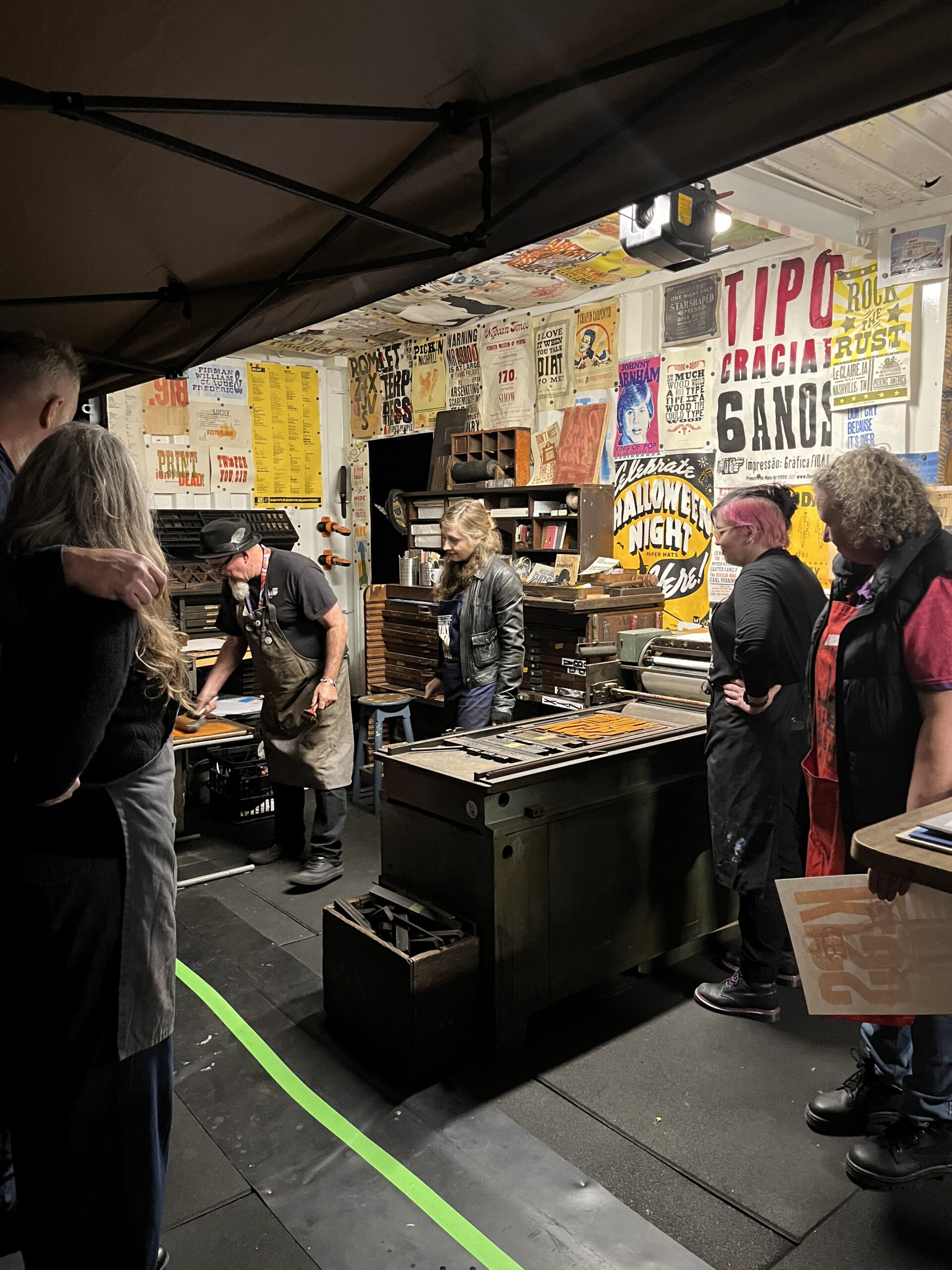
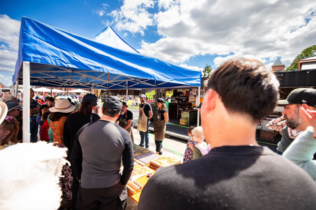
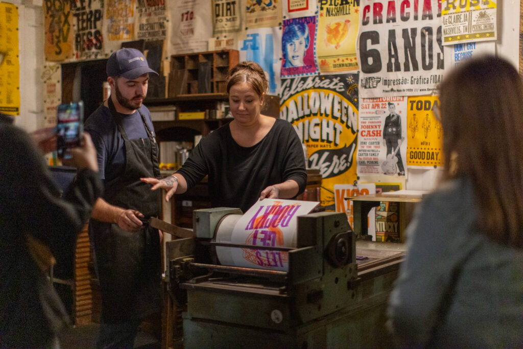
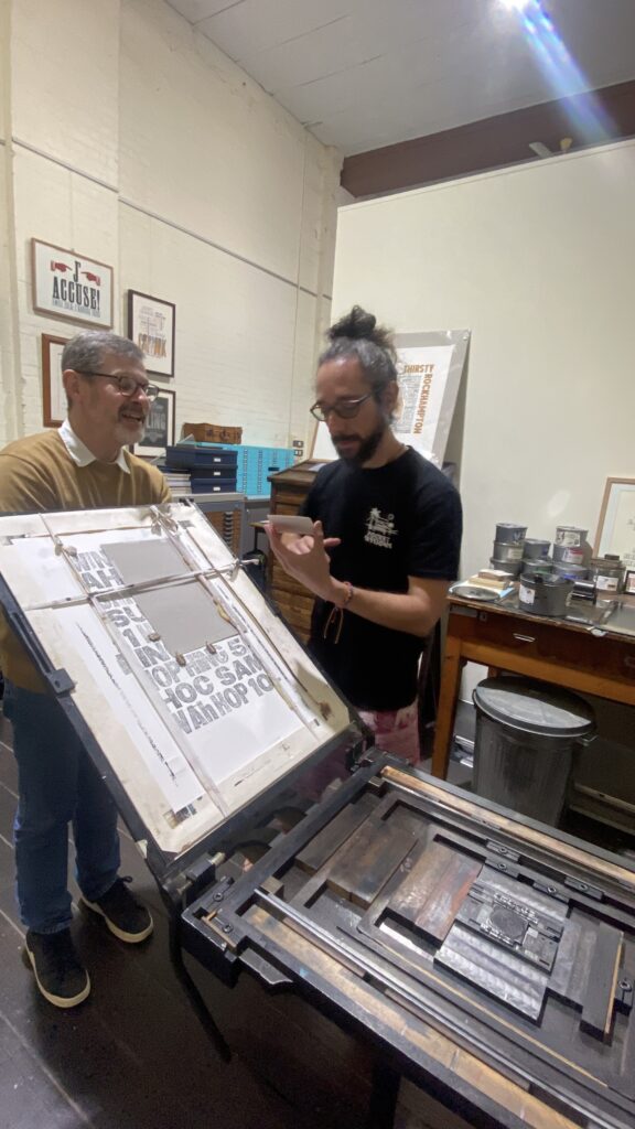
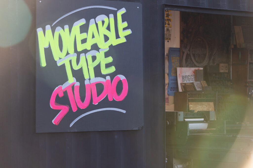
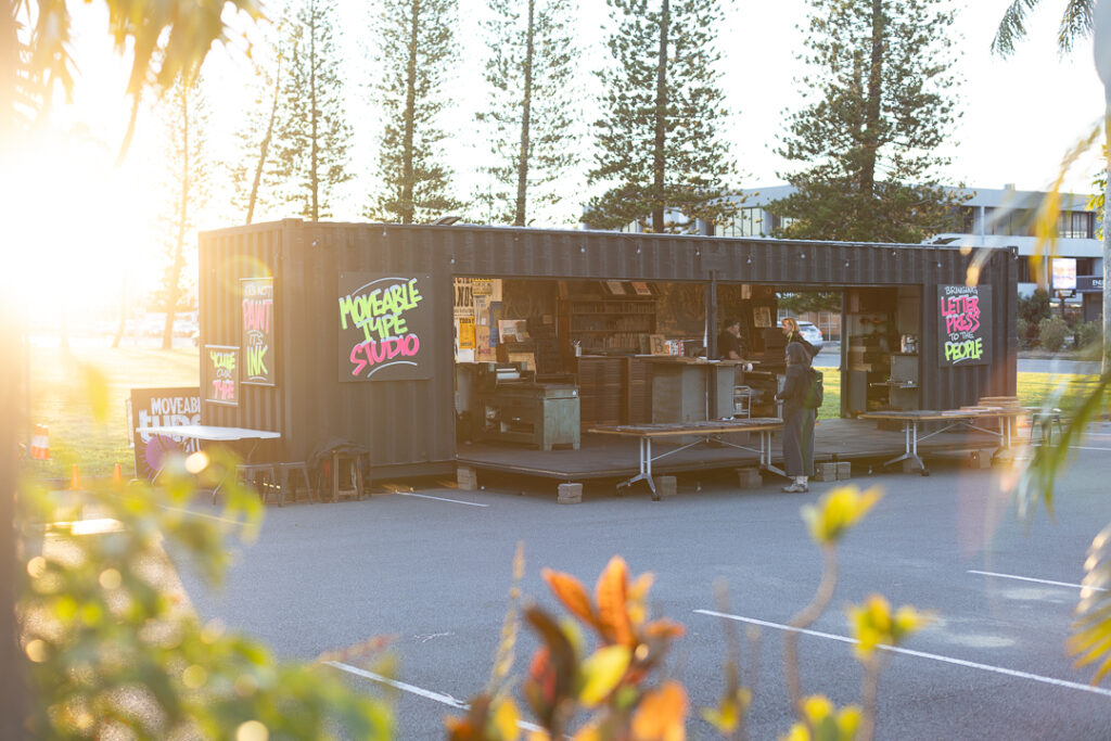
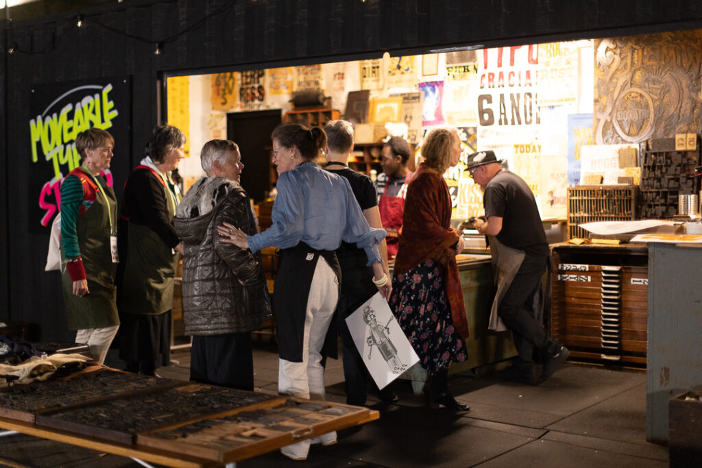
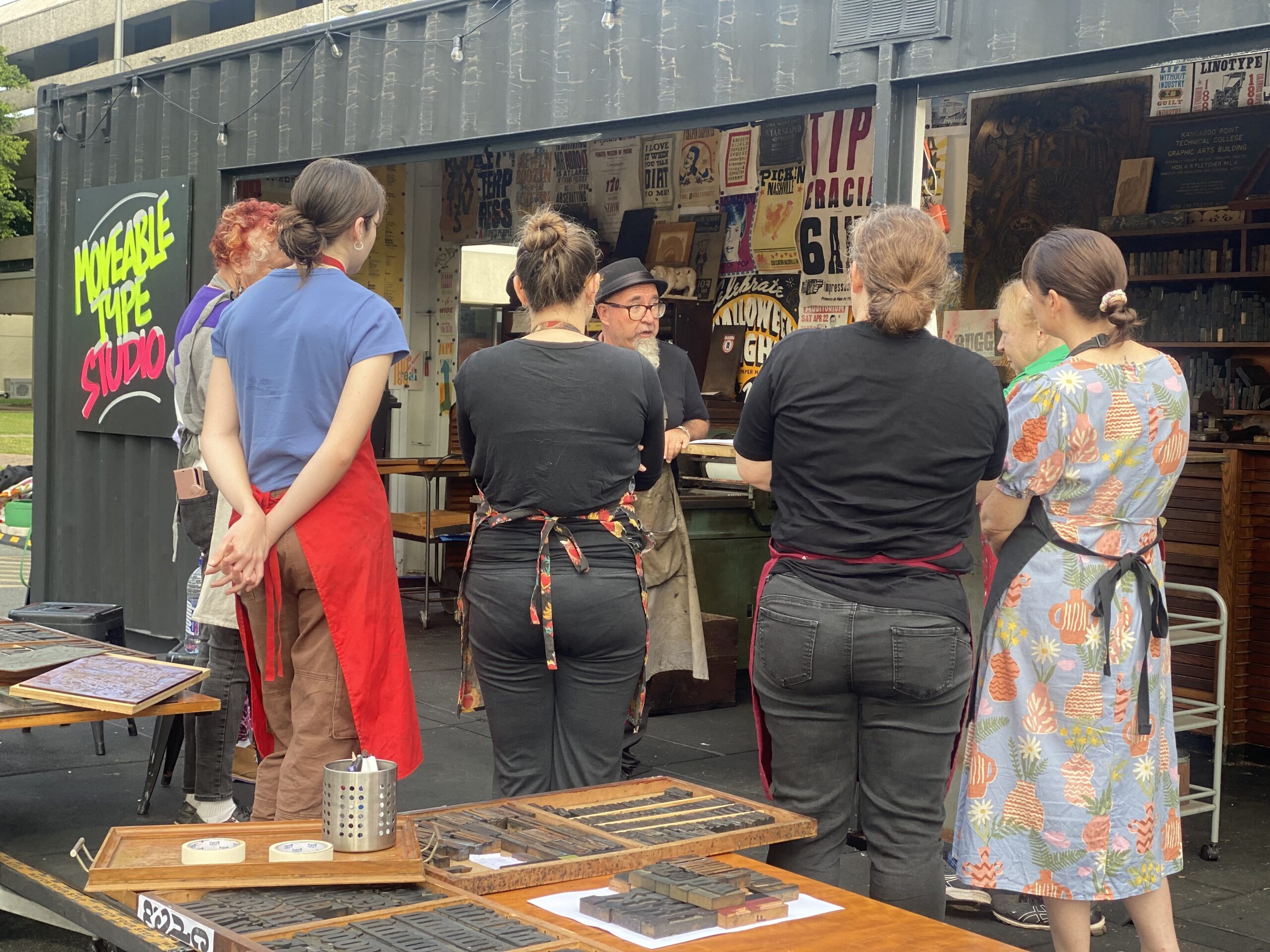
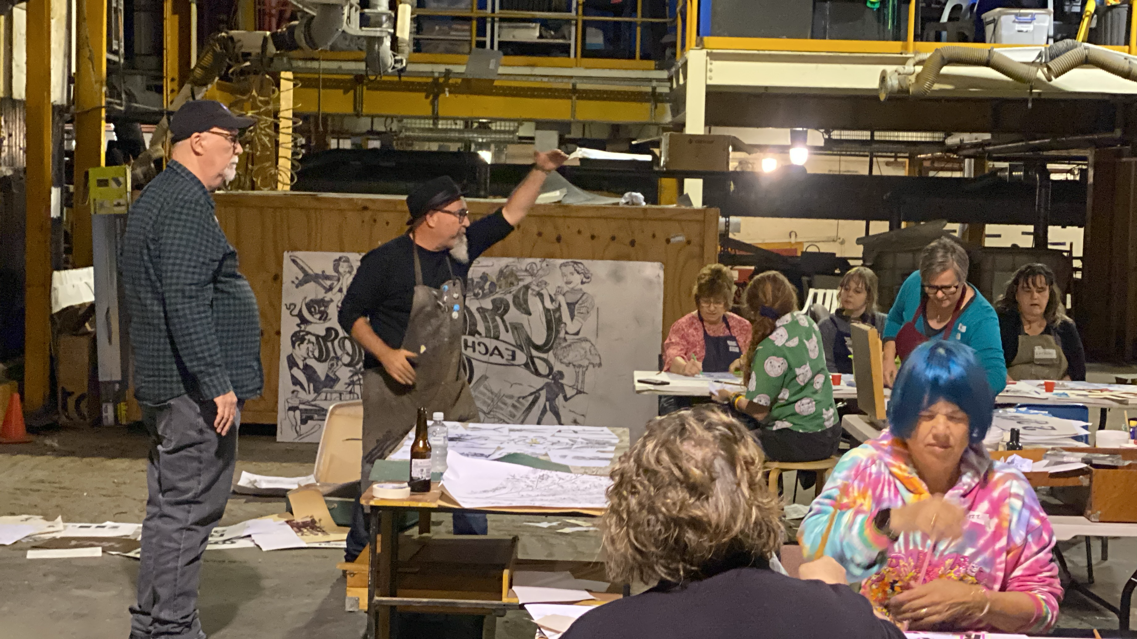
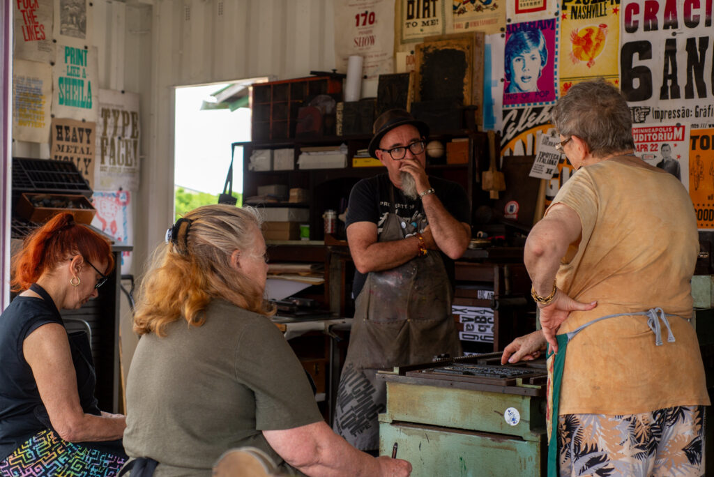
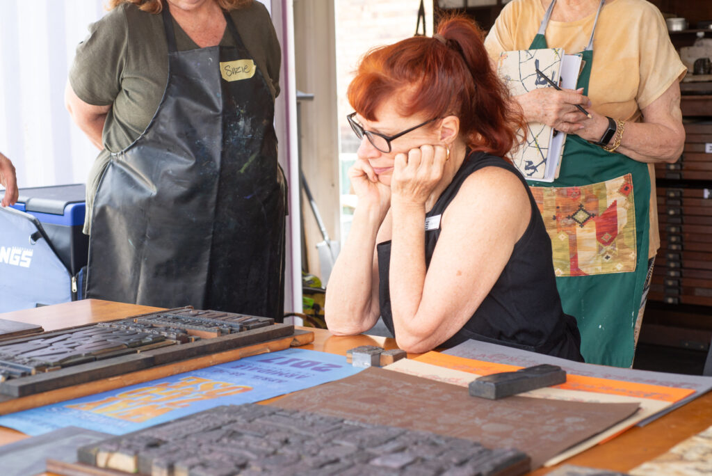
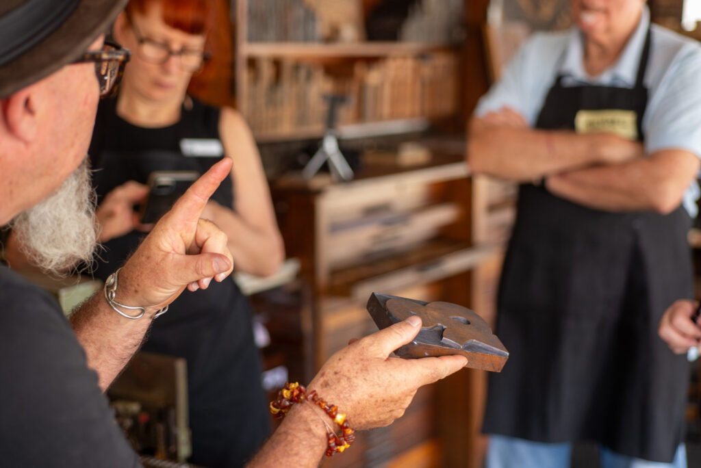
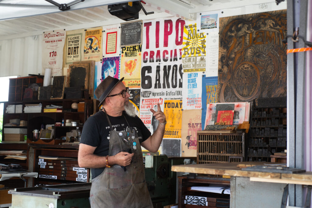
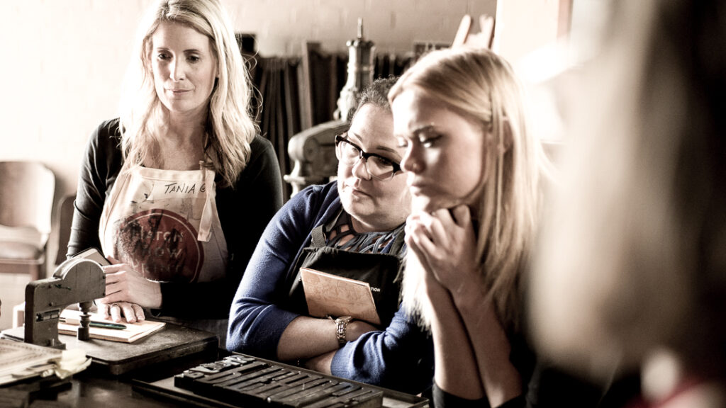
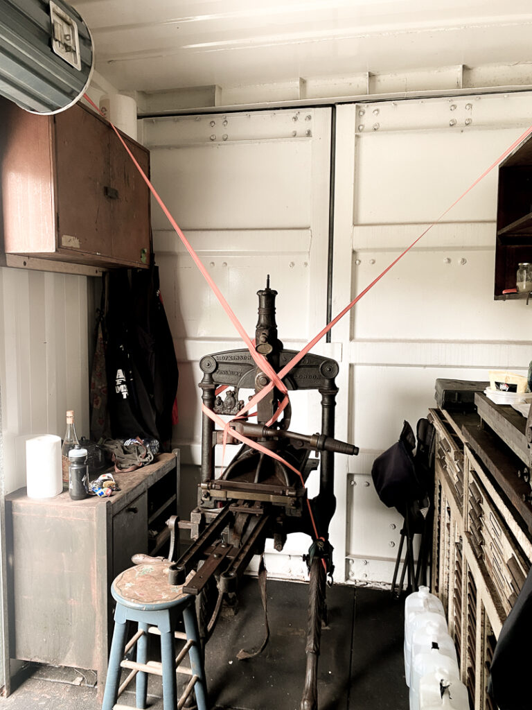
Saturday was hosted within the Moveable Type shipping-container studio at the Paint Factory. Despite the heat, our participants arrived ready to learn, experiment, and persevere.
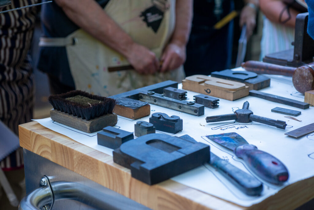
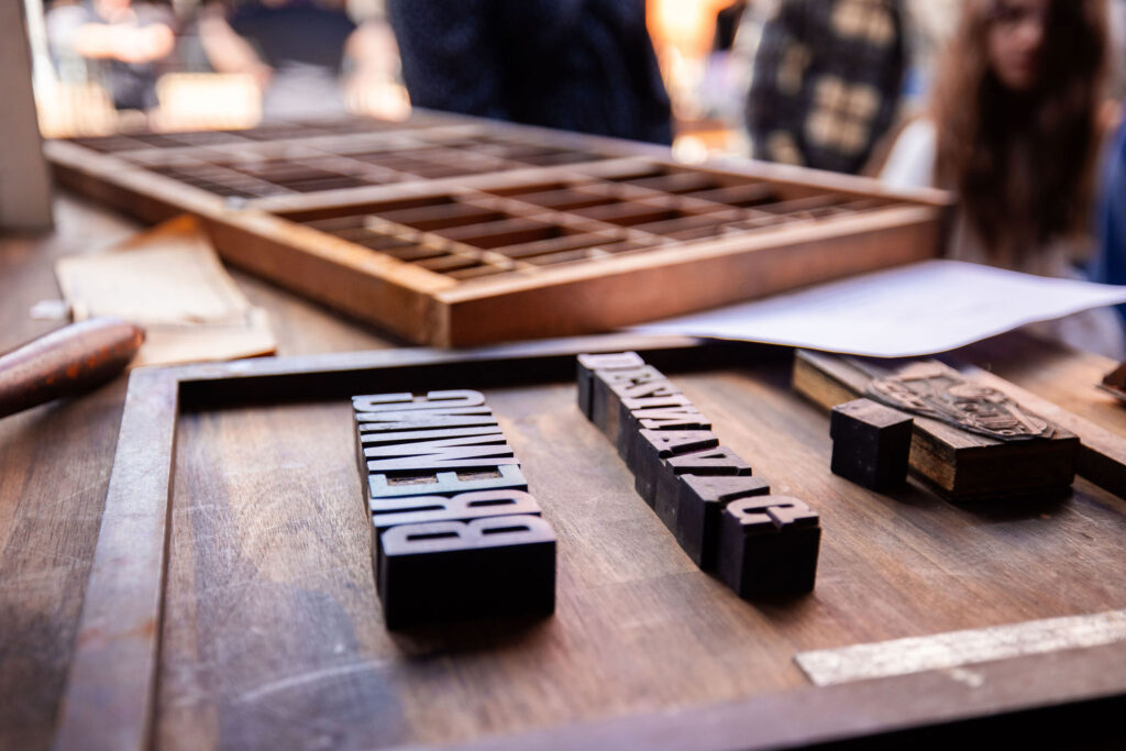
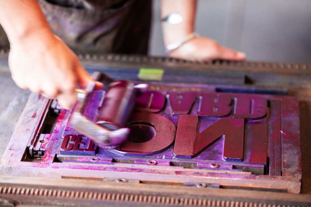
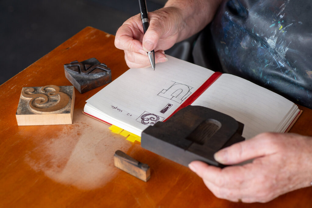
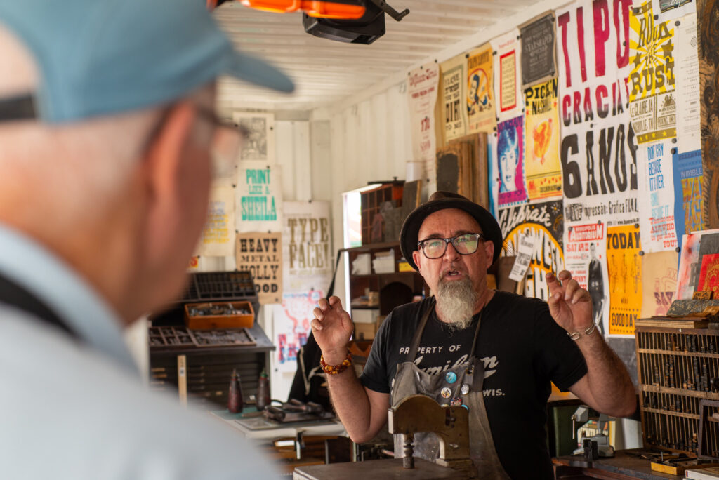
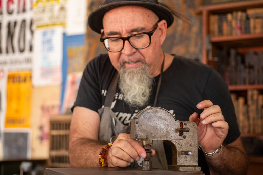
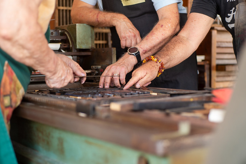
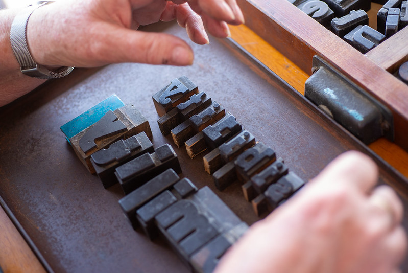
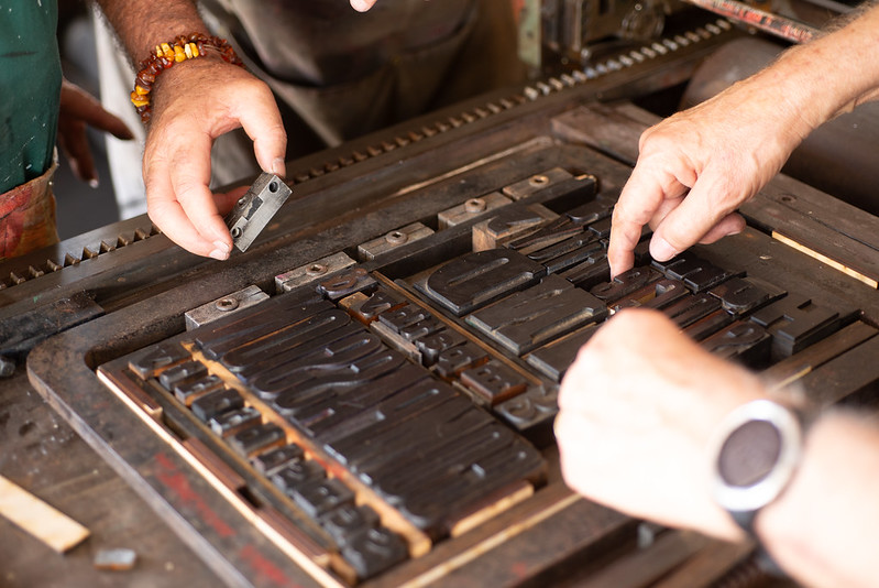
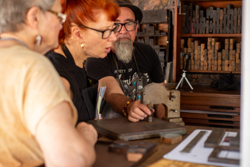
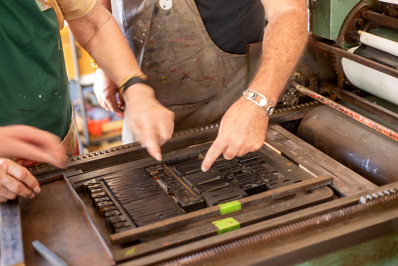
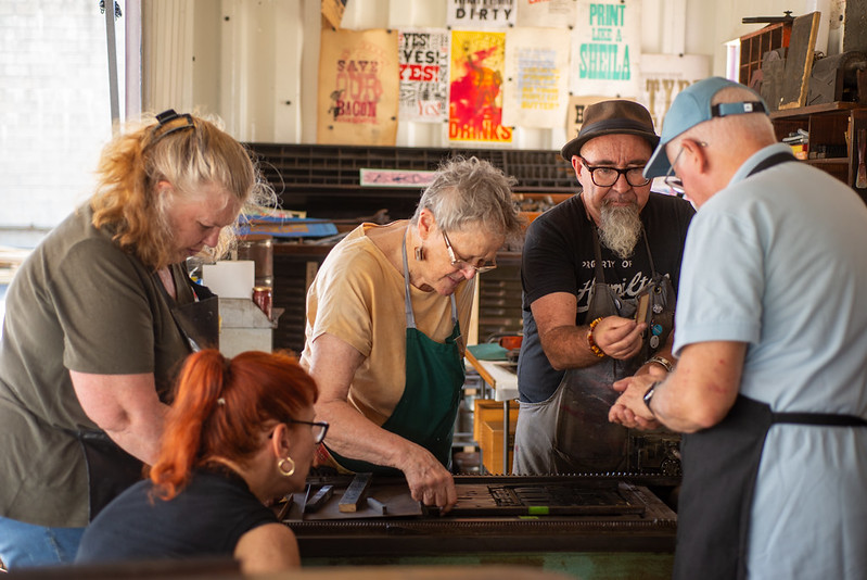
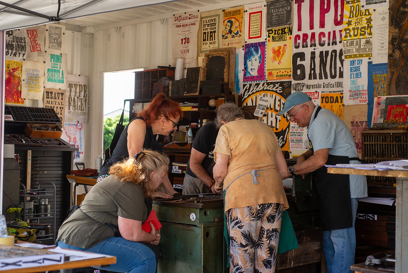
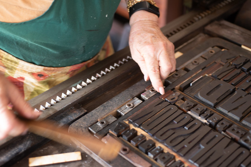
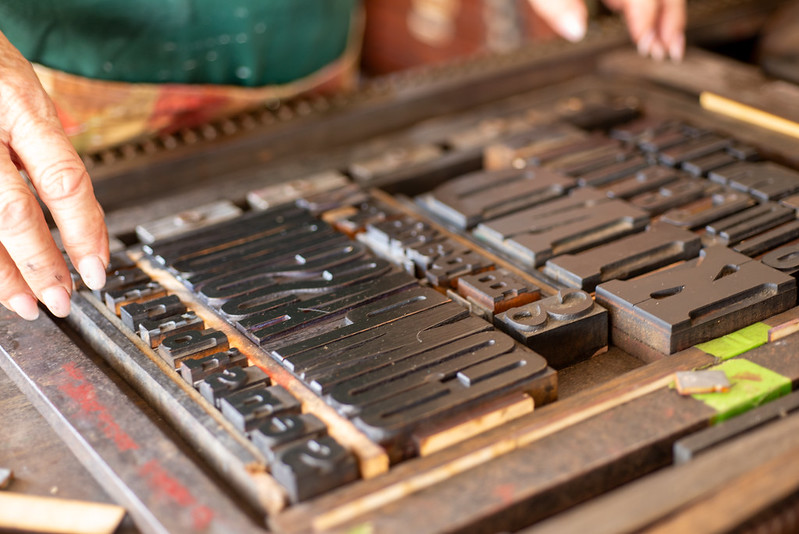
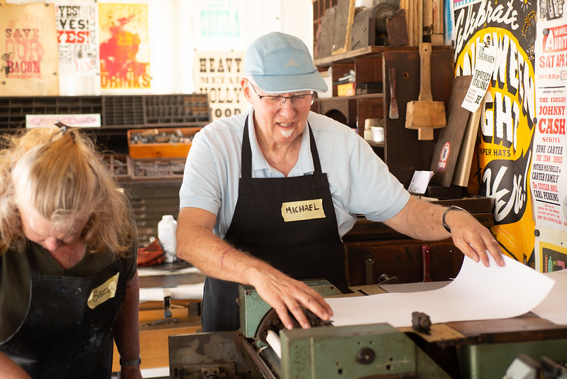
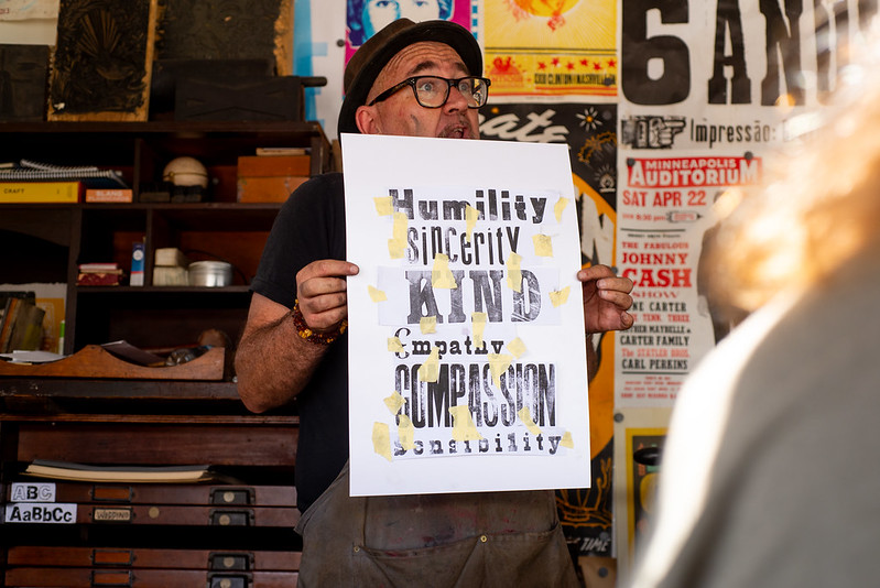
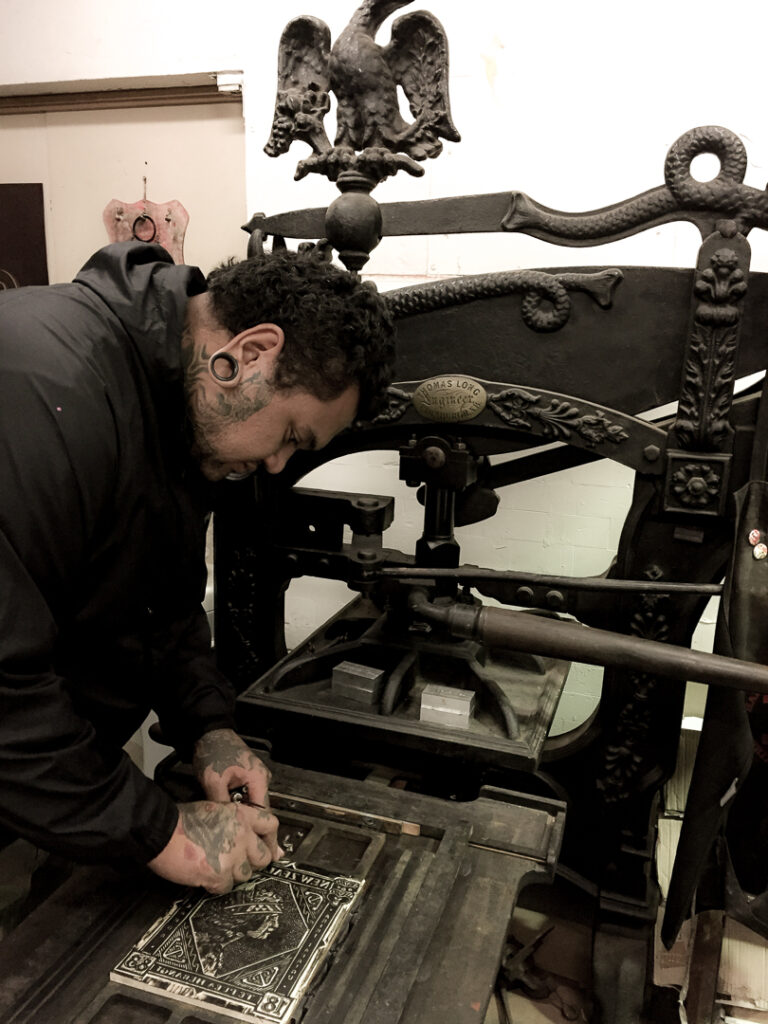
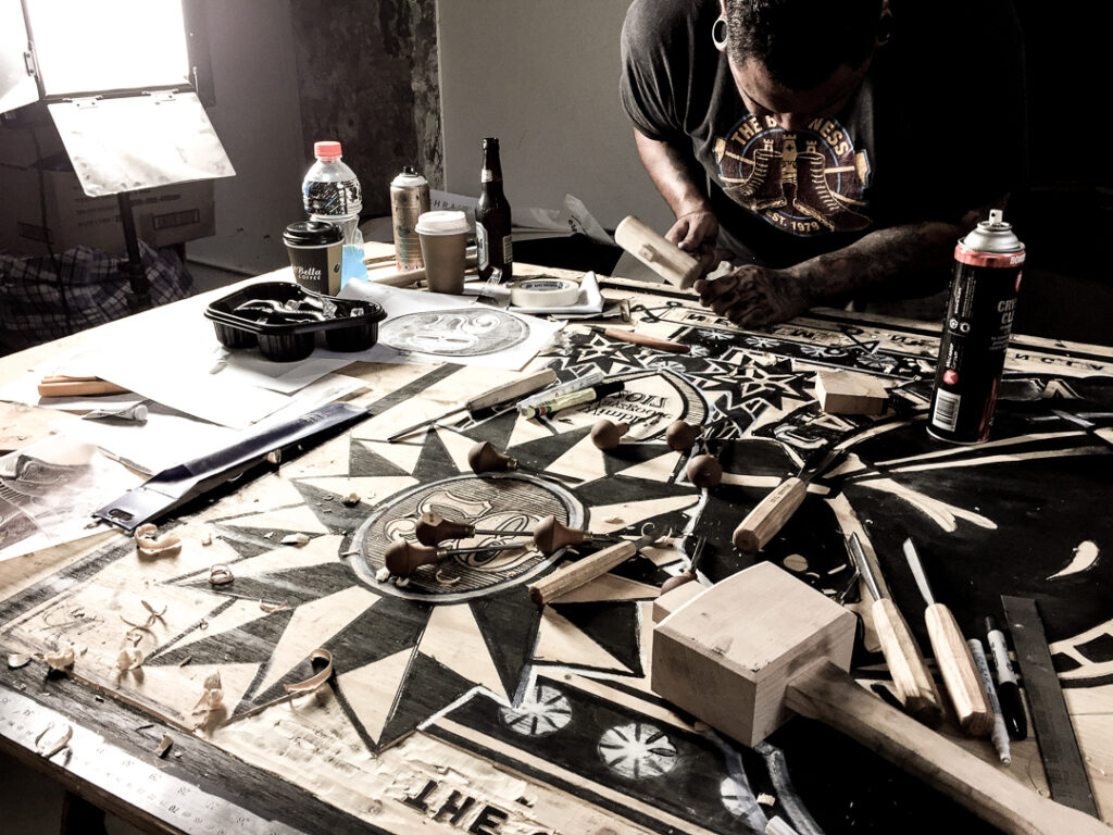
Clint led the foundational session on letterpress: understanding points and picas, the differences between wood and lead type, lock-ups, composition, and the realities of setting type by hand. Meanwhile, Barnaby Florence and Dzintra Menesis kept the presses running so participants could focus on making work rather than waiting for ink to dry.
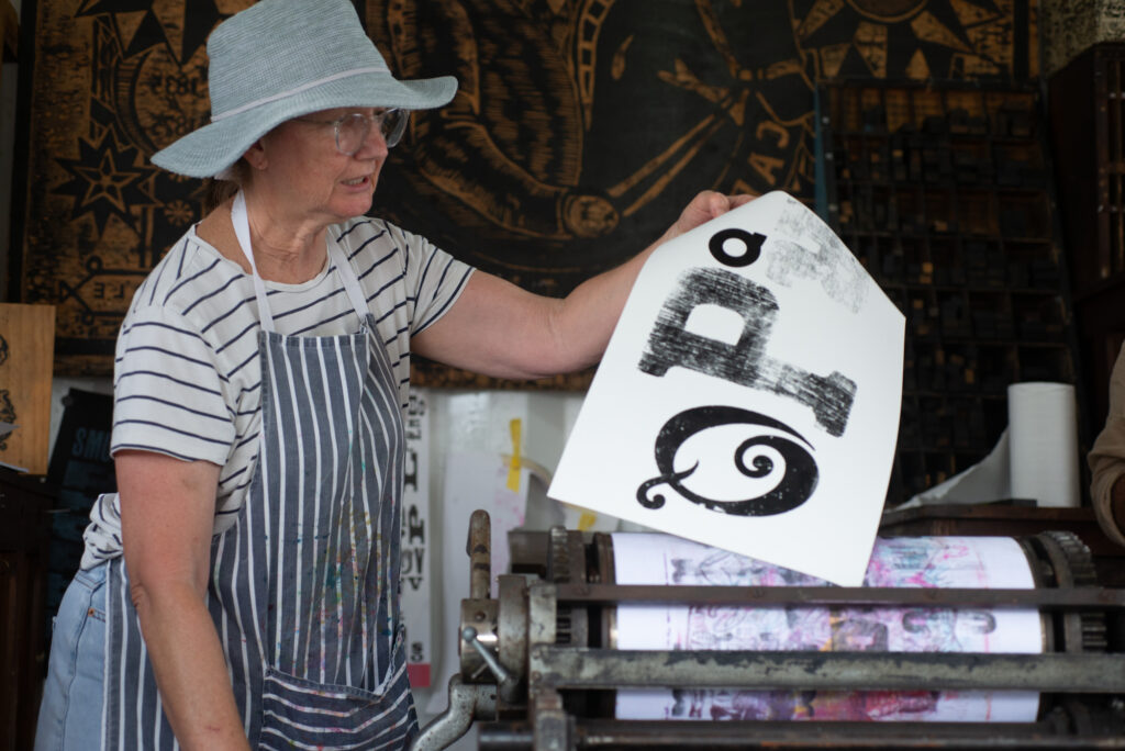
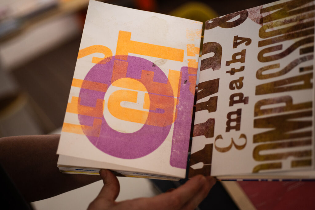
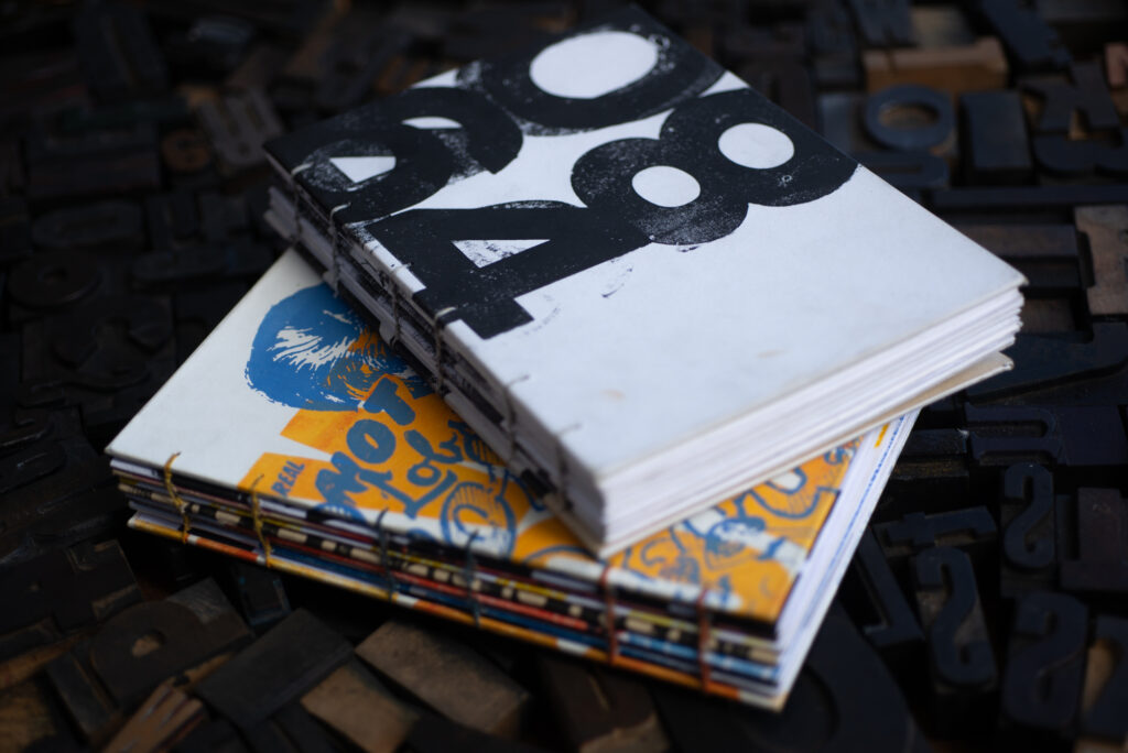
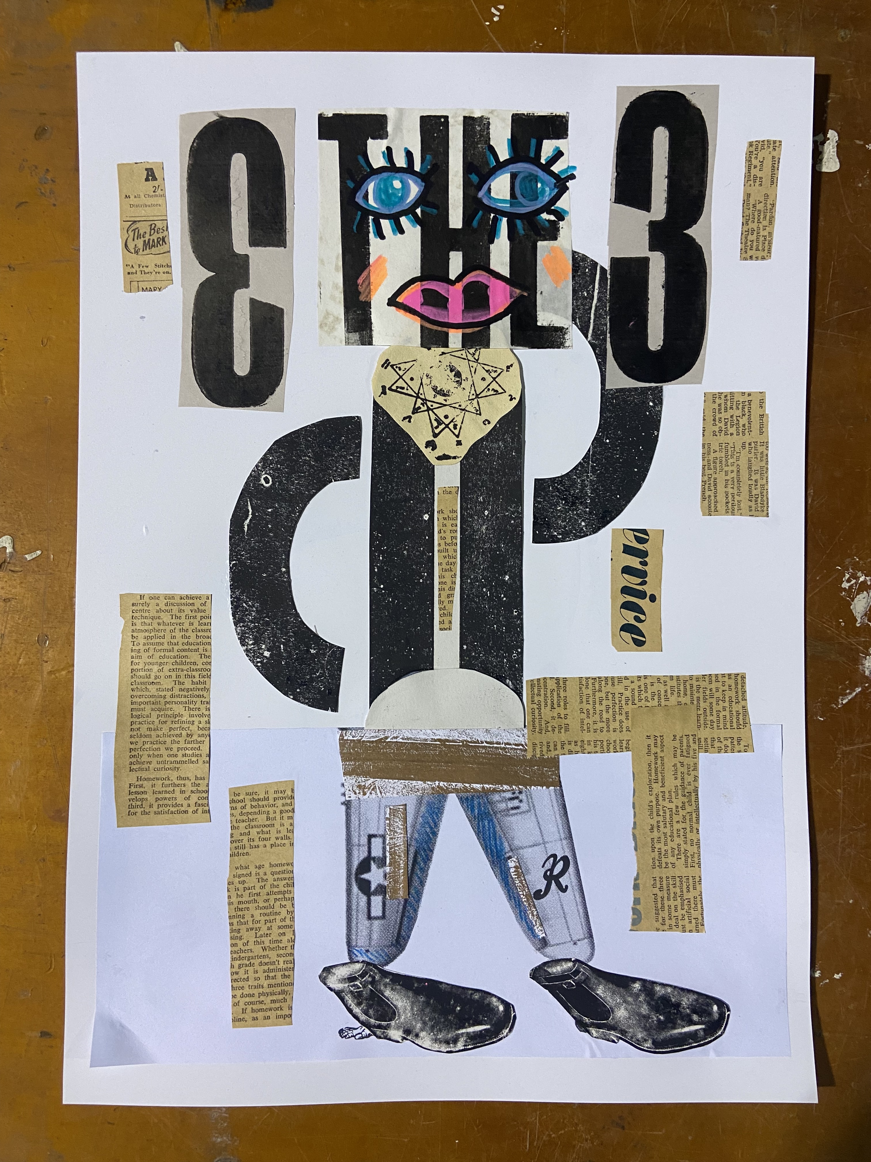
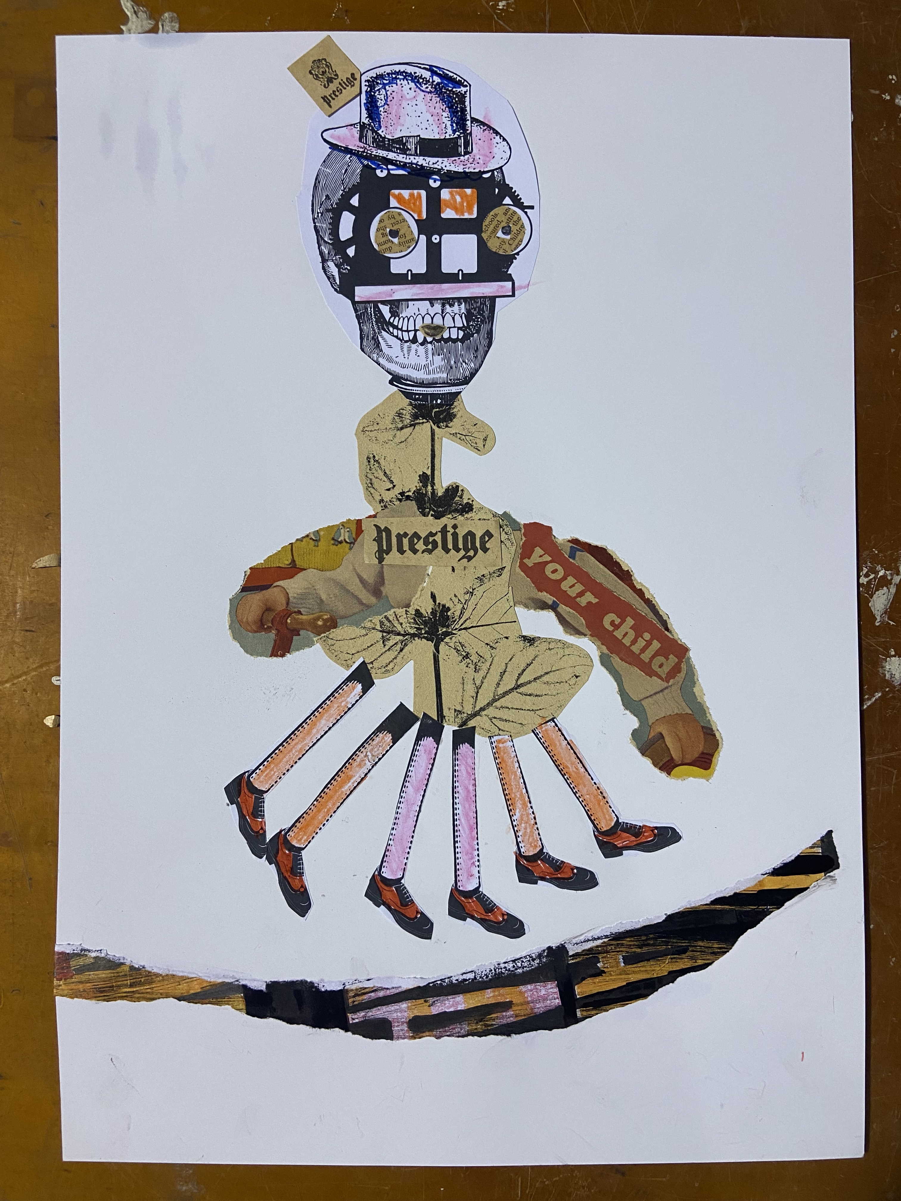
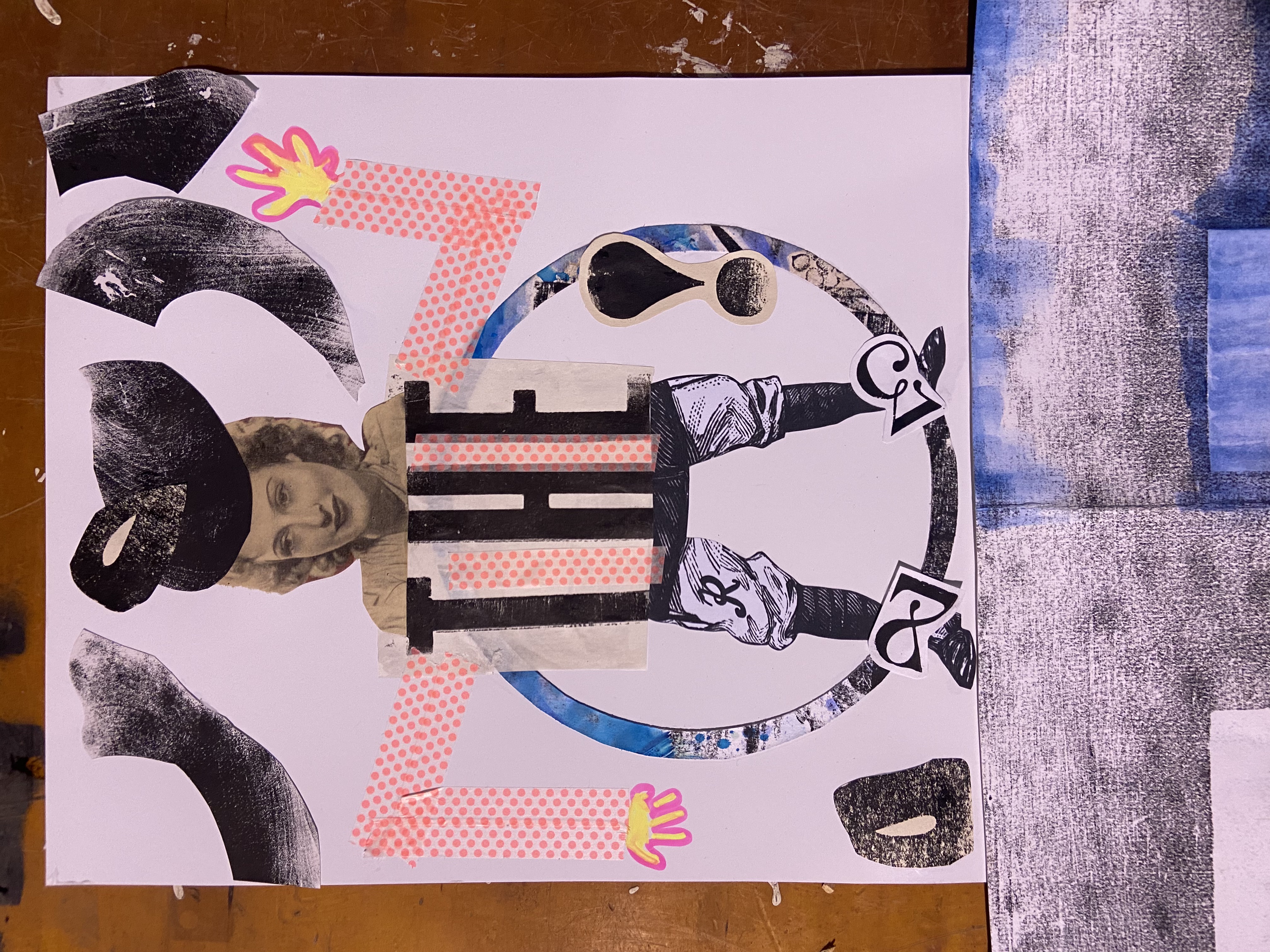
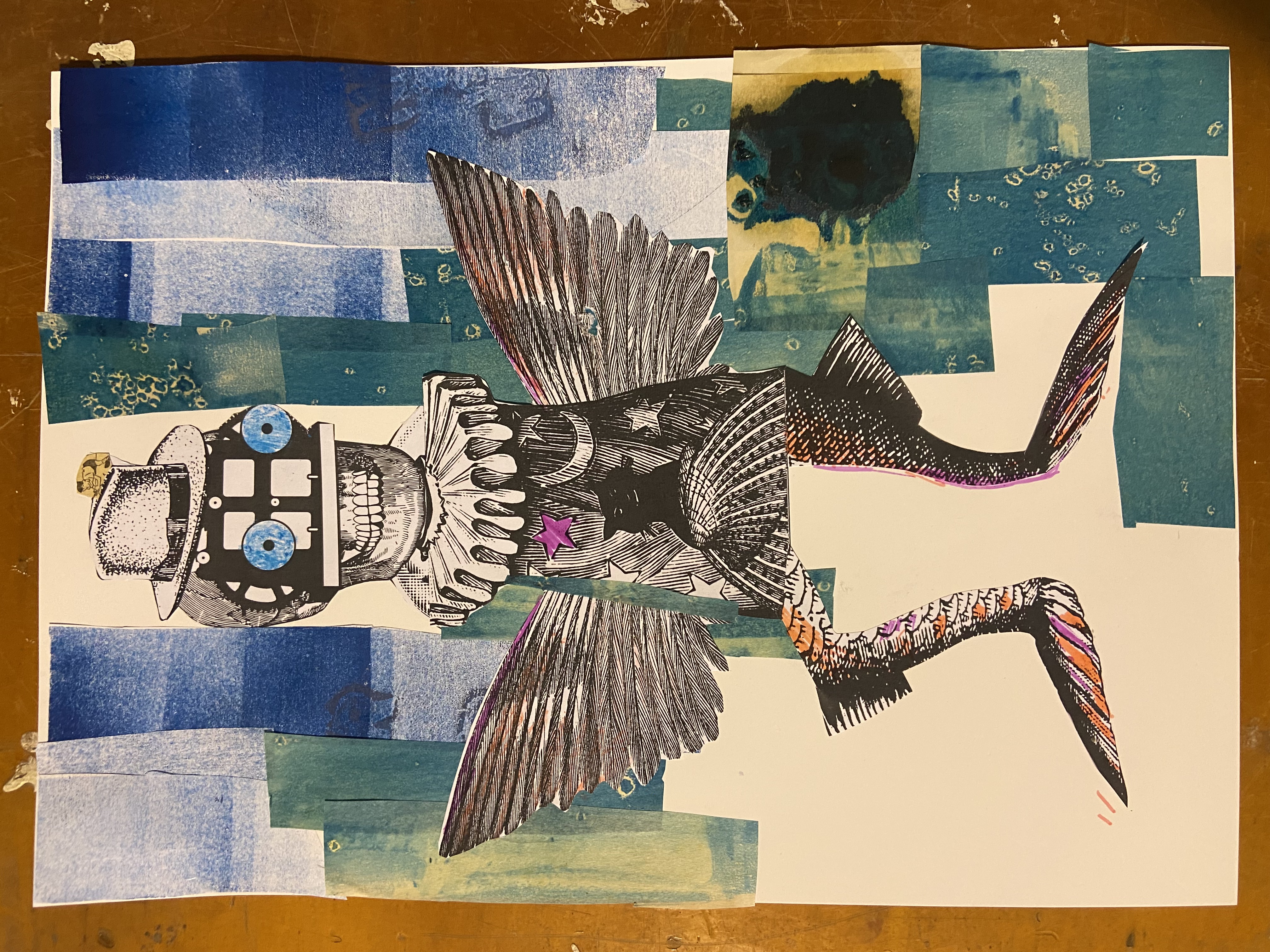
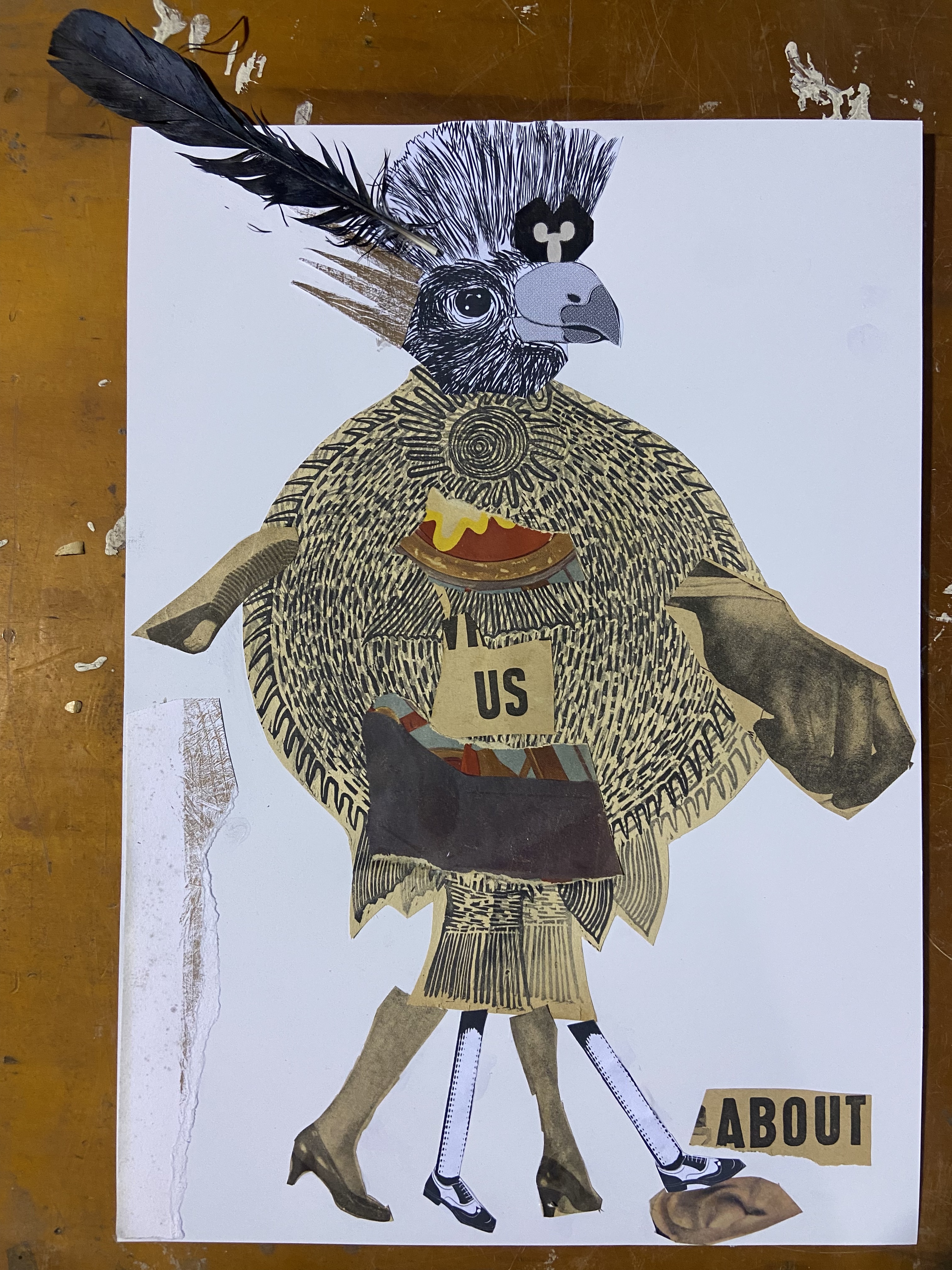
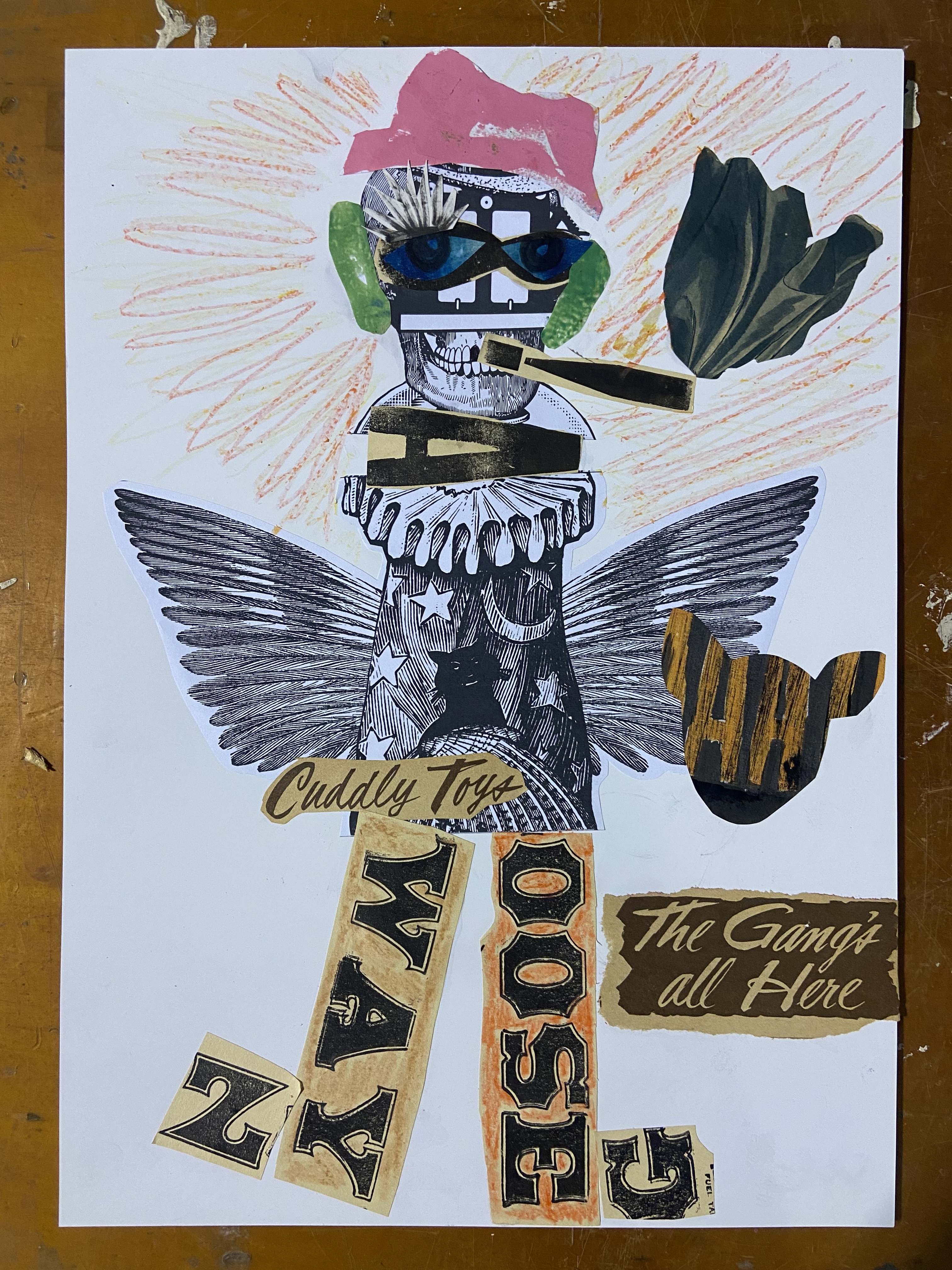
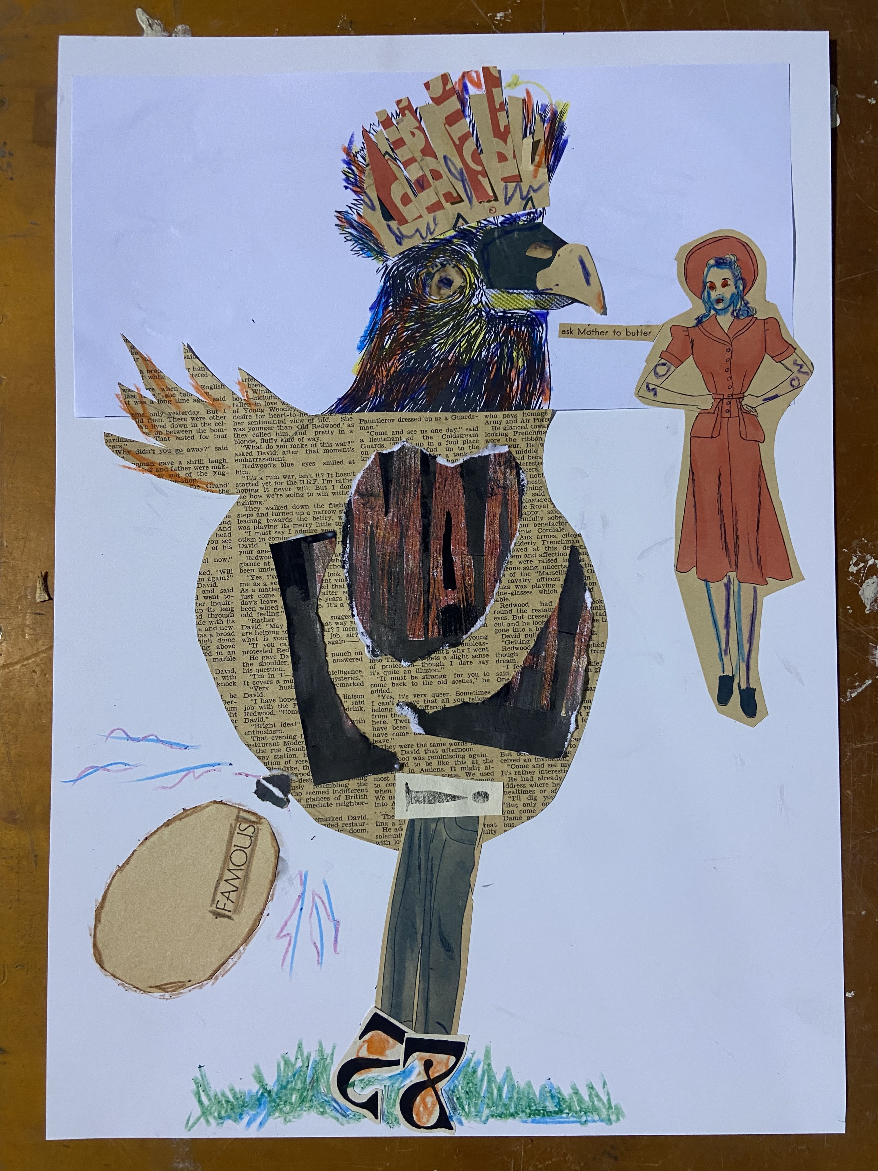
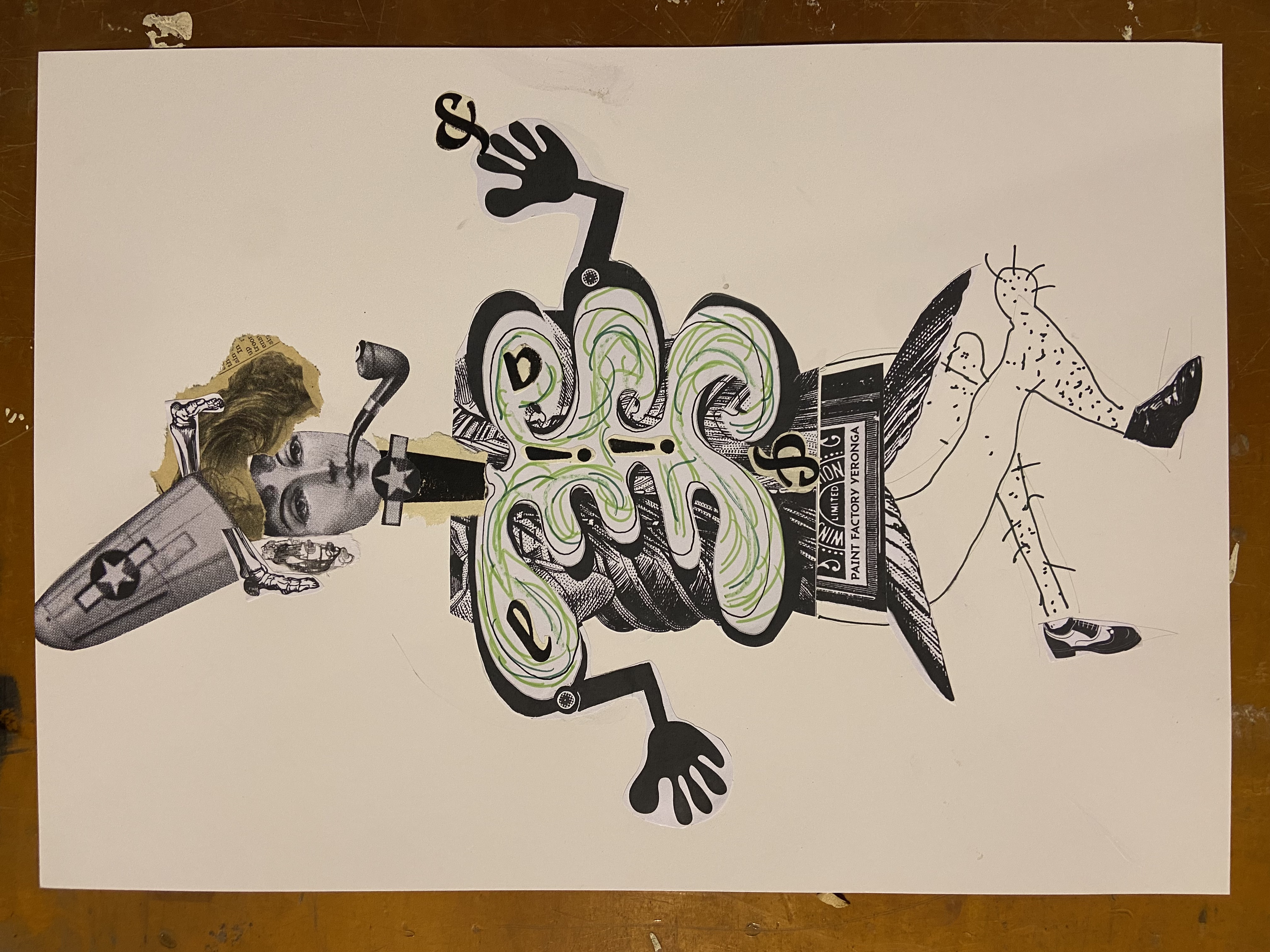
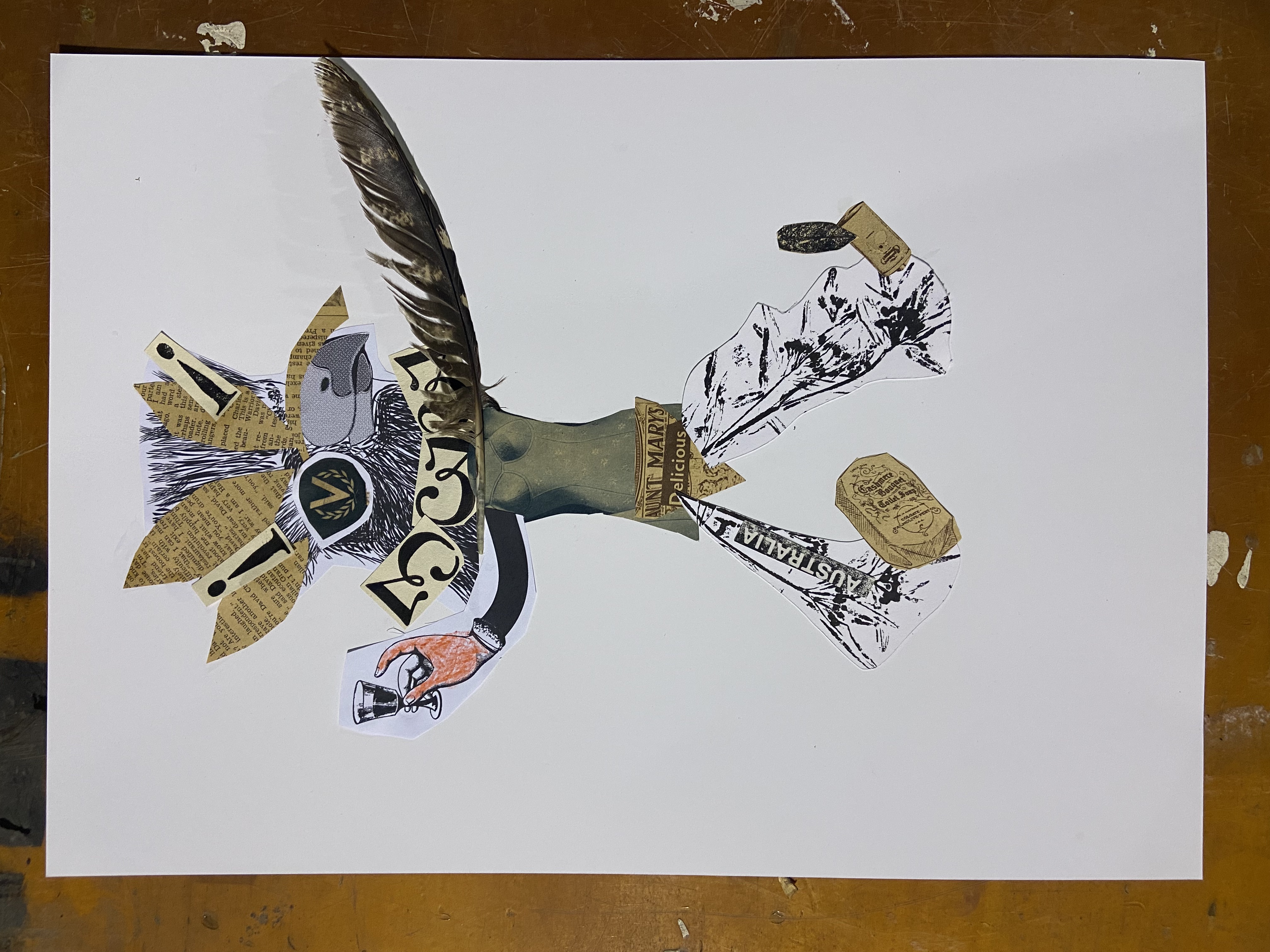
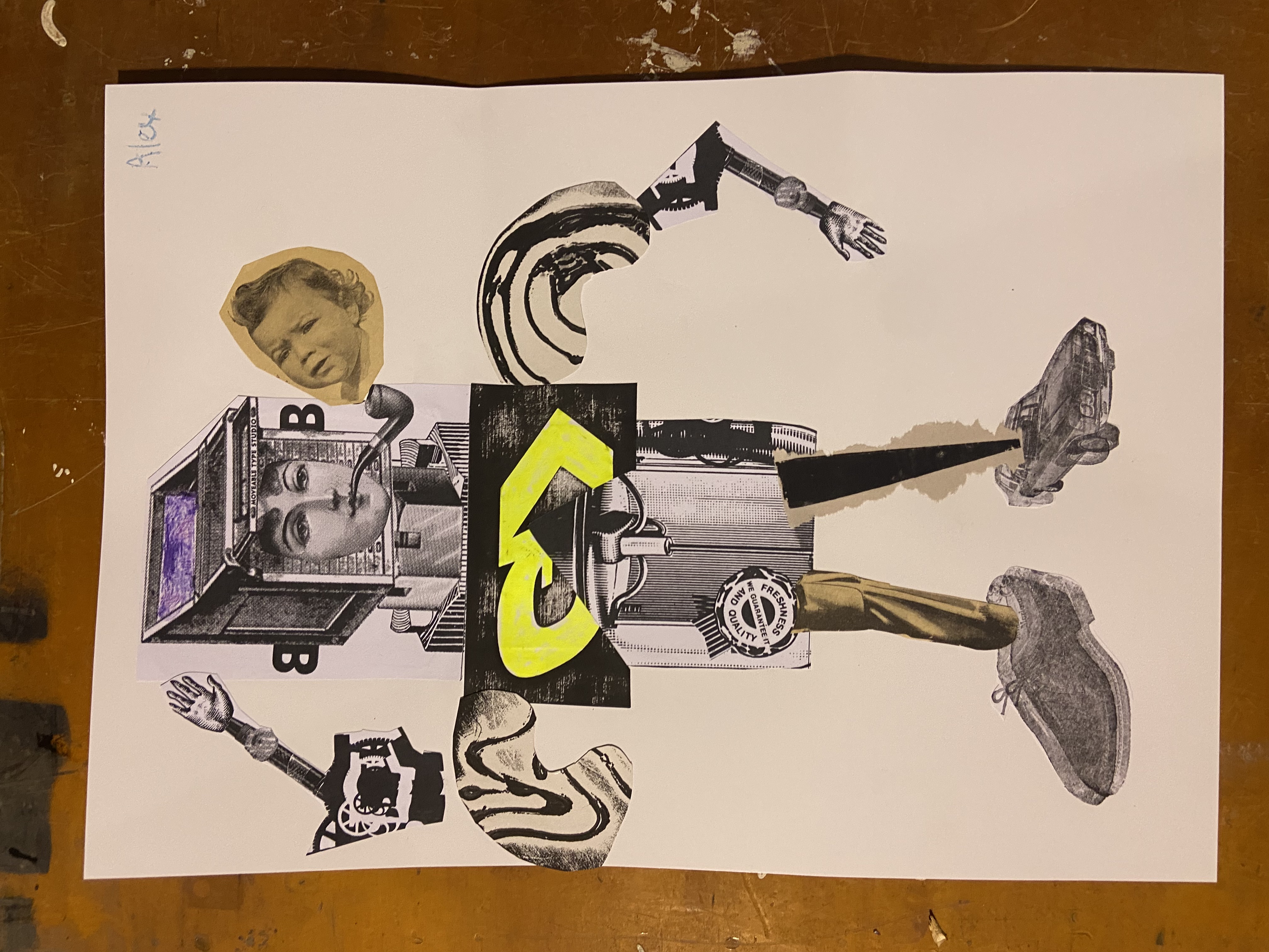
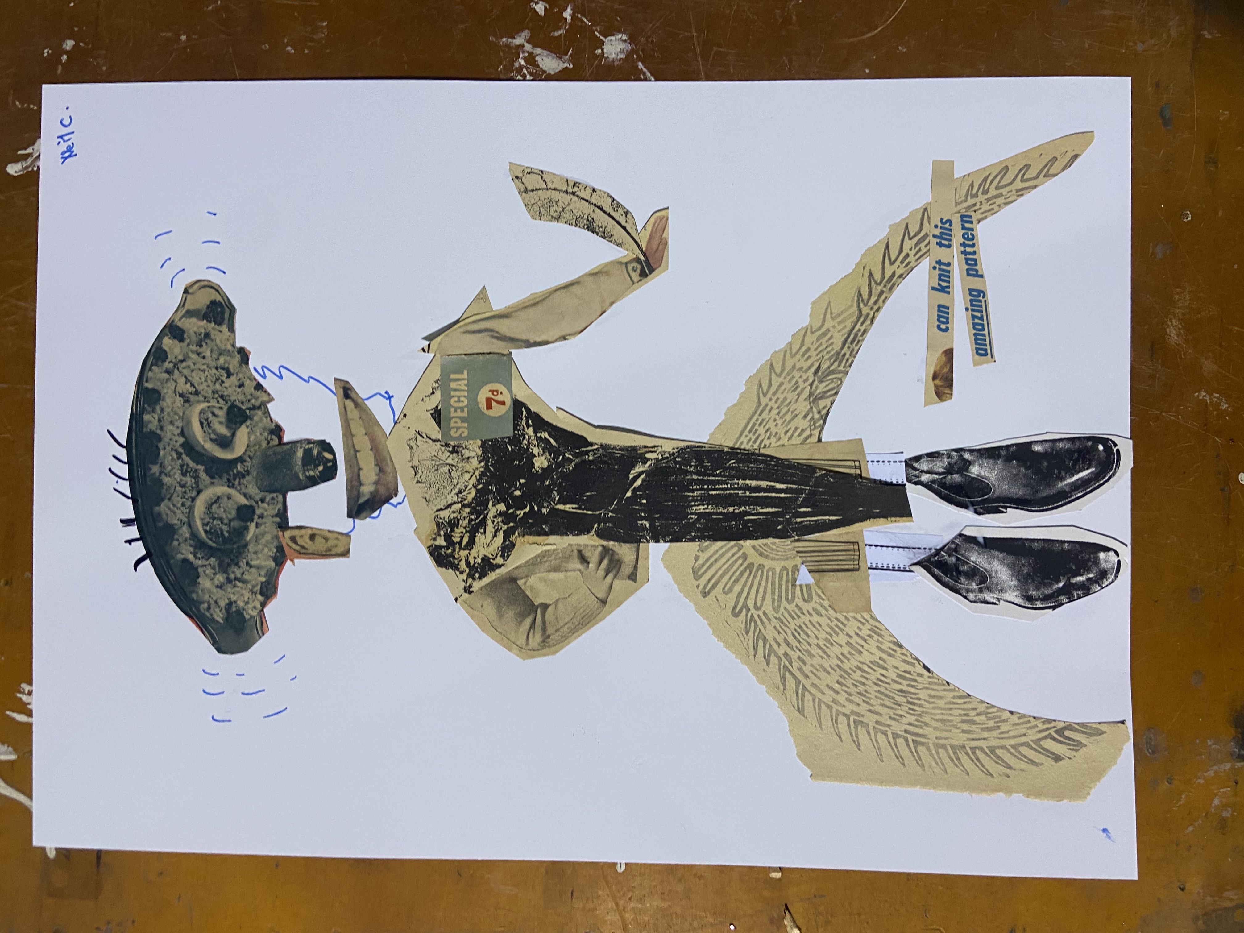
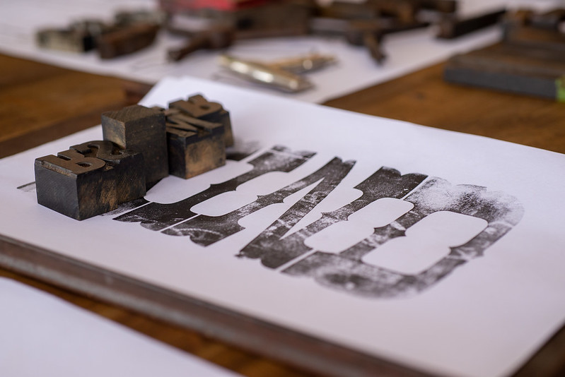
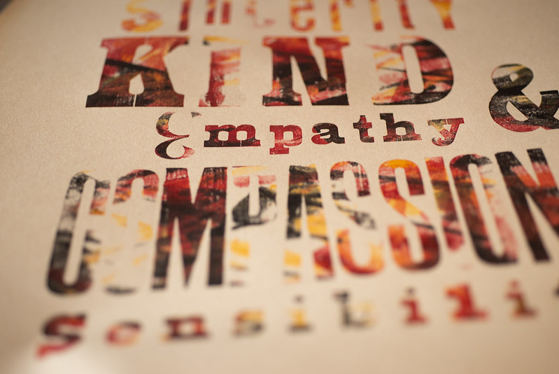
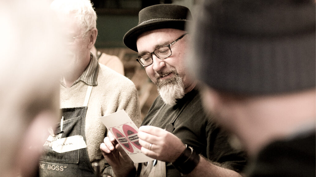
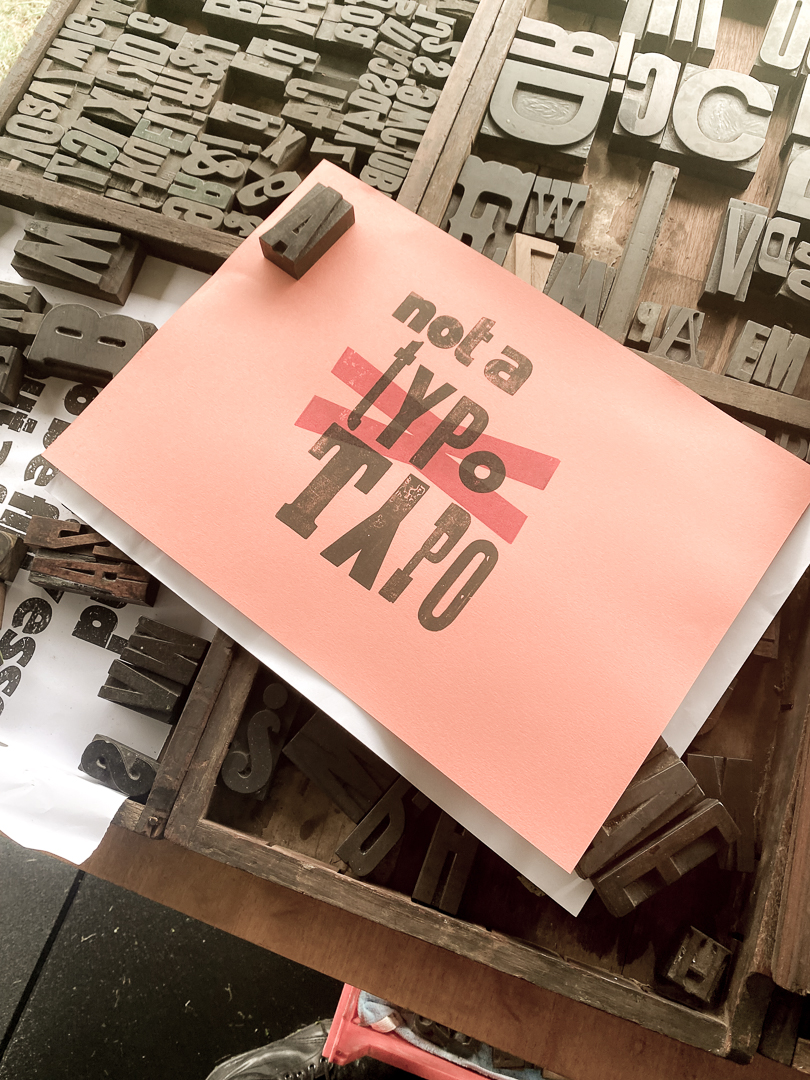
Our aim was ambitious, produce enough prints to give everyone a meaningful selection of colour spreads for the next day’s bookbinding. By the end, we had created around seven print designs, five of which were entirely designed and printed by the participants themselves. Many came from craft-based backgrounds, relief printmaking, quilting, mixed media, and it was inspiring to watch them translate those understandings into compositional and colour decisions in letterpress.
Everyone left exhausted, ink-stained, and genuinely excited to see their work transformed into books the next day. The heat at least worked in our favour: fast drying times meant all prints were ready to cut down and bind.
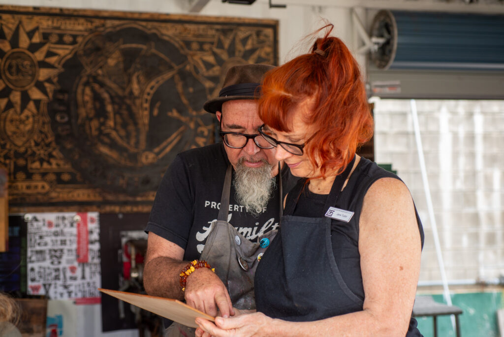
Day Two: Coptic Bookbinding with Shelbyville Bookbinding
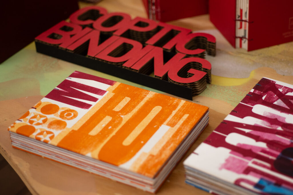
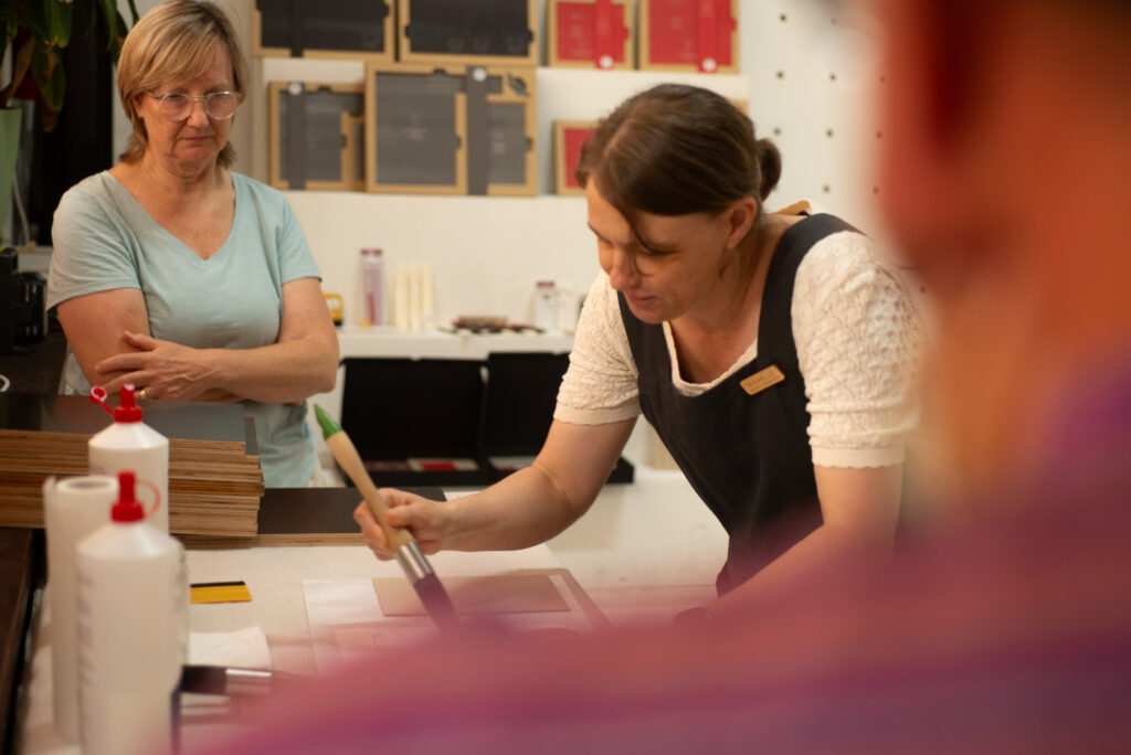
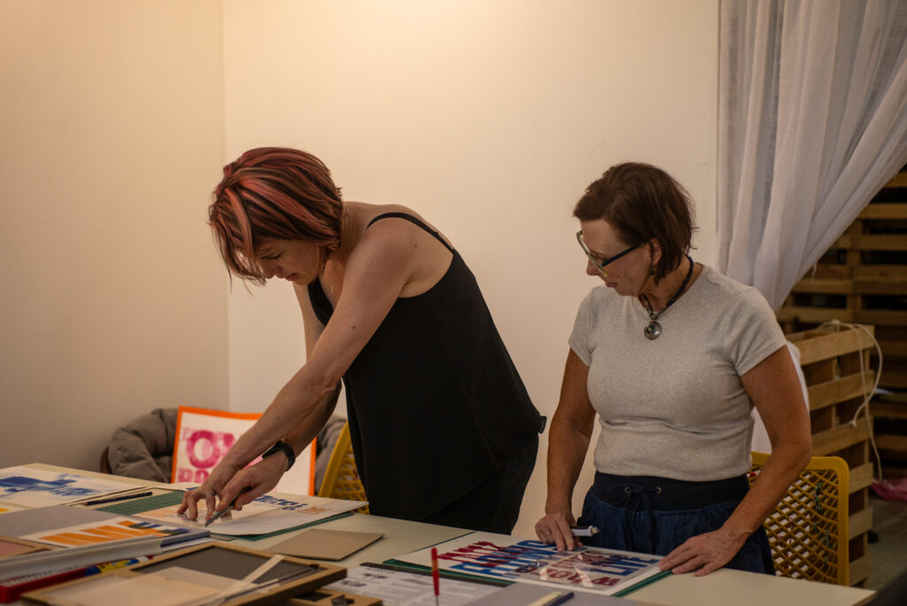
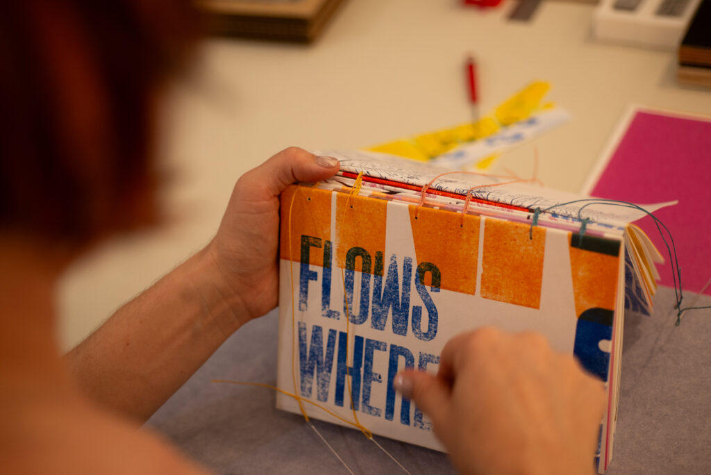
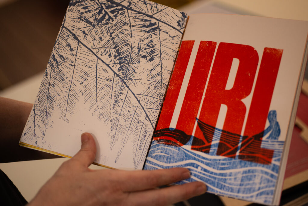
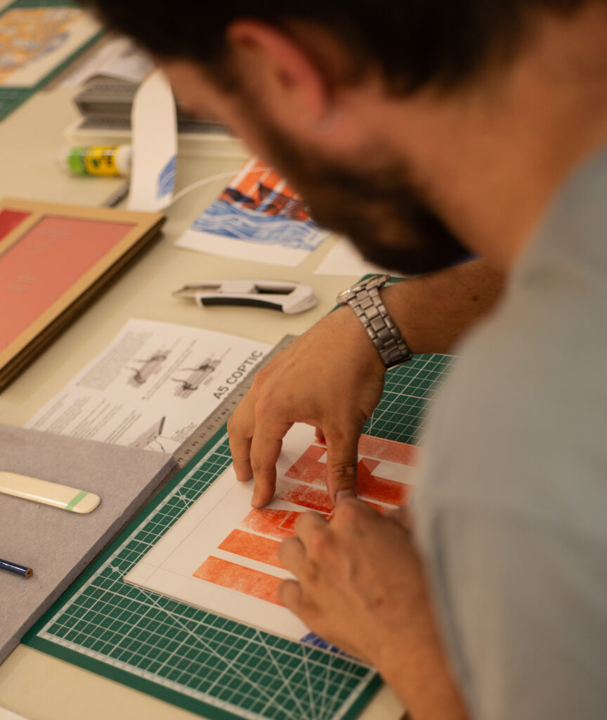
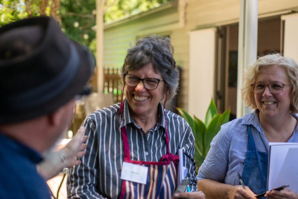
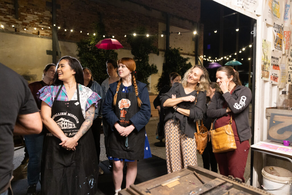
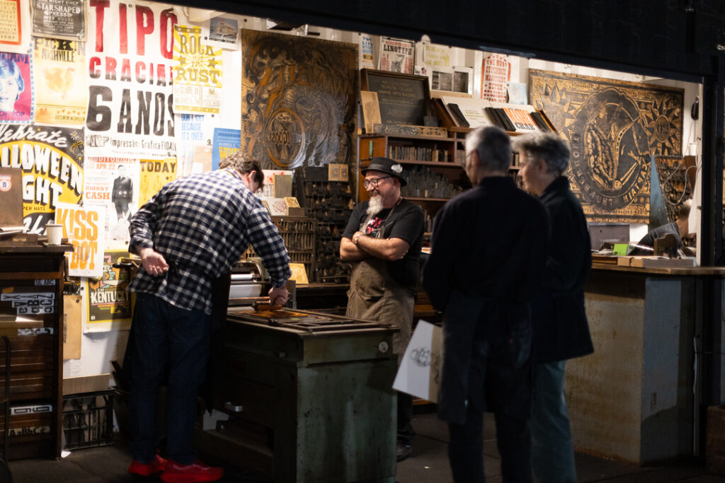
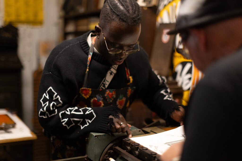
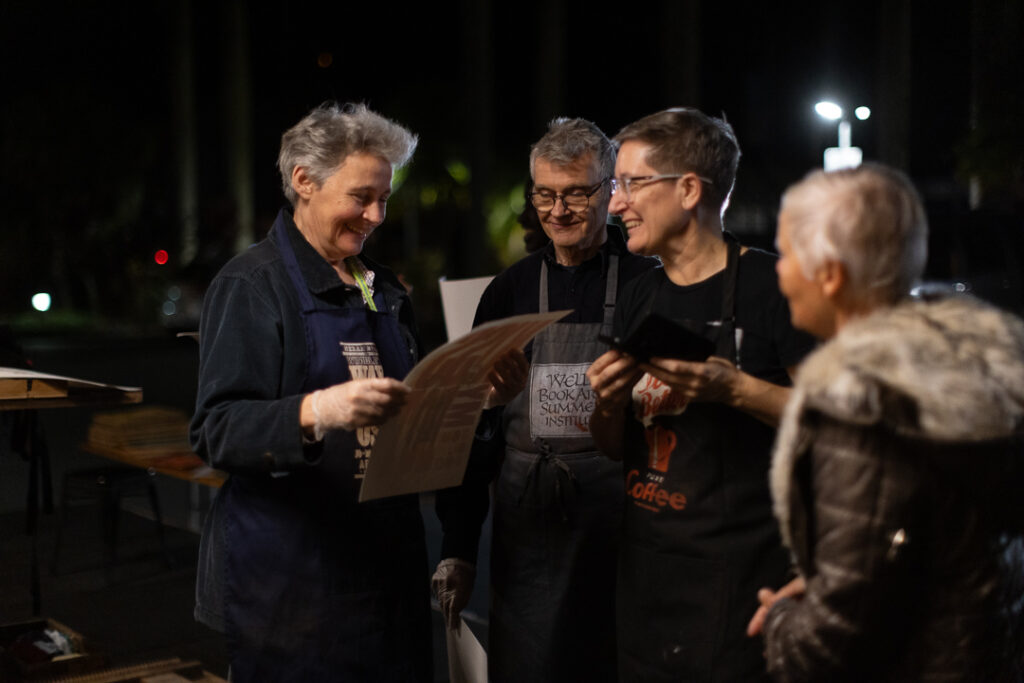
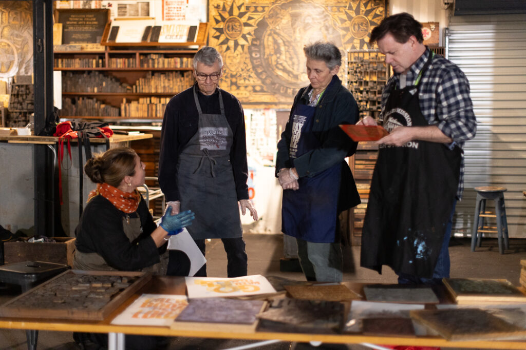
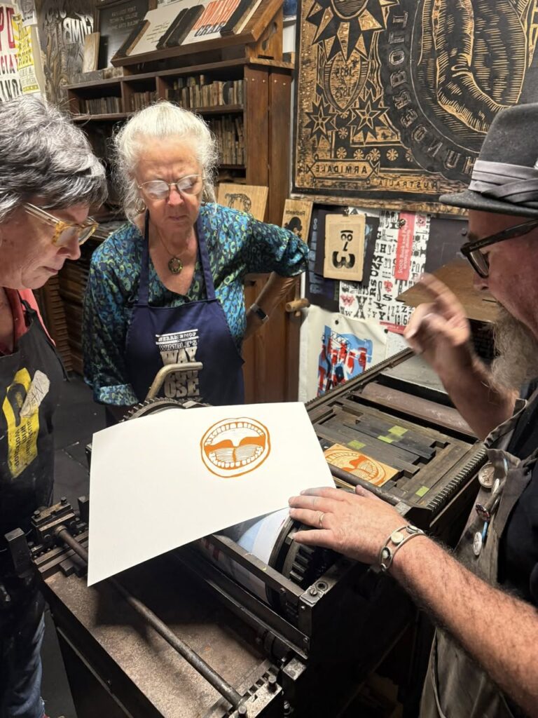
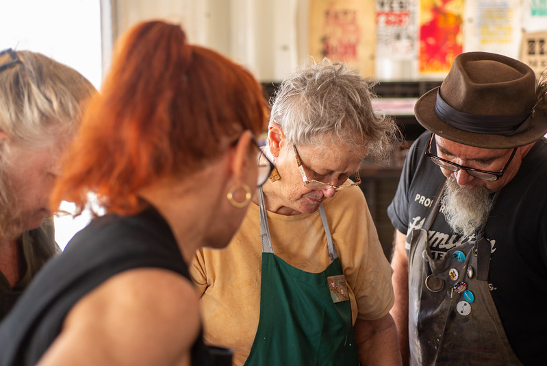
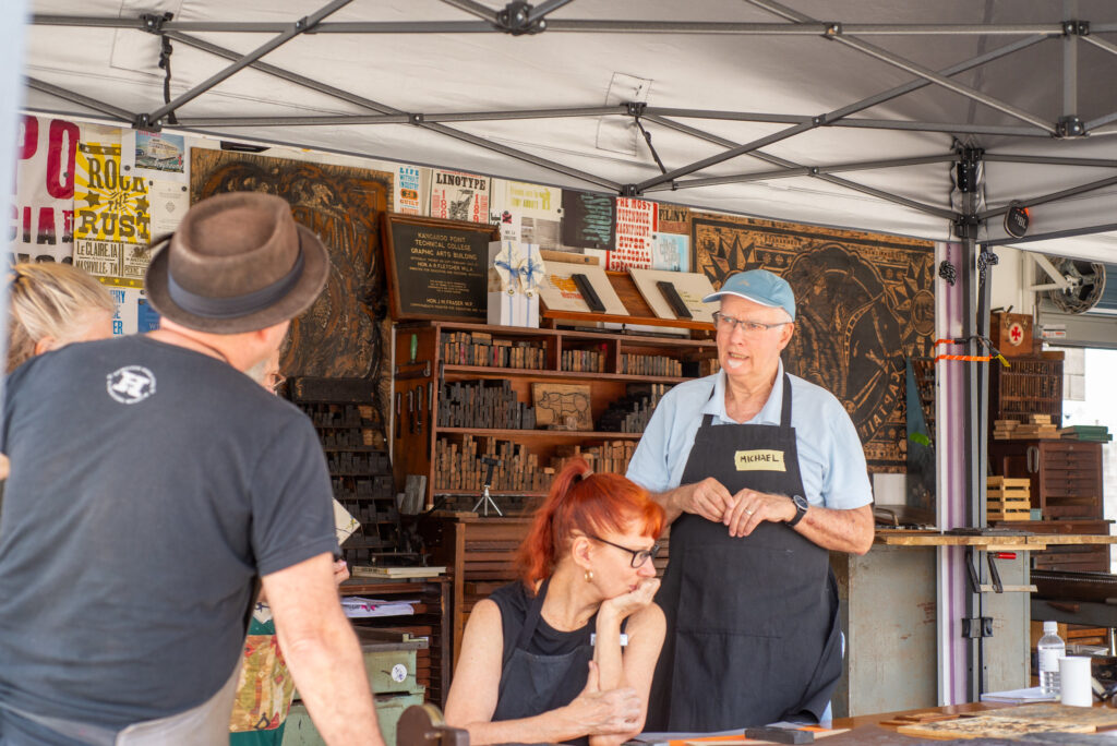
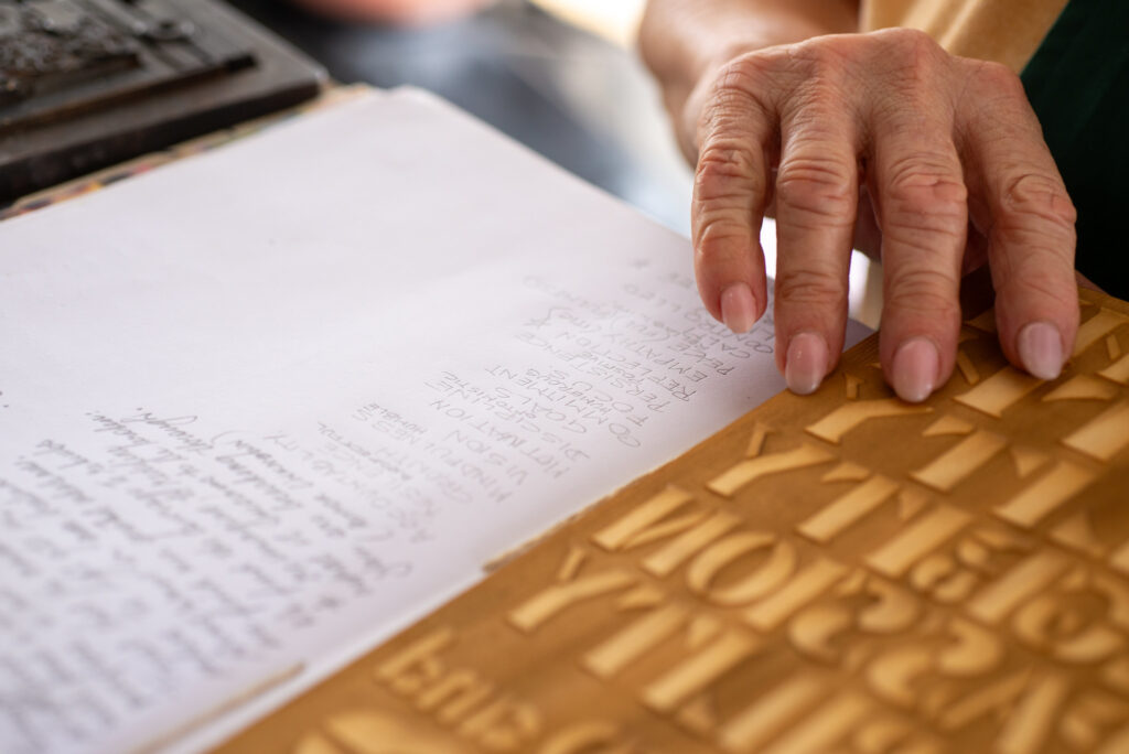
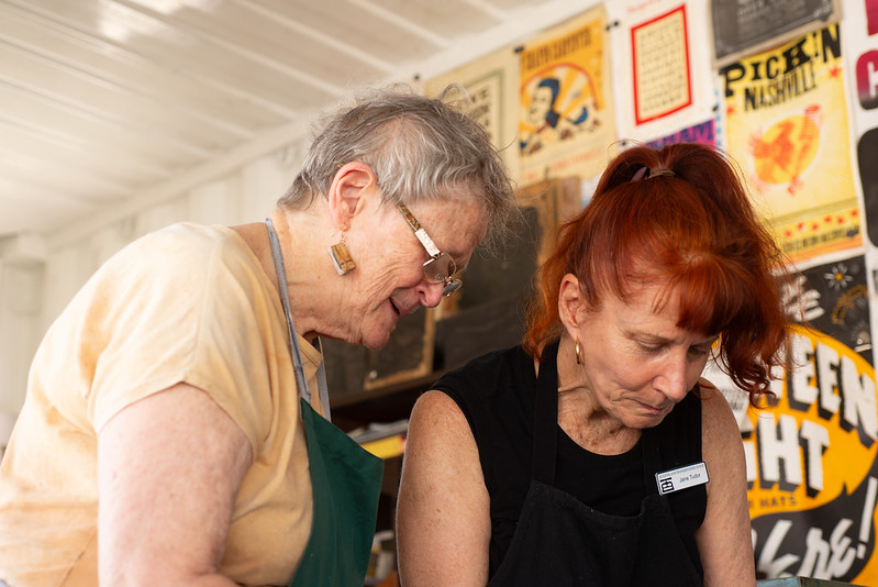
On Sunday, we shifted into Michelle Vandermeer’s studio for a five-hour deep dive into Coptic bookbinding. Michelle guided the group through constructing a seven-section book using the prints from Day One, cut down to size and reorganised into thoughtful sequences.
Her teaching approach, patient, precise, and generous, contrasted beautifully with the energy of the previous day’s printing. For Moveable Type Studio, this was our first time fully participating in the bookbinding process ourselves, sitting shoulder-to-shoulder with the same people who had printed in the heat with us the day before. It was grounding, humbling, and incredibly informative.
By the end of the session, everyone walked away with a completed Coptic-bound book , and a real appreciation for the slowness of the method. Many of our participants work full-time, some with families, yet they committed to the full weekend. Their dedication reinforced how important these heritage crafts are, not only as creative practices but as spaces for slowing down, focusing, and reconnecting with process.
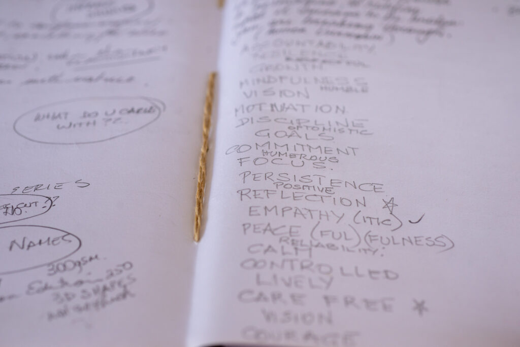
Why This Workshop Worked: A few reflections stood out clearly:
Intentional slowness matters. Letterpress and Coptic binding both demand patience. That patience created the depth of engagement.
Participants were genuinely committed. The weather alone could have chased people off. It didn’t.
The two processes complement each other. Printing one day and binding the next created a fulfilling, closed-loop experience.
Michelle’s teaching elevated the weekend. Her clarity, structure, and experience balanced our more energetic print day perfectly.
We learned alongside participants. As bookbinding beginners ourselves, sharing the experience strengthened the studio’s connection to the people we teach.
Looking Ahead
This workshop confirmed that there’s real potential for longer-term, term-based engagement: opportunities for participants to visit the studio throughout the year, build a body of printed work, and later assemble it into books with Michelle. There’s scope to incorporate other art forms into these volumes as well, creating multi-layered “creative field journals” that document a year in making.
This two-day workshop affirmed what we’ve believed for a long time: heritage craft thrives when it’s shared, slowed down, and integrated into everyday creative practice. And we’re excited to continue refining, expanding, and collaborating so more people can experience it.
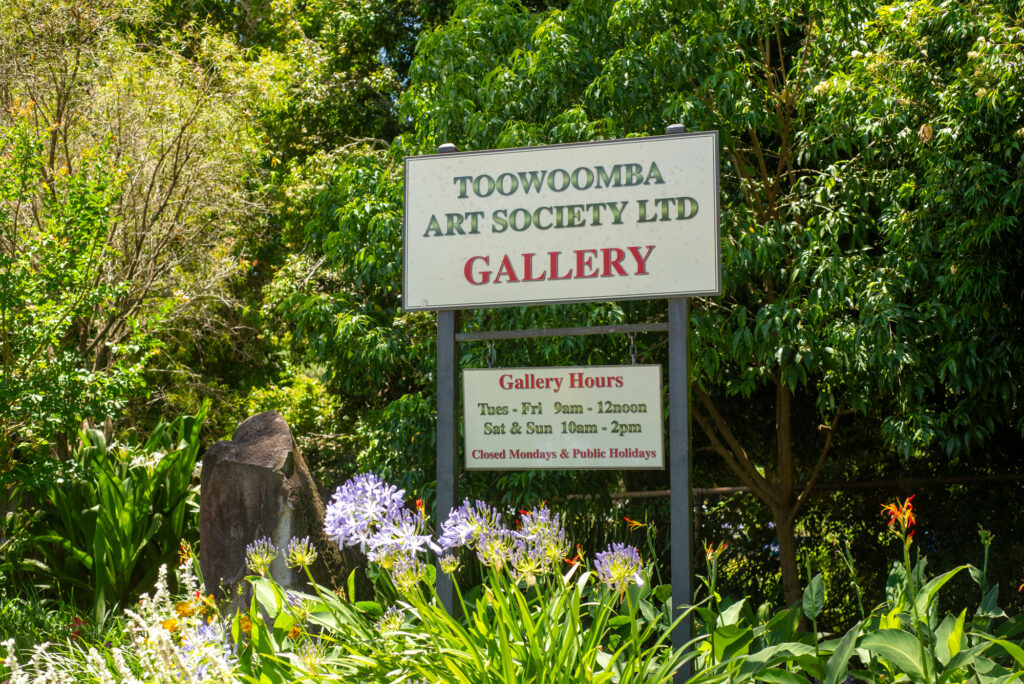
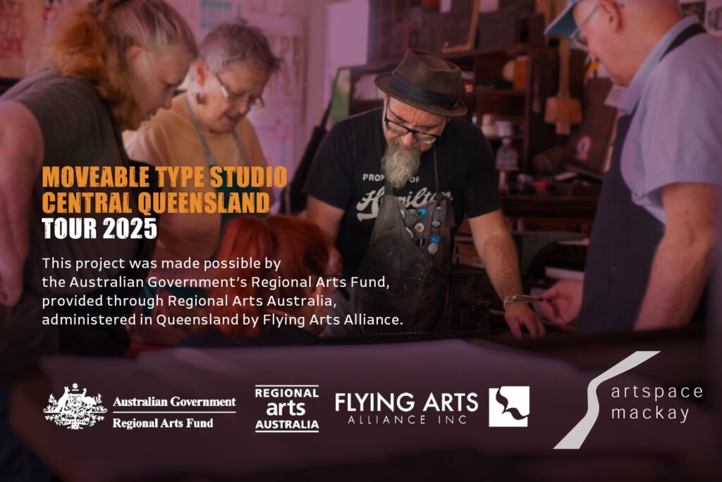
The Moveable Type Studio’s last Flying Arts funded workshop for 2025 found its home at the Toowoomba Art Society. Established in 1925, the Society has long been a cornerstone of regional arts, offering studios, galleries, and workshops that nurture creativity across generations. Toowoomba, Queensland’s largest inland city and the heart of the Darling Downs, lies two hours west of Brisbane. Its streets and surrounds carry a remarkable heritage, making it a fitting finale for the tour.
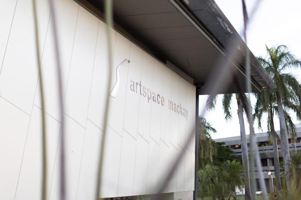
This stop marked the conclusion of the Moveable Type Studio’s 2025 regional Queensland tour. The journey began earlier in the year at Artspace Mackay, coinciding with the Libris Artist Book Awards. Across workshops and public demonstrations we collaborated with poets and printmakers, while connecting deeply with the local gallery and its community.
From there, we travelled south to Rockhampton, joining the Rockhampton River Festival for three days of music, entertainment, and hands-on letterpress with the public along the Fitzroy River. After returning to our home base at Yeronga’s Paint Factory, the former Taubmans Paint Factory, built in 1957 and now a thriving creative precinct, we prepared for the final stage of our Flying Arts supported regional tour: Toowoomba.
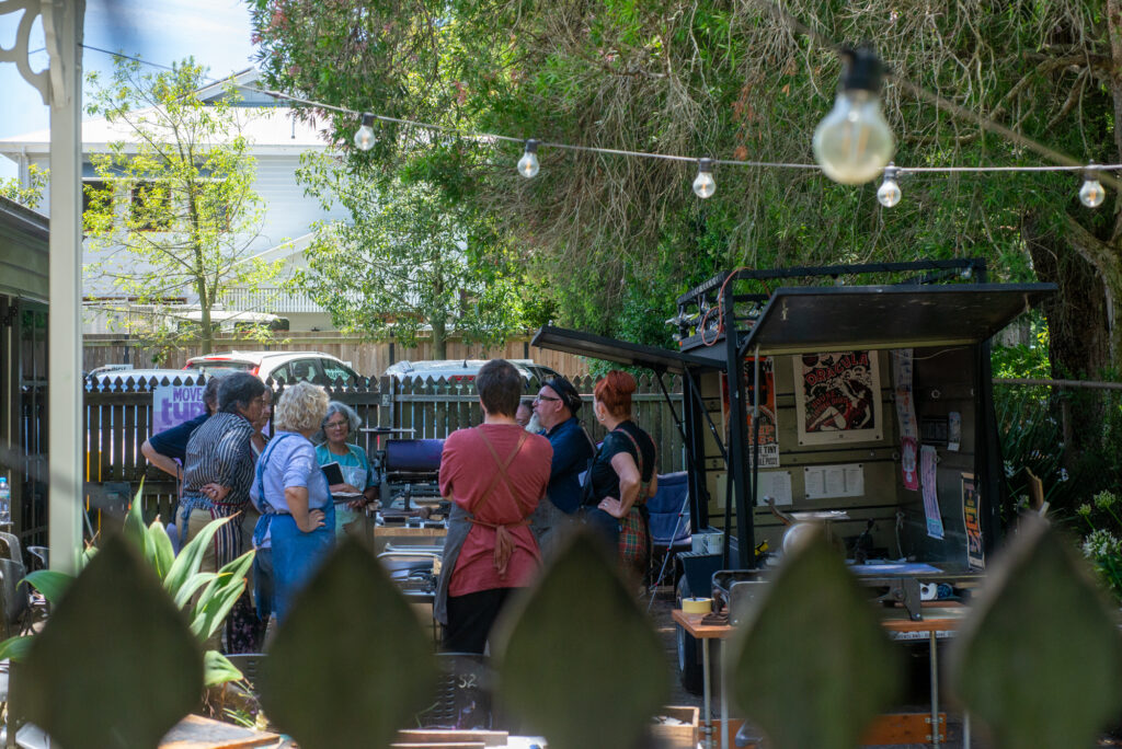
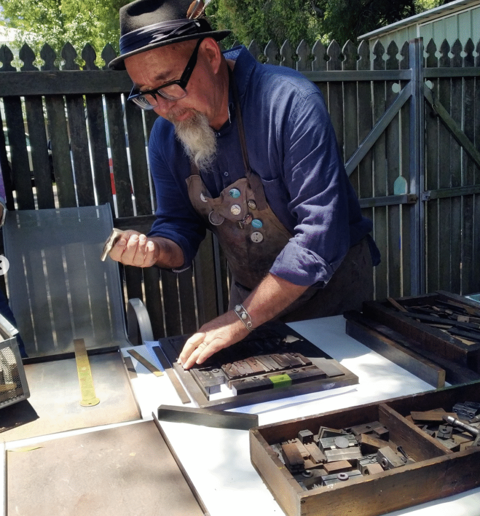
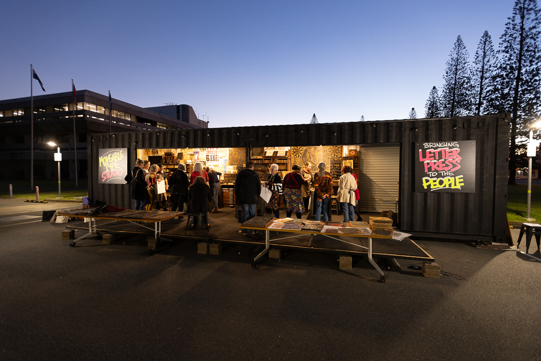
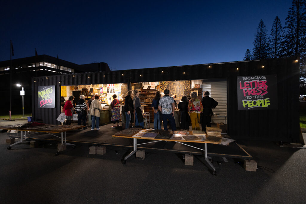
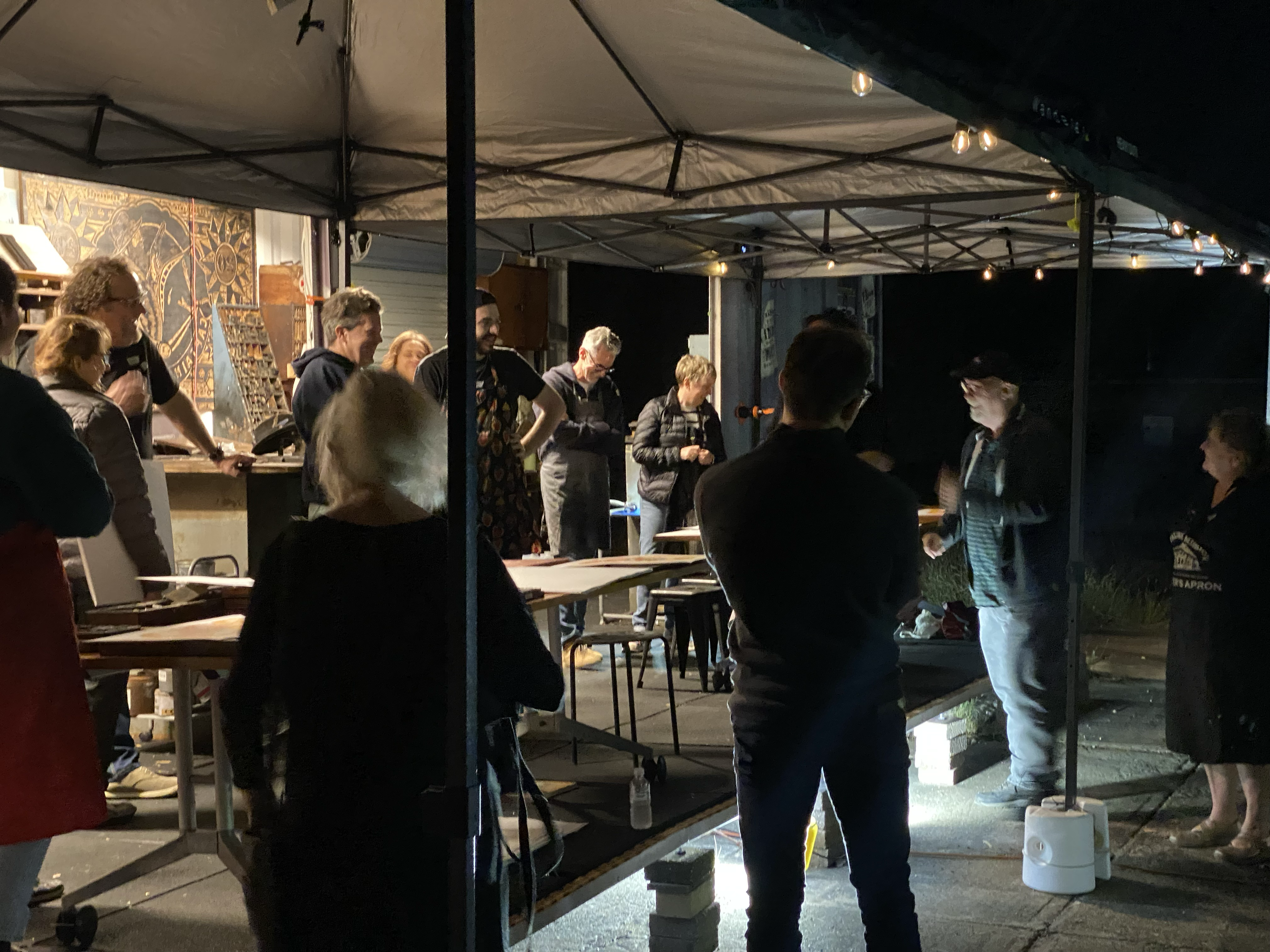
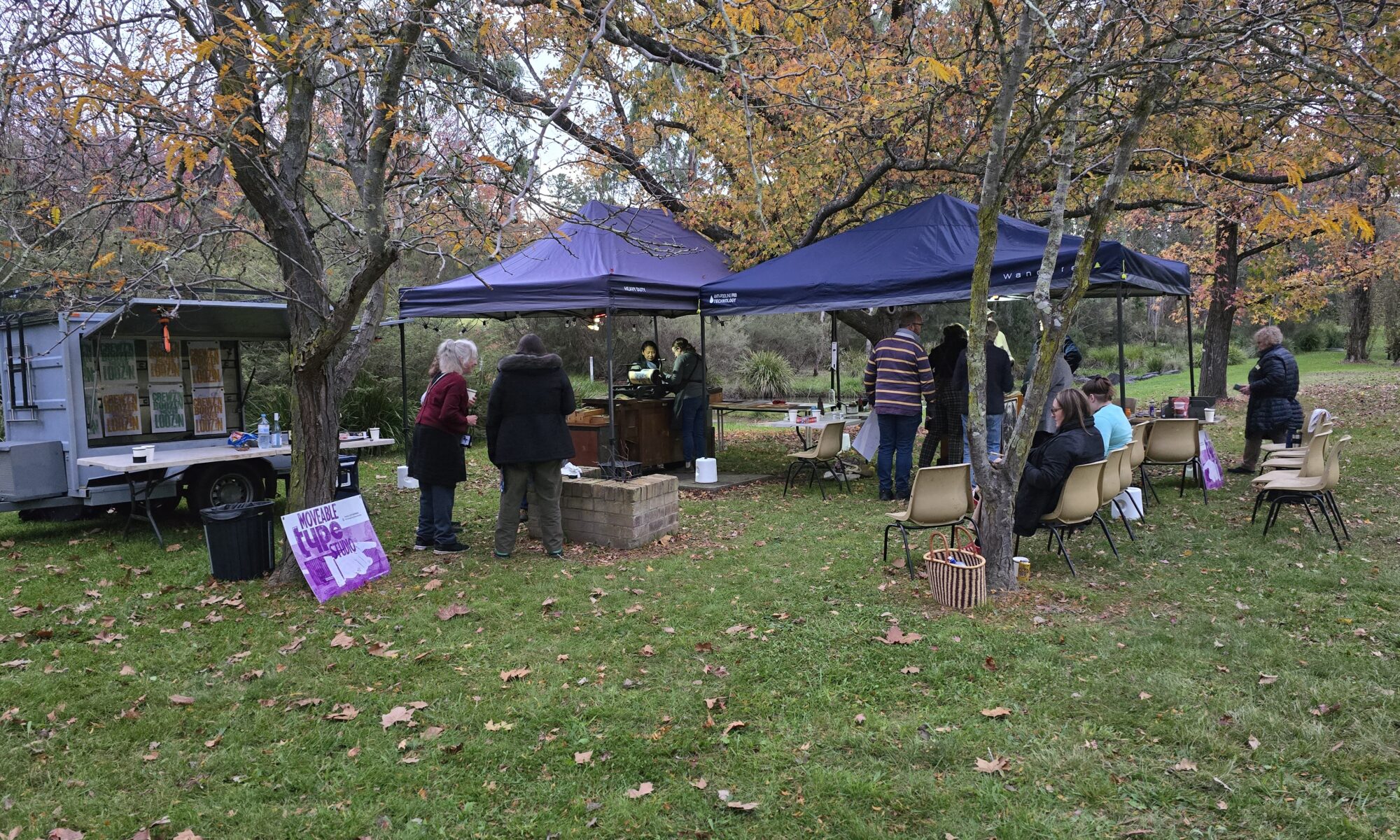
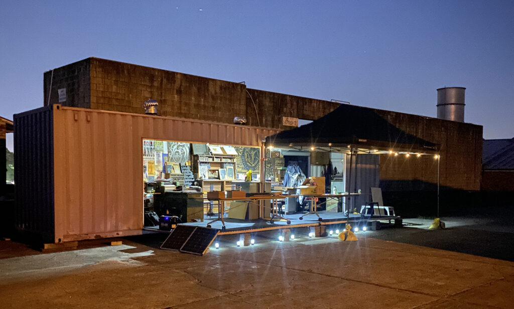
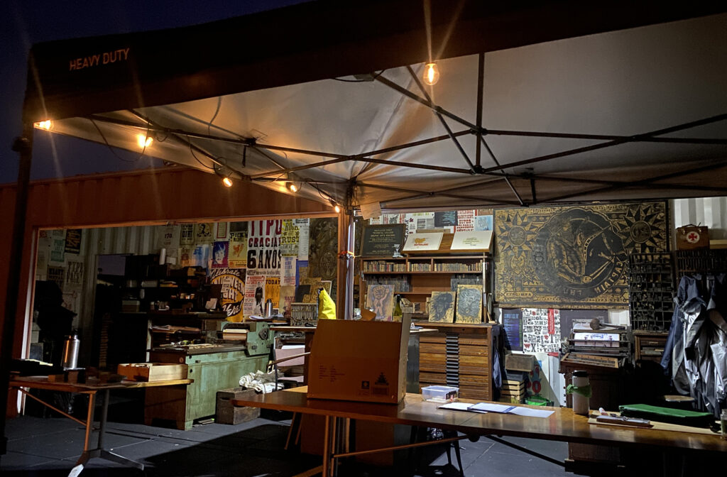
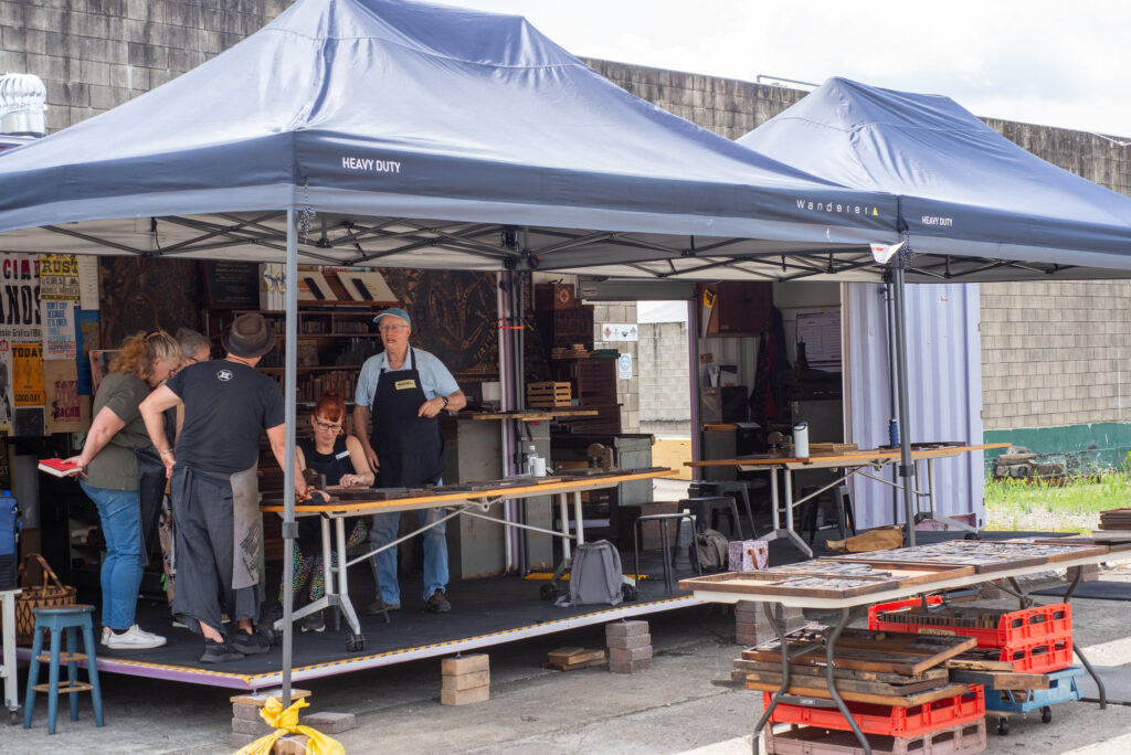
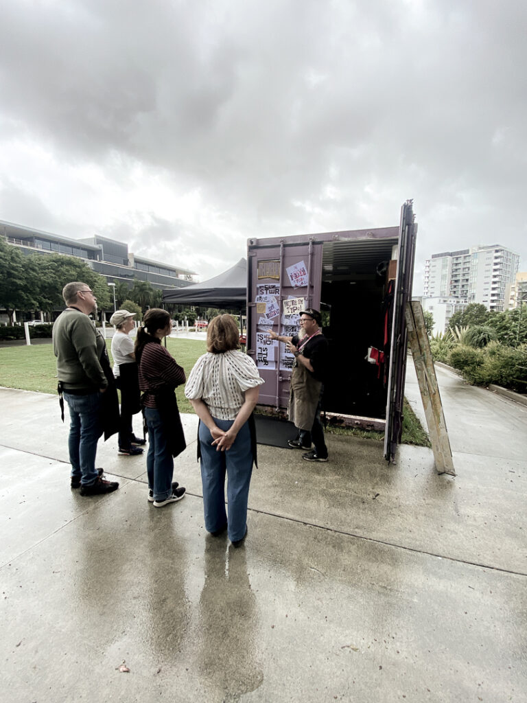
Unlike our Central Queensland engagements, which unfolded in our 40‑foot customised letterpress print shop, Toowoomba experienced the smaller version: our converted tradies trailer. Outfitted with two tabletop Poco proof presses, wood type, and all the sundries needed, it became a mobile studio ready to share letterpress with the people.
The Toowoomba Art Society welcomed us to Culliford House, its purpose‑built home on Godsall Street, located right beside Queens Park and the Botanic Gardens. We set up our pop‑up press in the courtyard, with leafy views across the gardens and only a short stroll to the Cobb+Co Museum, making it an inspiring setting for the final workshop of the tour.
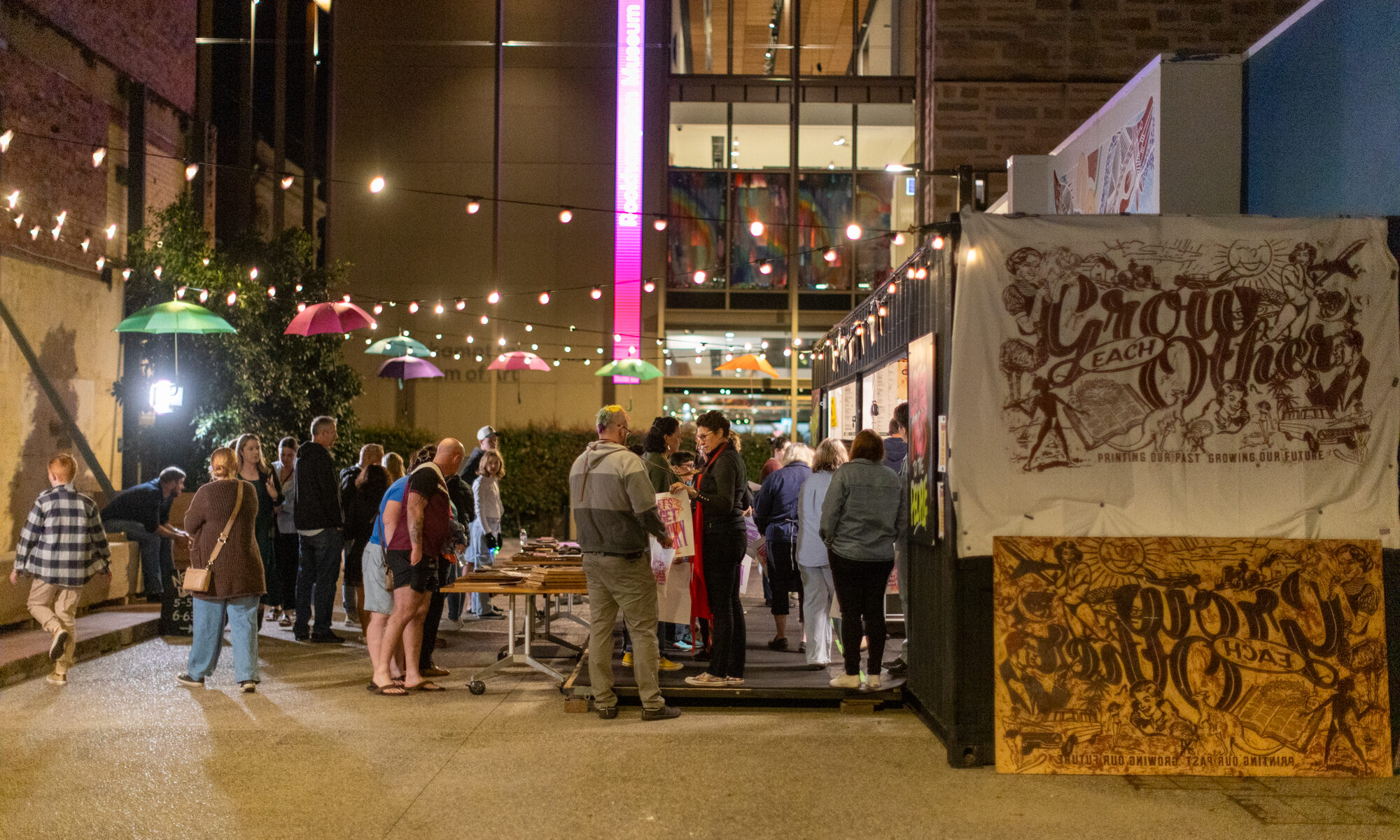
Ink & Drink Evening
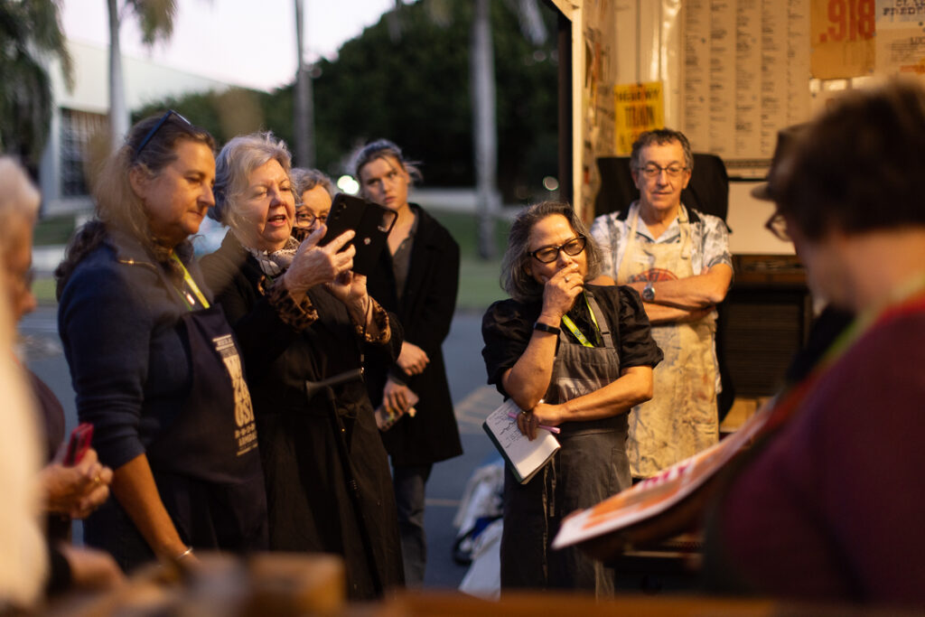
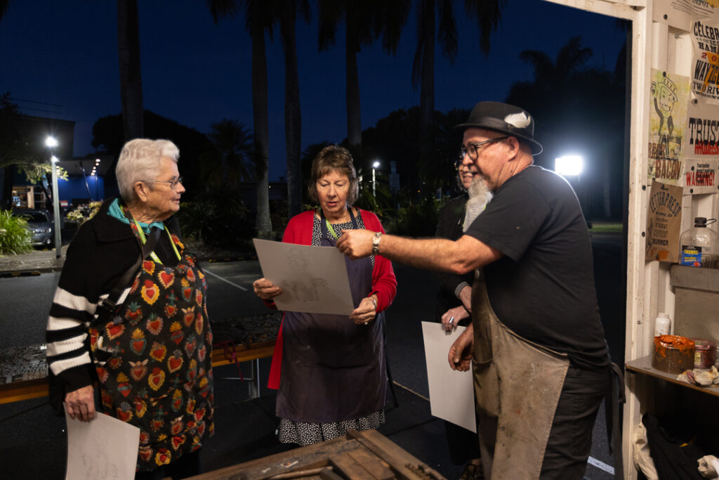
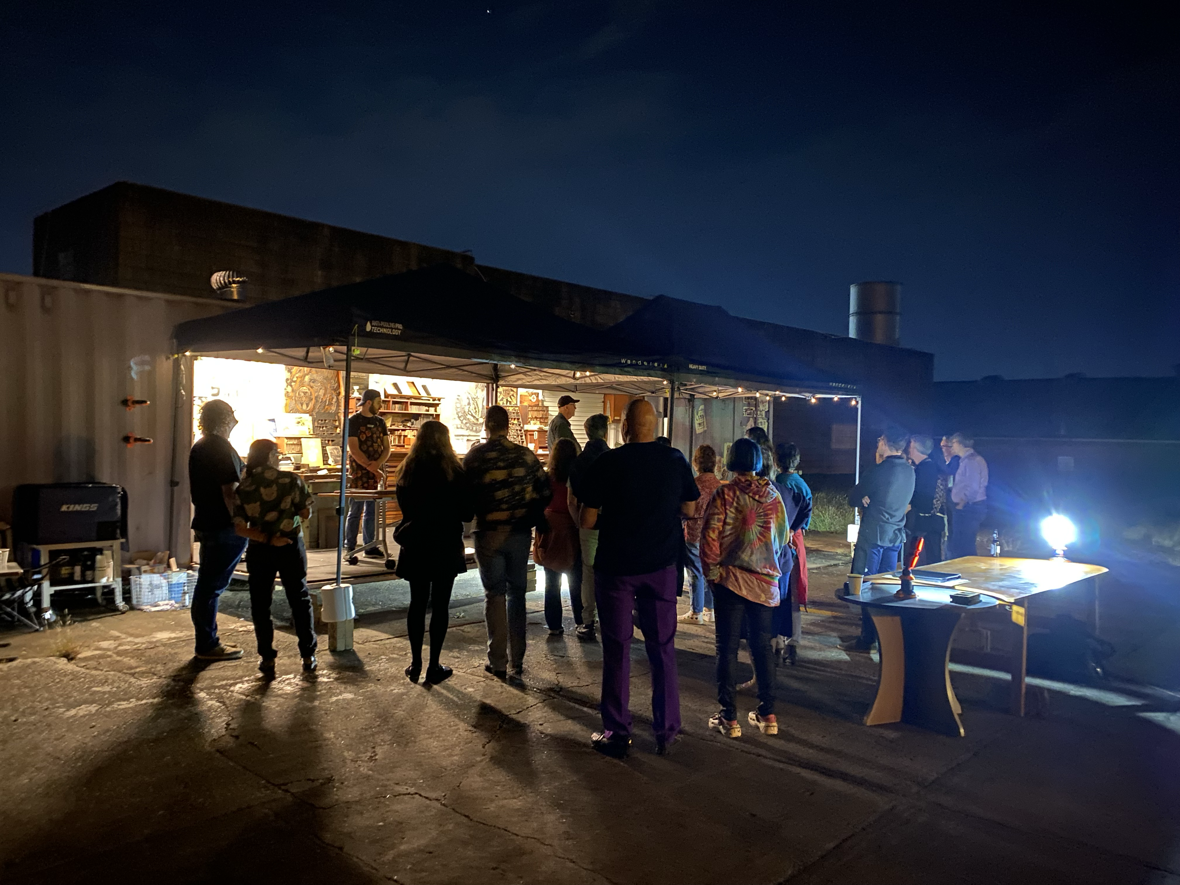
On a warm November Sunday afternoon, we rolled into the courtyard, set the presses in place, prepared the plates, and readied ourselves for the Ink & Drink gathering. Local artists joined us, and photographer John Elliott, renowned for his outback documentary work, swung past during the setup to share a quick hello before the evening began.
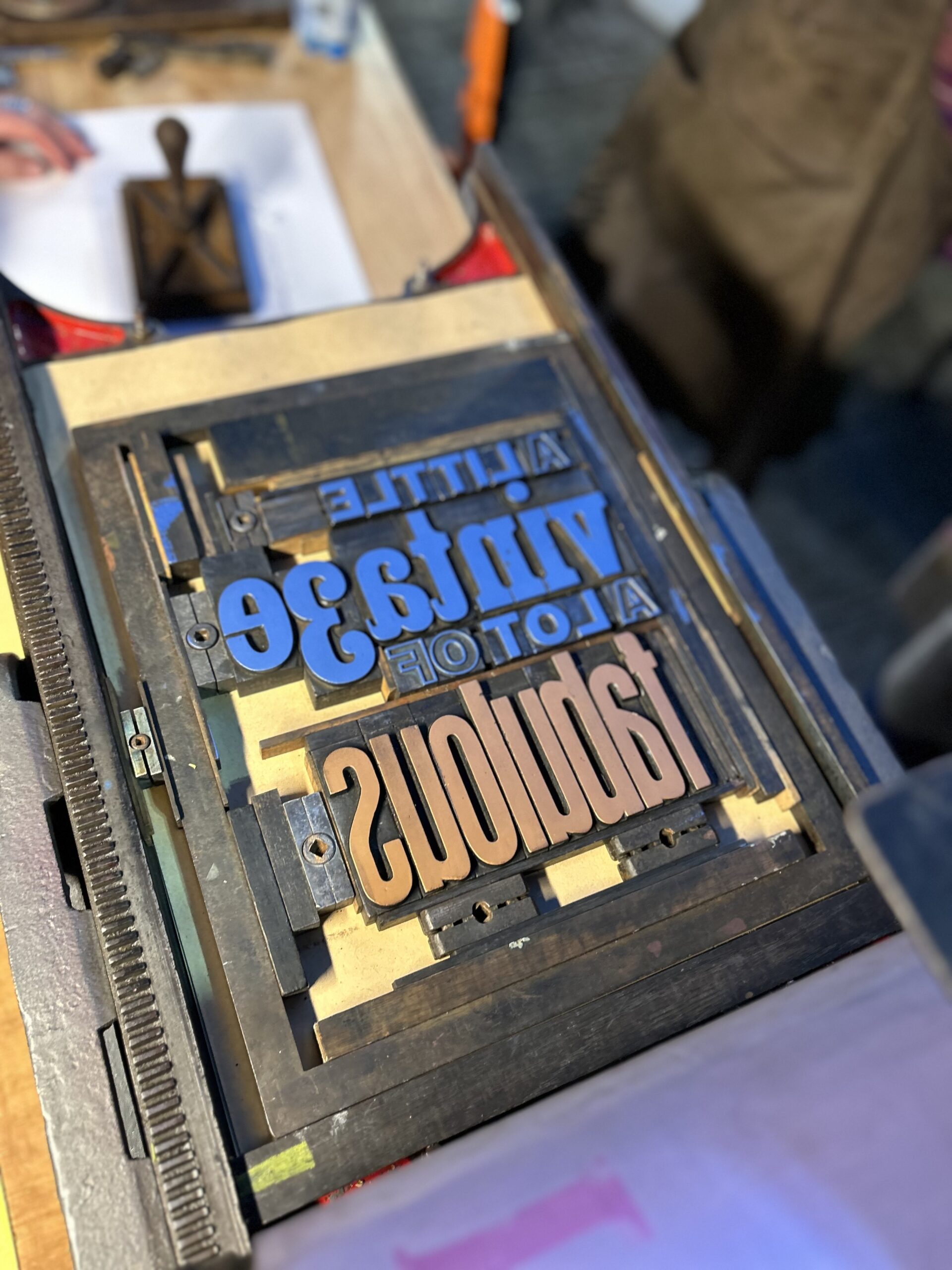
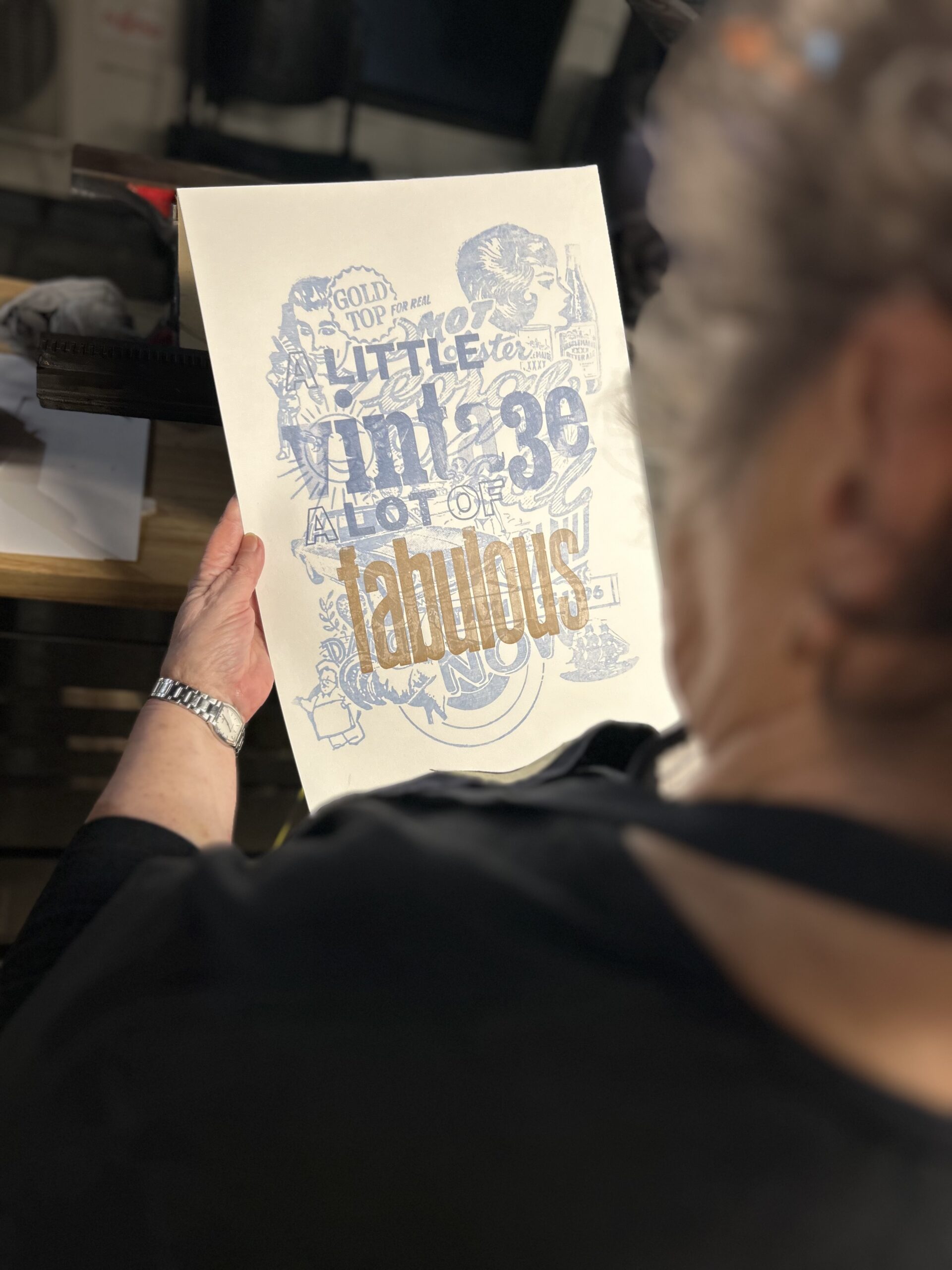
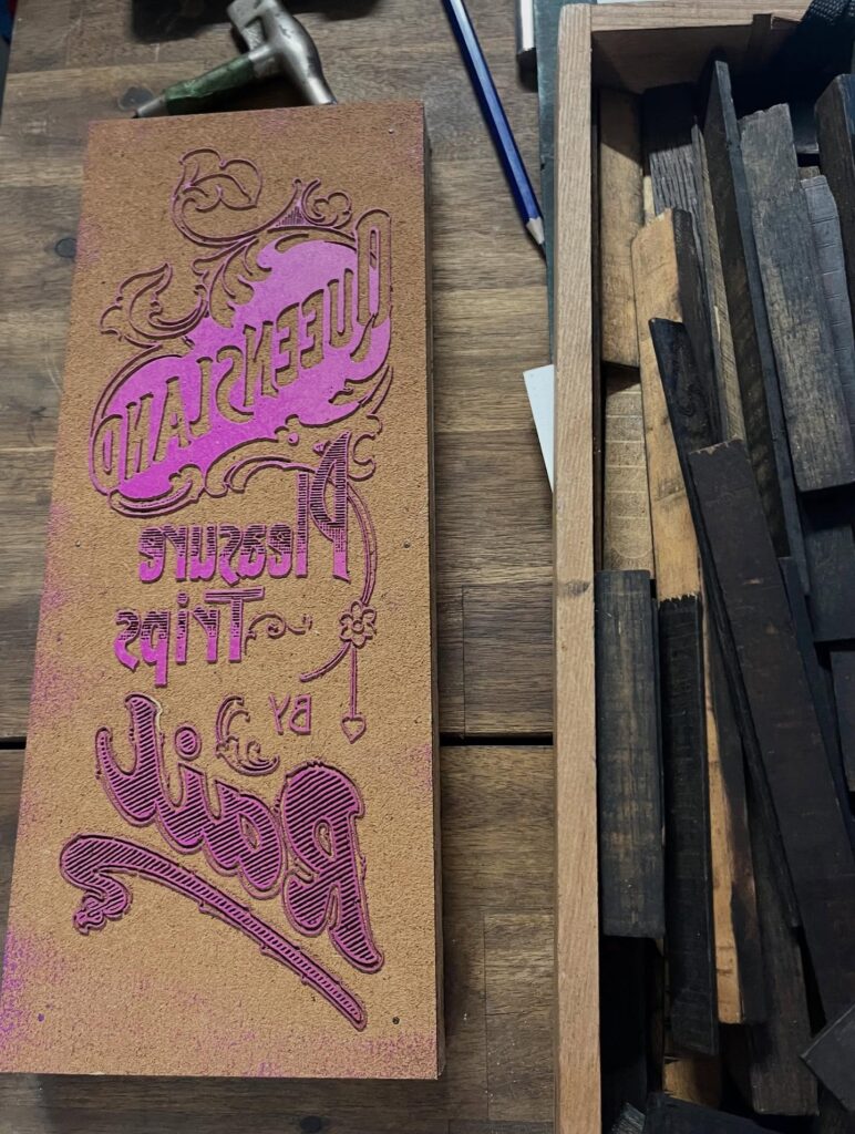
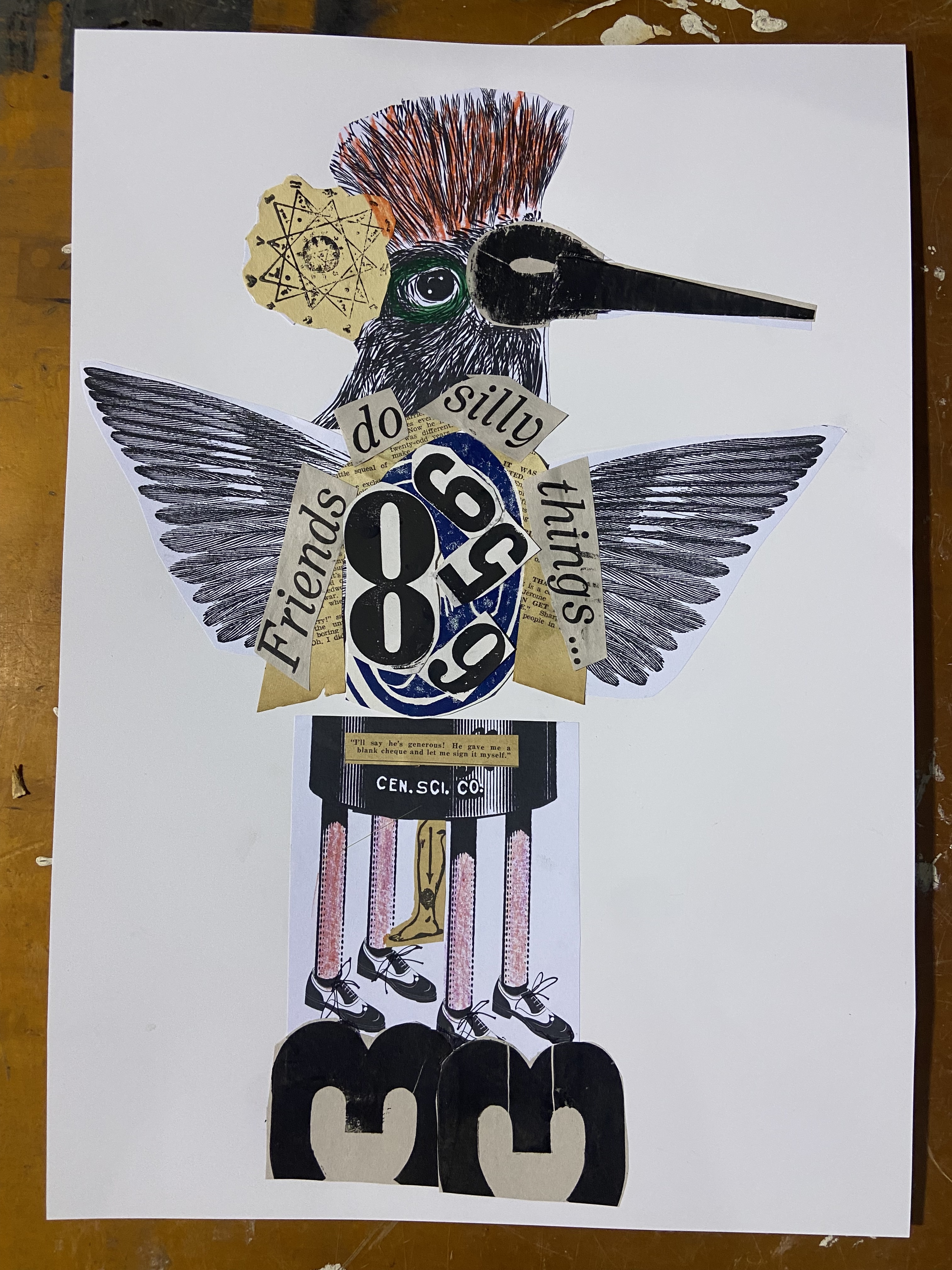
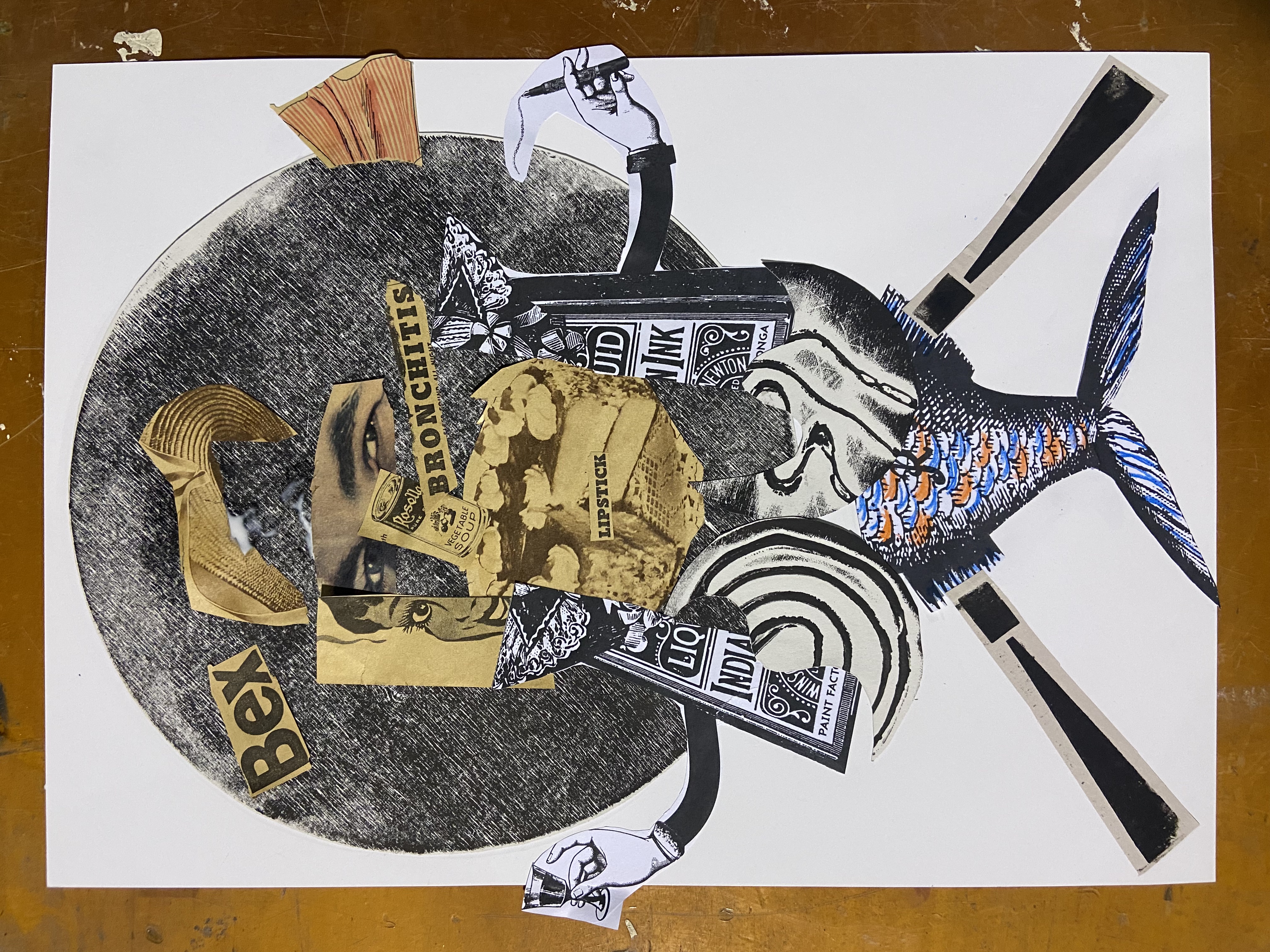
Our typographic composition drew directly from Toowoomba’s identity: the Carnival of Flowers, its celebrated botanical gardens and tree‑lined streets, and the city’s reputation as a destination for heritage, vintage treasures, and antique shops. We created a collage of stereo blocks, echoing the finds one might stumble upon in those shops. The poster carried our narrative: *a little bit of vintage, a lot of fabulous*.
Participants worked across the two Poco presses, printing first passes with stereotypes and laser‑engraved plates, then overprinting with traditional wood type. The result was a simple yet striking two‑colour hand‑printed keepsake. Wine, cheese, and conversation under the stars rounded out the evening, everything you’d expect from the Toowoomba Art Society.
Sunday Workshop
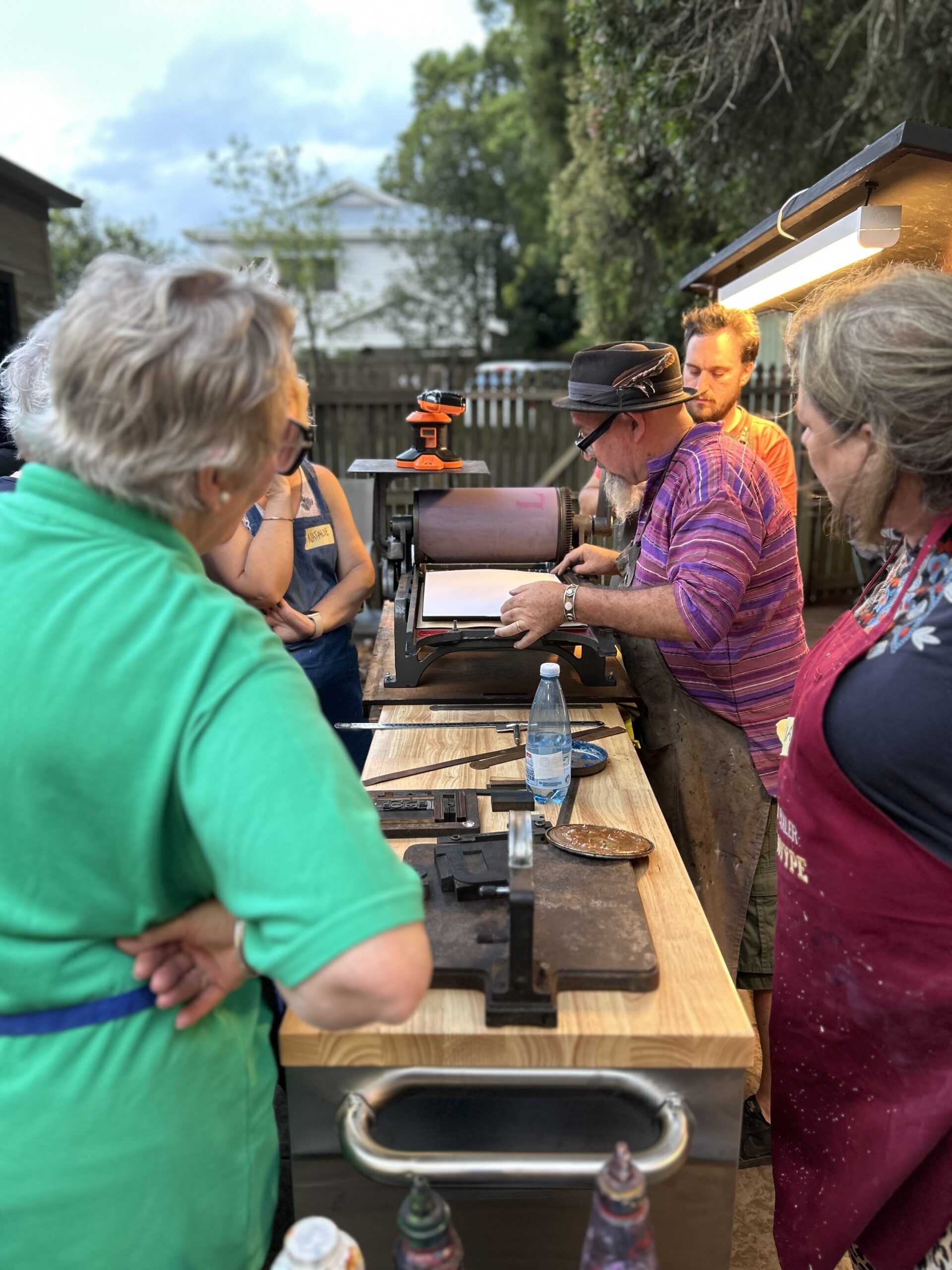
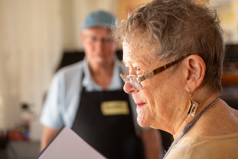
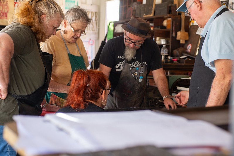
The next morning began with breakfast at Ground Up Coffee, a place of beautiful textures and the kind of café you return to day after day. By 10 a.m, our full‑day letterpress workshop commenced in the courtyard and studio spaces, joined by members of the Saturday Printmakers.
This workshop built on the introductions from Ink & Drink, but went deeper: tools of the trade, points and picas, lock‑ups, make‑readies, and the intricacies of traditional letterpress. The Toowoomba Art Society and Saturday Printmakers had recently acquired their own equipment, so this was a chance to strengthen their skills and understanding.
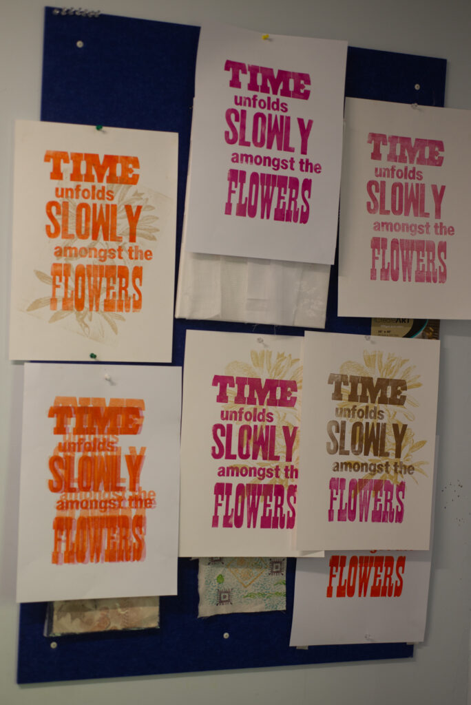
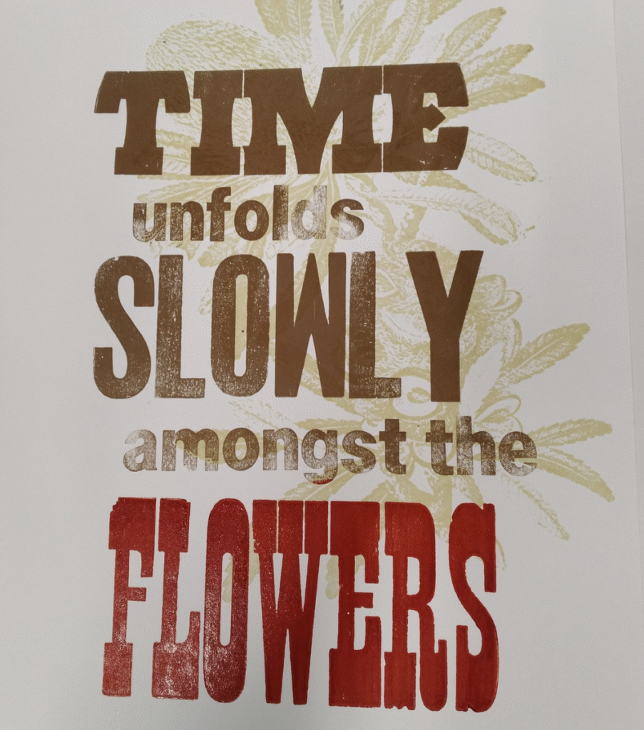
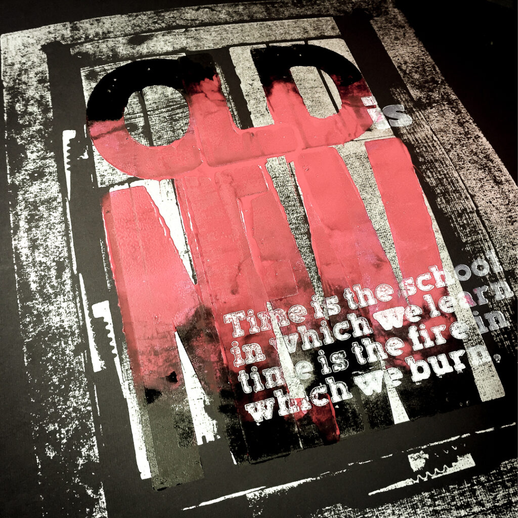
The narrative for the keepsake was inspired by Toowoomba’s heritage and blooms, paired with the slow, deliberate pace of letterpress: Time unfolds slowly amongst the flowers.
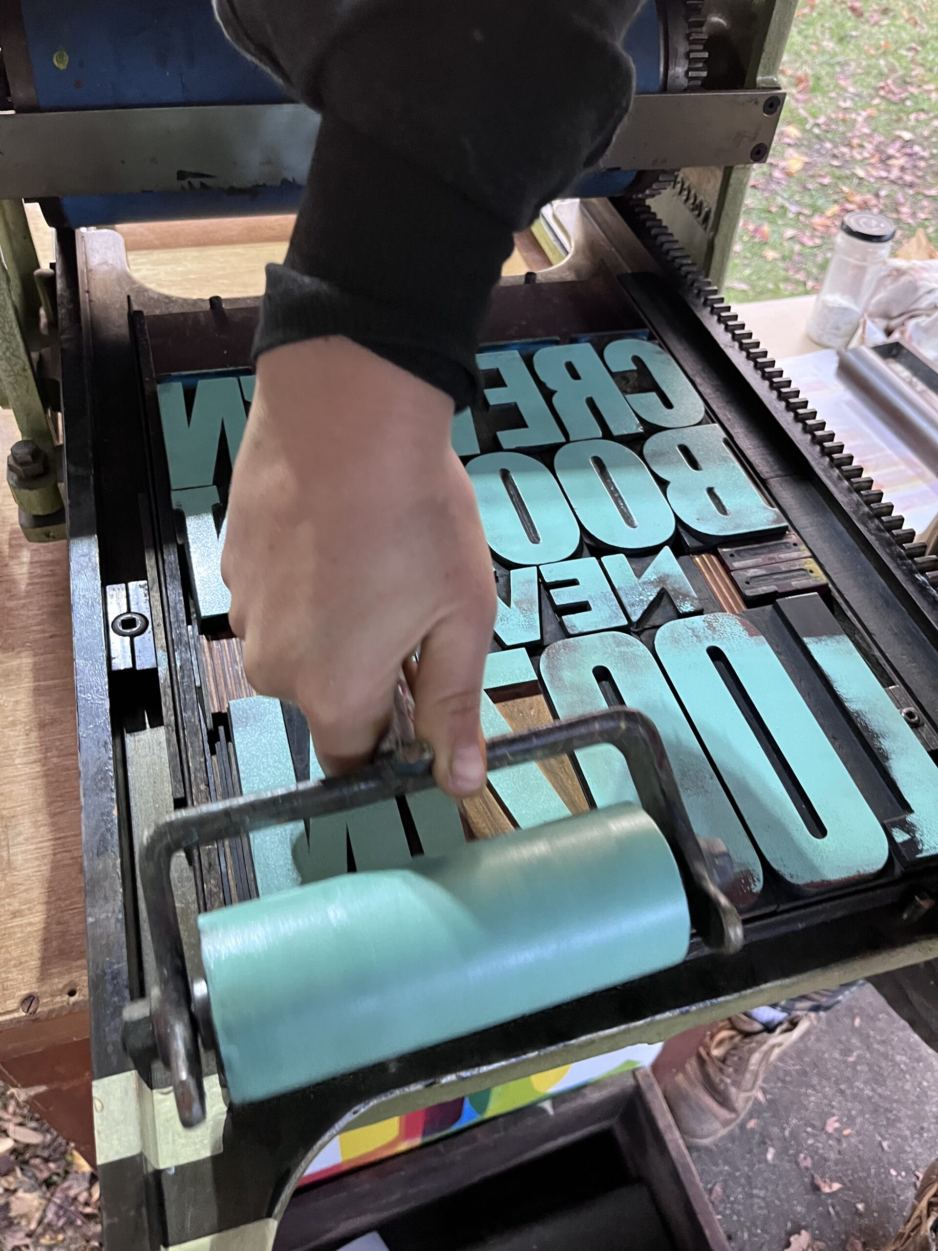
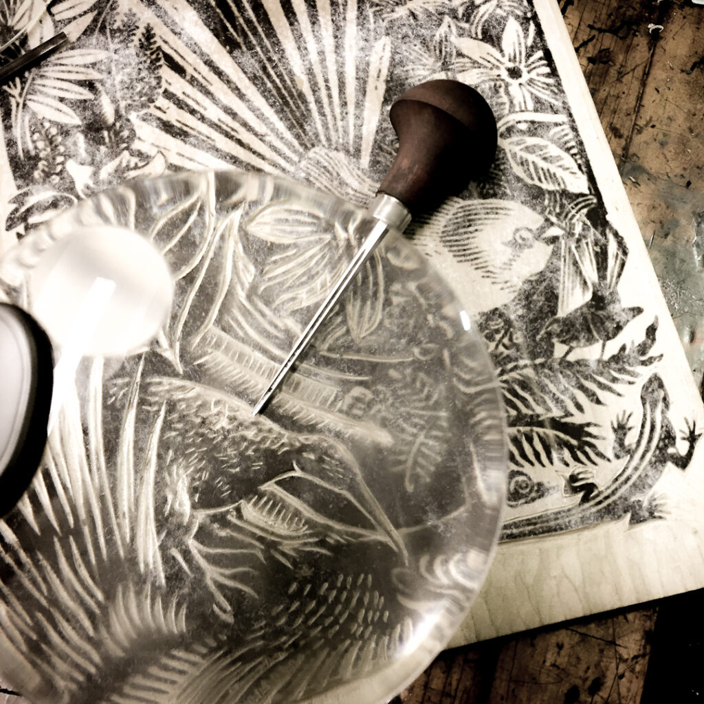
We printed from a laser‑engraved plate depicting a Banksia, based on an illustration by Sydney Parkinson, the botanical artist who accompanied Joseph Banks on James Cook’s first voyage. The image comes from Banks’ Florilegium, the monumental collection of engravings published from those original drawings. Over this botanical motif, we set traditional wood type, combining upper‑ and lowercase forms to create a layered composition.
The edition of 15 prints was a genuinely collaborative effort, designed by committee, with lively banter about colour and layout. Groups worked together on both graphic and typographic elements, negotiating ink choices, layering, and composition. The process was as rewarding as the outcome, embodying the spirit of shared making and collective creativity.
This was a wonderful way to conclude the Movable Type Studio’s 2025 regional tour, made possible through Flying Arts and the Regional Arts Fund. We thank Robert Heather for his support, Tracy Heathwood and her team at Mackay Art Space, Tanya Woooley from Advance Rockhampton and the Rockhampton Shire Council, and all those who helped bring this journey together.
This project was made possible through the Australian Government’s Regional Arts Fund, delivered by Regional Arts Australia and administered in Queensland by Flying Arts Alliance. We are deeply grateful for the opportunity to share the craft of letterpress with communities across the state. Without this support, reaching thousands of people throughout Queensland would have been a significant challenge. Thanks to the Fund, we’ve been able to celebrate the timeless art of letterpress and build connections that will continue to grow into 2026.
Activating Heritage Through Printmaking and Public Engagement
Before the clang of steel and the hiss of steam, this land was, and still is, Country. The ground beneath our feet belongs to the Jagera, Yuggera, and Ugarapul peoples of the Yugara language group. Ipswich, known as Tulmur in Yugara, has been a place of care and connection for countless generations. We acknowledge this enduring relationship and pay respect to First Nations communities past, present and emerging.
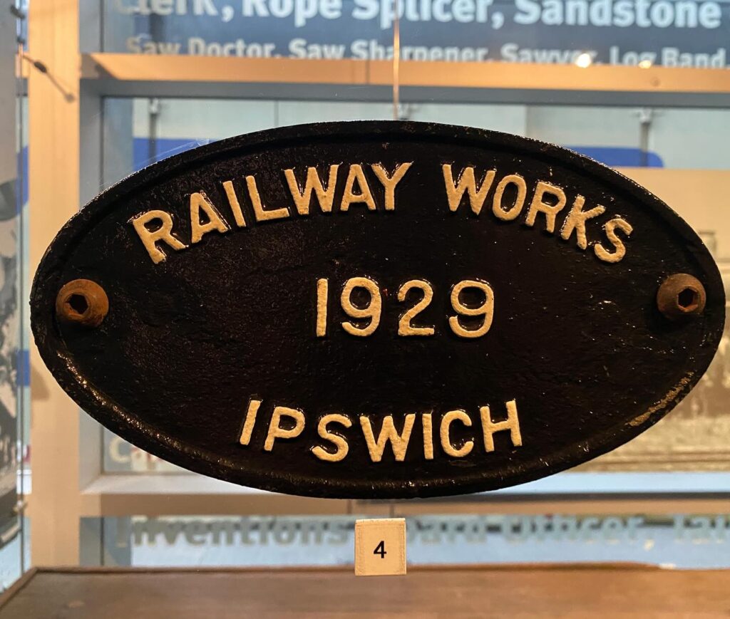
Then came change. In the 1860s, Queensland’s colonial government saw rail as the key to opening up the inland. On 31 July 1865, the first railway line steamed west from Ipswich to Bigge’s Camp (now Grandchester). Ipswich was chosen for its river port and growing town, and with that choice came the need for a rail workshop.
By 1864, the first sheds stood about a kilometre from where we are today. Some were shipped from England, prefabricated and ready to assemble. Inside those sheds, crews pieced together locomotives sent in parts from Glasgow. By 1877, Ipswich workers had built Queensland’s first home-grown locomotive from spare parts, a sign of the innovation that would define this site for generations.
Behind the fence, a world was taking shape. A world of steam, steel, and skill. Over time, the Ipswich Railway Workshops grew into one of Queensland’s largest industrial workplaces. At its peak, more than 3,000 people worked here every day. They built locomotives, carriages, and wagons that kept the state moving. They forged iron, shaped timber, and painted the bold insignia that marked Queensland Rail’s identity. This was a place of craftsmanship and community, a self-contained city humming with energy.
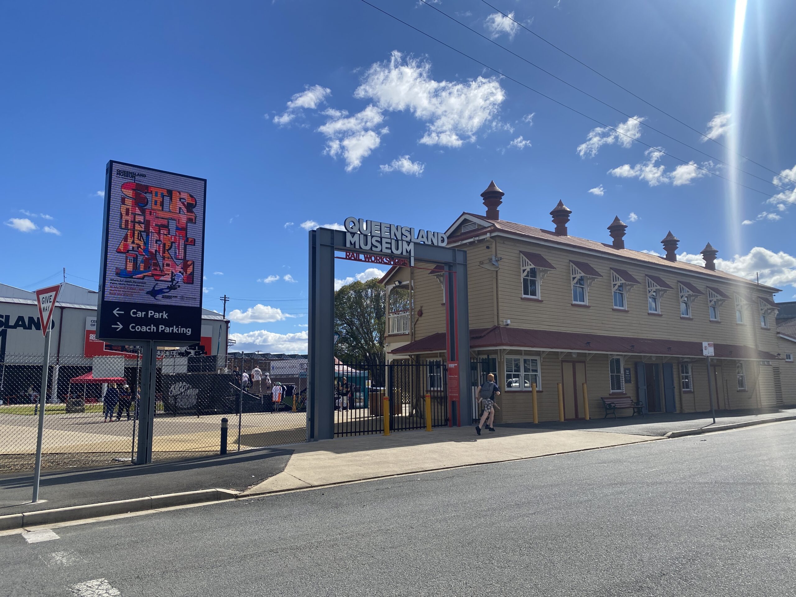
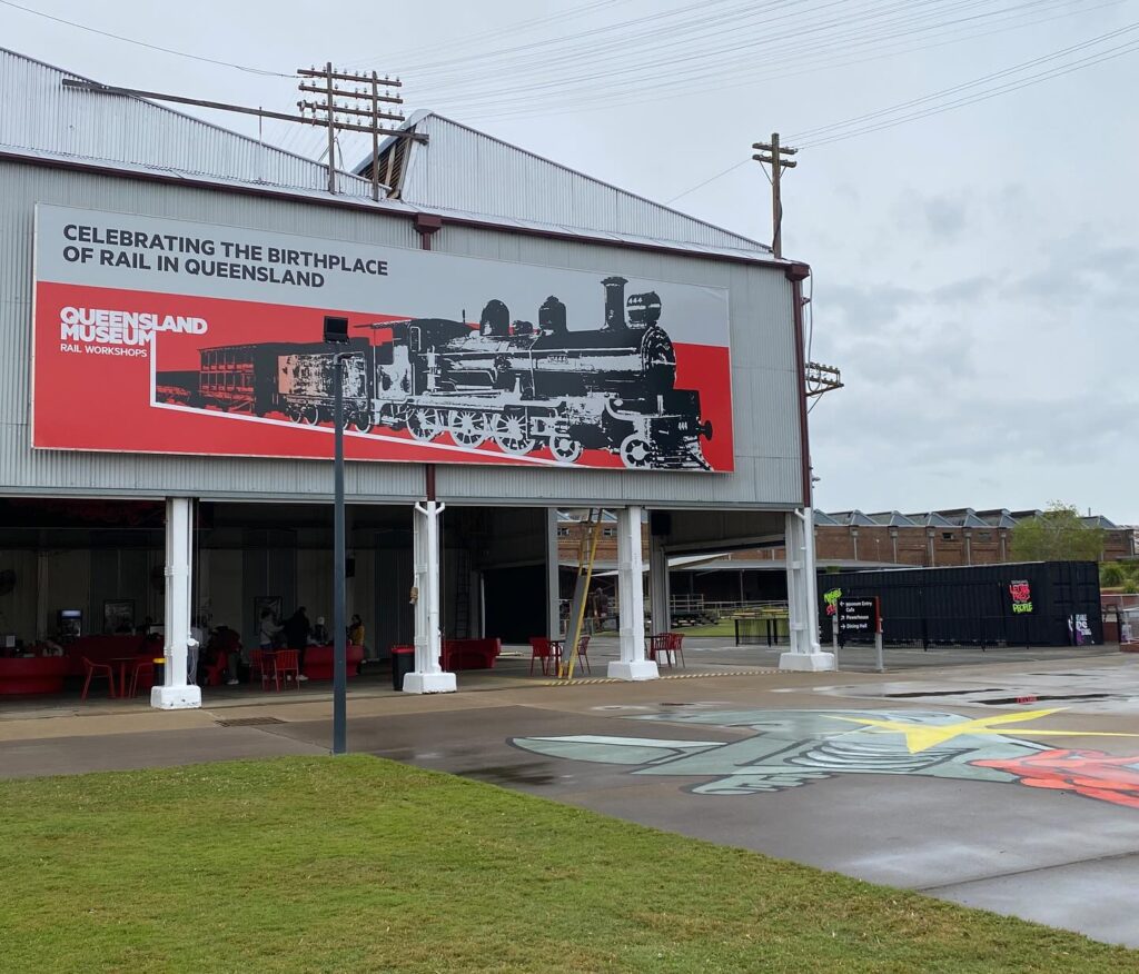
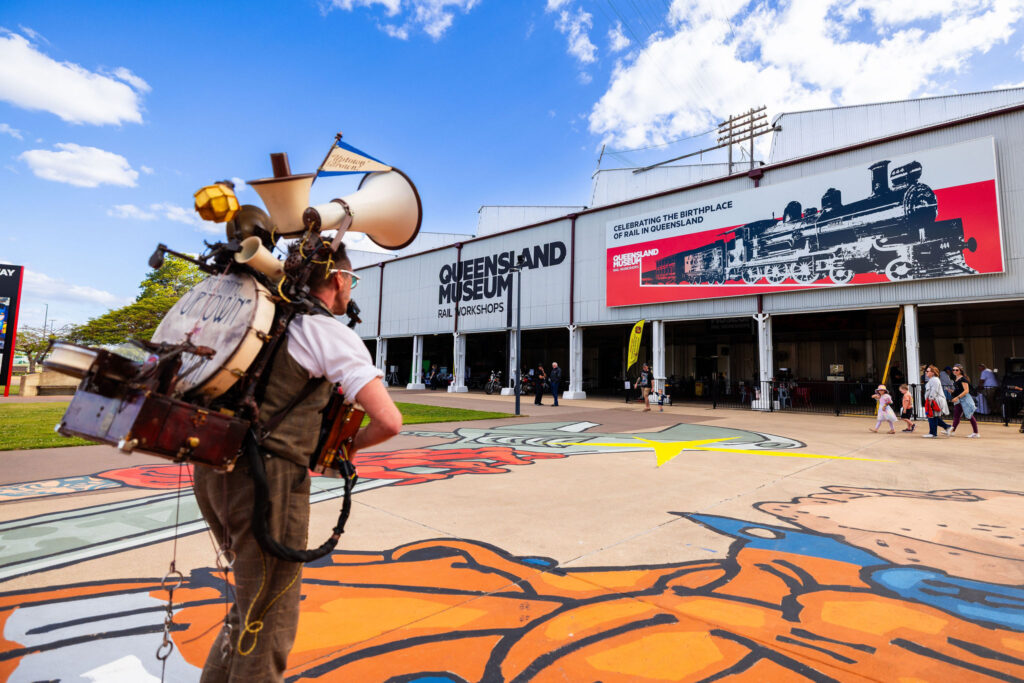
Today, the Queensland Museum Rail Workshops (QMRW), keeps that story alive. The towering brick halls, the overhead cranes, the worn workbenches, they all whisper of the hands that built a state. And now, those echoes of industry have inspired a new chapter.
Moveable Type Studio Rolls In
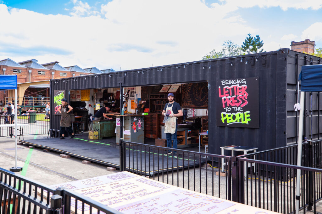
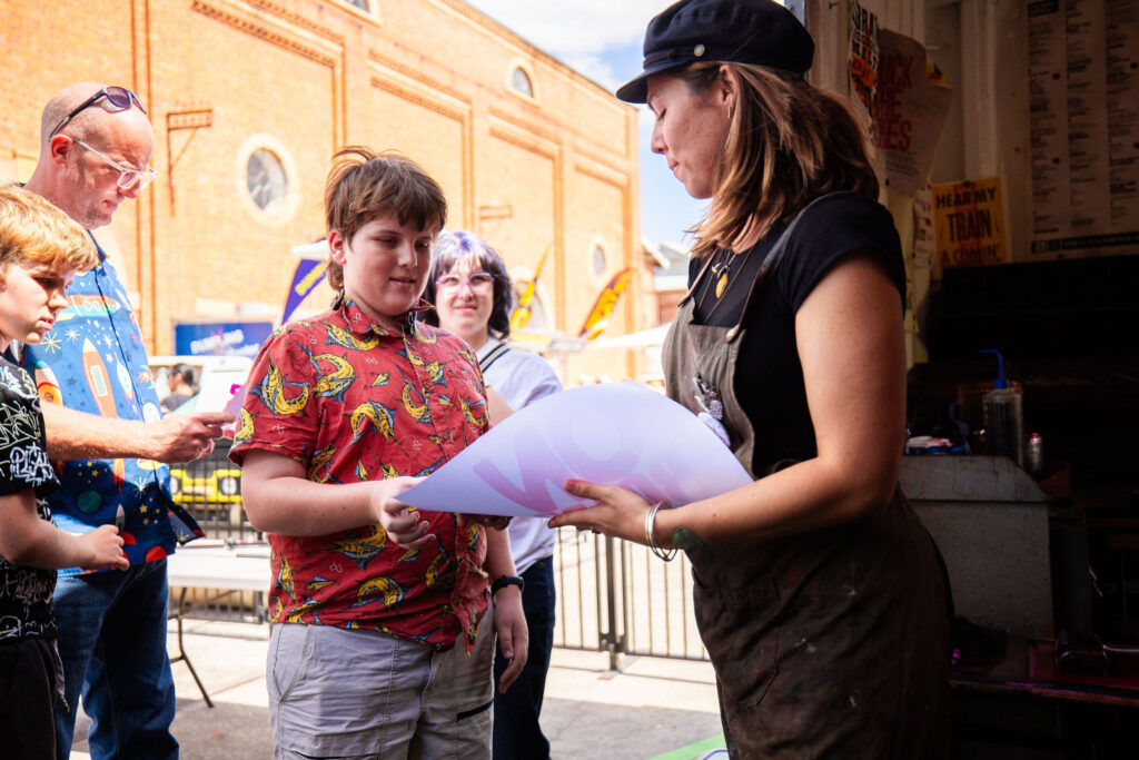
It didn’t arrive with whistles or fanfare, just the steady rumble of a container truck rolling through the gates. Inside that 40-foot box was Moveable Type Studio (MTS), our travelling print workshop built to spark curiosity and get hands dirty. For six weeks, MTS sat nestled among the towering brick halls of the Queensland Museum Rail Workshops, humming with creative energy. Visitors wandered in, drawn by the scent of ink and the clack of setting type, and found themselves part of something rare: a space where history wasn’t just displayed, it was reactivated, one print at a time.
Our residency began with a deep dive into the museum’s collection. From bold union posters to delicate Edmondson railway tickets, we uncovered artefacts that spoke volumes about Queensland’s industrial past. These discoveries inspired hands-on projects: reimagining historic designs as contemporary relief plates, and printing them anew for today’s audiences. Each piece became a bridge between eras, a conversation in ink and paper.
Public Engagement Highlights
Our residency wasn’t just about setting up a studio, it was about opening doors. Each activation invited people to get closer to the story of the heritage site and experience creativity in motion. Here’s how those moments unfolded.
Live Printing Demos
We started with the basics’ ink, type, and a press. No screens, no shortcuts. Each demo was different. Some days, it was quiet with just a few curious visitors leaning in, asking questions, watching the process unfold. Other days, the place buzzed. Car clubs rolled in, families wandered through, and suddenly the studio was full of chatter, ink, and shared stories.
People didn’t just watch, they participated. For many, it was their first time touching the tools of communication that once shaped Queensland’s industrial voice.
First Nations Storytelling Through Language
For two days, the studio shifted pace. The presses kept rolling, but the focus turned to language; how it’s shaped, how it’s shared, and how it holds memory.
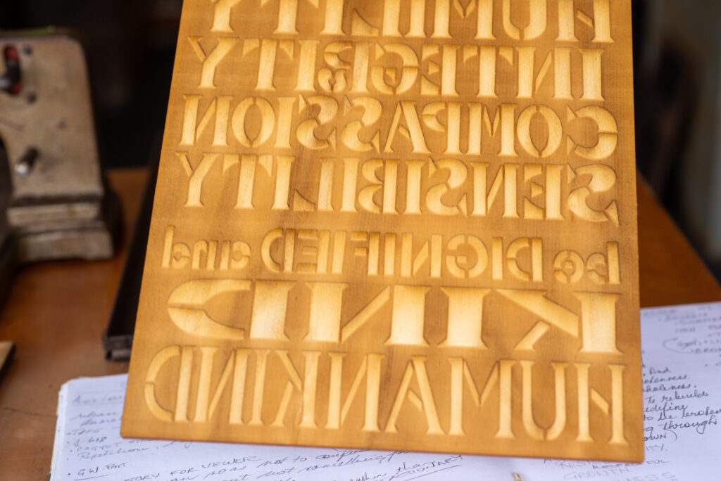
Gordon Hookey joined Clint Harvey at the bench. A Waanyi man from Cloncurry, Queensland, with Chinese and Javanese ancestry, Gordon’s practice is grounded in a divergent, activist perspective. His work sits at the intersection of Aboriginal and non-Aboriginal cultures, challenging dominant hierarchies and amplifying marginalised voices. Known for his bold, hand-drawn letterforms and acrostic wordplay, Gordon brings language to life, not just as text, but as commentary, as resistance, as story.
In the hands of Gordon Hookey, language is never just text; it’s a tool, a challenge, a conversation. His hand-drawn letters carry weight: shaped by lived experience, sharpened by humour, and grounded in a practice that speaks back to power. For this workshop, those letters became something new. Digitised and laser-cut into timber ahead of the session, they formed a custom typeface; not a font in the conventional sense, but a set of marks built for meaning.
When participants arrived, the blocks were ready; but the real work began in conversation. Around the bench, people spoke about words that mattered to them: names, places, phrases that held memory or meaning. With Clint Harvey facilitating and Gordon’s letterforms as a starting point, the studio became a space for reflection and response. Participants composed prints that layered personal stories with cultural references, shaping each piece through dialogue and making.
The result was more than a set of prints; it was a shared process, tactile, thoughtful, and grounded in the layered heritage of the Workshops site. Each impression carried the rhythm of language and the weight of lived experience, pressed into paper one word at a time.
Type Tasting at the Queensland Museum Railway Workshops
Deep into the Moveable Type Studio residency at the Queensland Museum Railway Workshops, we activated a public engagement session called Type Tasting.
This session brought together eleven participants at the MTS container, inviting them to experience a hands-on introduction to letterpress printing. Using contemporary laser-engraved plates depicting a steam locomotive drawn from the museum’s archives, participants were able to print a modern interpretation of historical imagery. These new plates offered a contemporary lens through which to explore heritage, bridging the precision of digital design with the tactile rhythm of traditional printing.
Alongside the laser-engraved plates, participants also worked with nineteenth-century wood type from the MTS collection. They learned to lock up type, ink rollers, and print combinations that merged old and new technologies, combining the bold personality of wood type with the fine detail of laser engraving.
This session encouraged people to slow down, engage in conversation, and connect with both the physical process and each other. For many, it was their first time handling historic printing tools and understanding the labour and craft behind each impression. Participants left with a tangible reminder of their time, a unique print that carried both the story of the Railway Workshops and the enduring art of letterpress.
Introduction to Letterpress
By the time the “Introduction to Letterpress” session kicked off, Moveable Type Studio had been parked at the Queensland Museum Rail Workshops for a couple of weeks now. It had settled into the site like it belonged there, a container of wood and metal type nestled among steel beams and locomotive bones.
Seven participants arrived that day, stepping into a space already steeped in history and making. The session unfolded slowly. Clint Harvey welcomed each person into the process, setting type, mixing ink, locking up chases. Around them, the Workshops whispered reminders of what this place once was: a hub of industry, of invention, of labour.
At the centre of the session was the C18 locomotive No.692, not in the container studio, but present all the same. Built in Ipswich in 1914, its silhouette had been drawn from QMRW photograph collection and laser-engraved into timber plates ahead of the workshop. Participants inked the image, pressed it into paper, and paired it with bold, handset wood type spelling out “Get on Board.” The phrase felt apt, a call to engage, to connect, to keep things moving.
Teacher PD Evening
Our connection to education was just as important. Educators stepped into the Queensland Museum Rail Workshops for a free, hands-on session linking printmaking to curriculum outcomes. Feedback from Lynette Shanahan, Head of Creative Arts at All Hallows’ School, captured the impact: “I was impressed by the high level of visual samples and the practical experience of using your amazing printing presses… Keeping Queensland Art Teachers Association QATA in the loop may be useful, as art teachers are always interested in new ideas and community participation.”
Schools Program – Exquisite Monsters
Finally, we took creativity back to the classroom. Our pilot schools program brought together Redbank Plains State School, IPSAI Arts Collective, and artist Ally Boots for a collaborative design challenge. Using the exquisite corpse method, students created a steampunk-inspired monster: Redbank Plains designed the head as a mechanical panther (their school mascot), IPSARI crafted the body, and Ally Boots completed the feet.
Final Week of Residency: Galvanised Festival
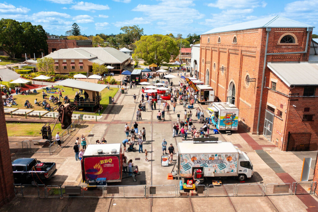
As our residency drew to a close, we were delighted to anchor the grand finale of our program within the annual Galvanized heritage festival. Galvanized is the City of Ipswich’s festival of heritage, showcasing “the best heritage experiences and events Ipswich has to offer” across ten days.
Kicking off the weekend, we hosted a ticketed two‑hour “Ink & Drink” session at the MTS container on the Friday evening. Participants gathered at dusk, beverage in hand, and worked with the same laser‑engraved plates of the steam locomotive (drawn from the museum archives) alongside nineteenth‑century wood type, continuing the hybrid print process of our earlier “Type Tasting” sessions.
On Saturday the doors opened wide to the festival crowd. Our container space formed part of the broader museum site activation where visitors moved through, chatted with us and fellow participants, and observed hands‑on demonstrations of both wood type lock‑up and the laser‑engraved plate process. The buzz of the site amplified as families, heritage enthusiasts and curious passers‑by engaged in the craft of letterpress within a rail‑heritage setting.
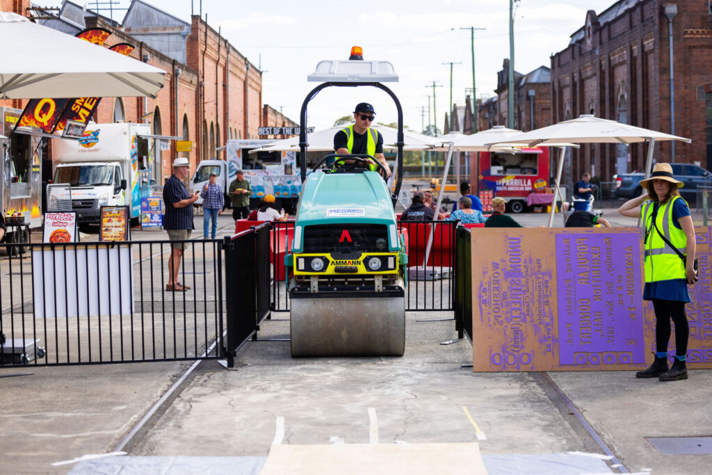
Sunday proved to be the major highlight: the “Steam & Smoke BBQ” event held at the museum drew approximately 1,800 people through the gates. Amid food‑trucks, blacksmith demonstrations, nature‑dyeing workshops and the rumble of industrial heritage, our culminating print event stepped into the spotlight.
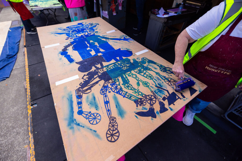
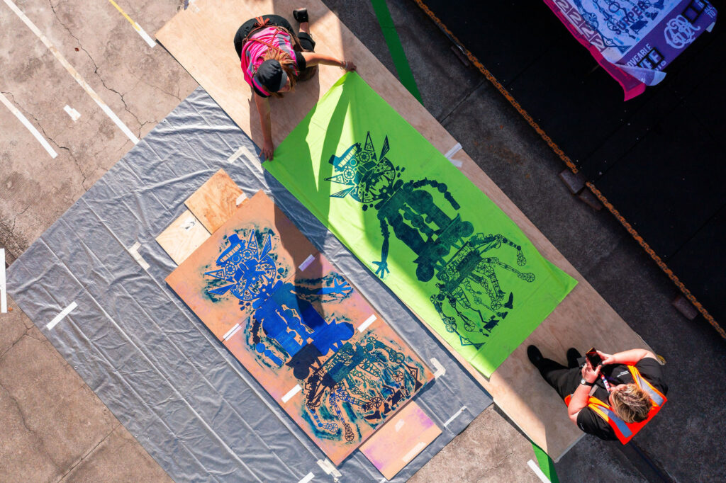
Working with local schools and the Ipsari art collective, we had developed a large‑format relief block in three parts, one third designed by Redland Primary School (head), one by Ipsari (body), and one by the MTS crew (feet), forming an “exquisite‑corpse” monster concept tied to our theme Monsters of the Industrial Revolution. We inked the block on fabric, laid it flat, and then rolled it with a road‑roller to create a one‑of‑a‑kind print event. The result: bold, massive fabric prints and delighted participants. The day ended with smiles all round as the large‑scale relief printing found its public moment.
Reflections & Impact
Over six weeks, we welcomed hundreds of visitors, teachers, students, artists, and curious locals, into a space where heritage and creativity collided. The residency sparked conversations about history, design, and identity, leaving behind not just prints, but lasting connections. For us, the greatest reward was seeing people engage with the tactile beauty of letterpress and rediscover the stories embedded in Queensland’s industrial past.
Our heartfelt thanks to the Queensland Museum Rail Workshops team for their support and collaboration. This residency was more than an artistic project, it was a celebration of community, culture, and craft. Follow Moveable Type Studio for upcoming activations as we continue to bring letterpress to the people.
The Regional Arts Development Fund (RADF) is a partnership between Queensland Government and Ipswich City Council to support local arts and culture in regional Queensland. This project is supported by the Queensland Government through Arts Queensland.
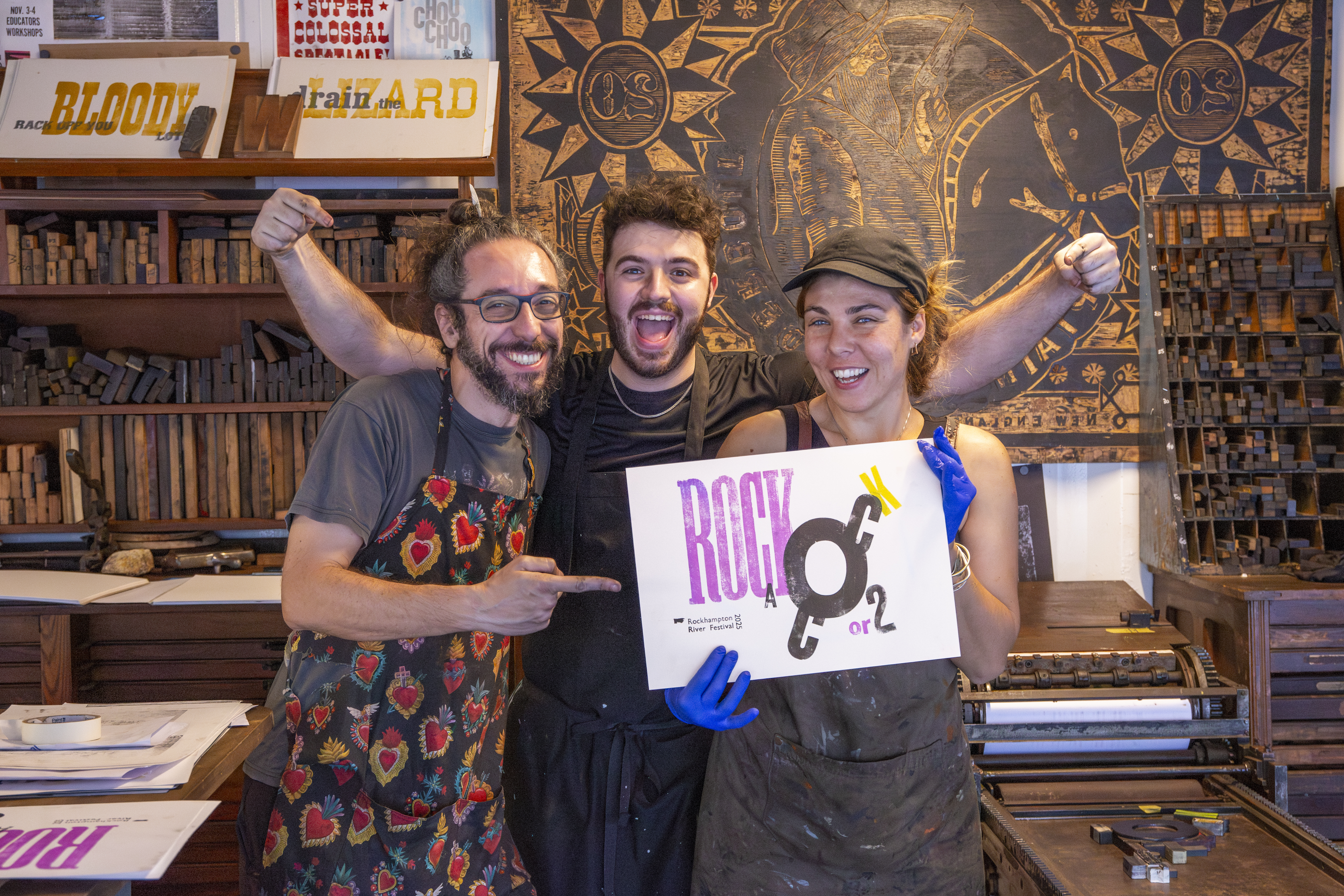
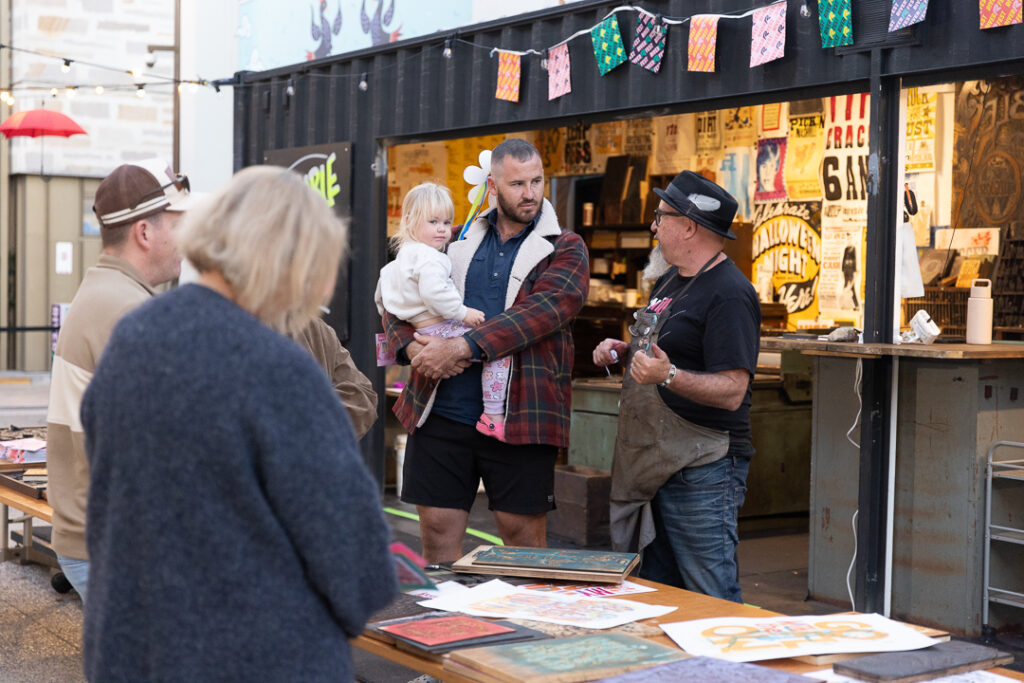
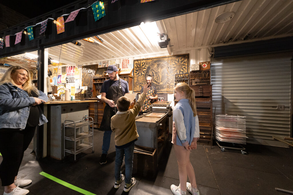
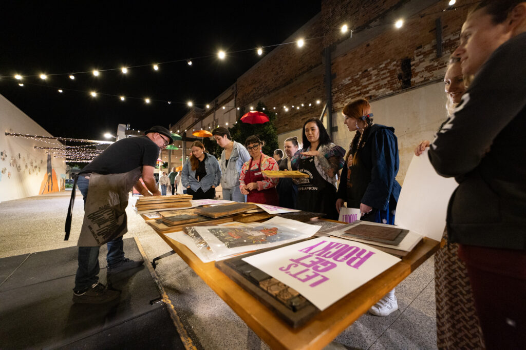
Just weeks after our residency in Mackay, Moveable Type Studio (MTS) rolled into Rockhampton for the annual River Festival, a shift from gallery calm to festival buzz. Parked behind Customs House and the Rockhampton Museum of Art, our 40-foot shipping container studio became an unexpected site of discovery and dialogue. Some festival-goers stumbled upon us with curiosity; others sought us out with intention. Either way, the engagement was immediate and electric.
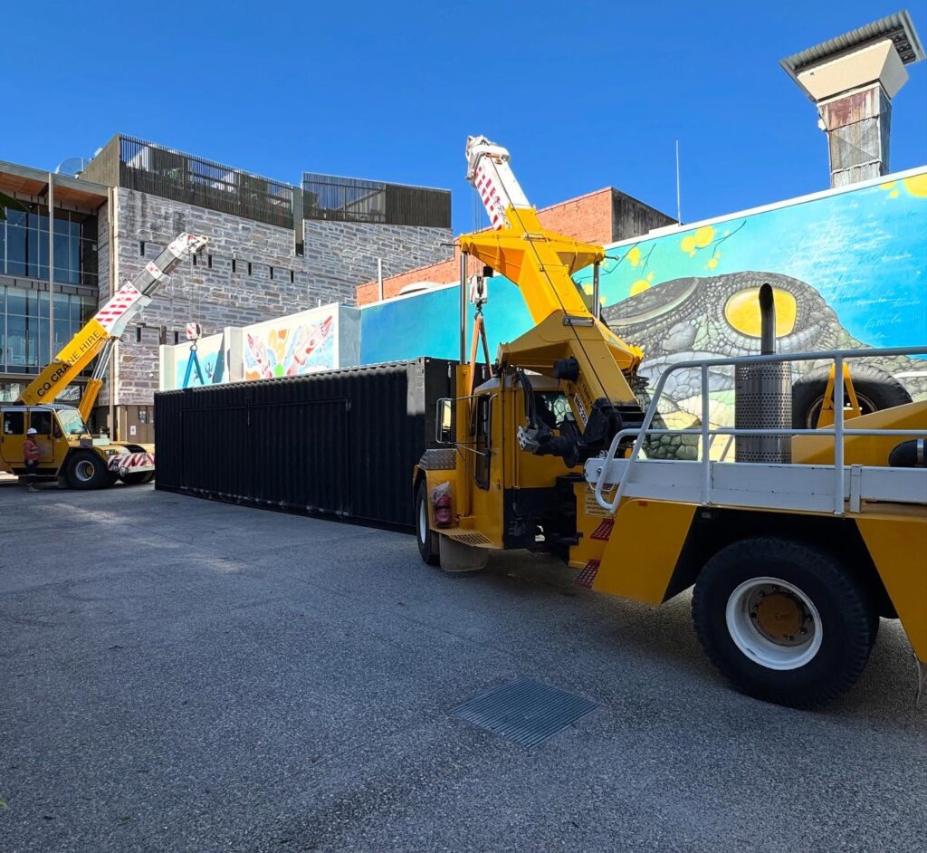
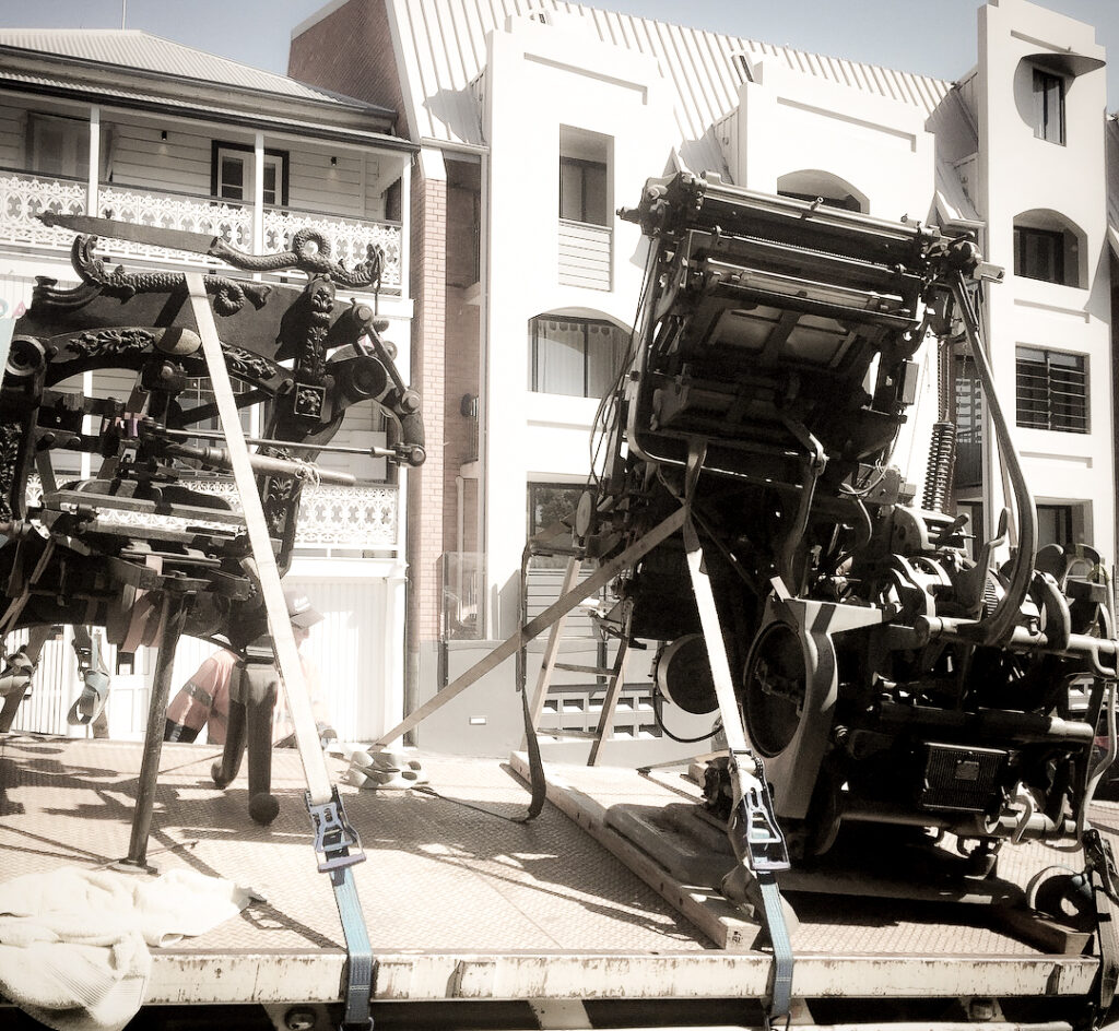
Rolling into Rockhampton from Mackay, five hours on the road—the nerves were already high. Advance Rockhampton (the local council), had lined up something pretty wild: the Moveable Type Studio was going to be craned into place. Not just shifted, not inched along with a forklift—craned. That’s the kind of big, gutsy move that only a council with balls as big as a Brahman bull would sign off on.
When the container finally pulled up in the alley behind the Rockhampton Museum of Art, the show began. Two 12-ton Franna cranes moved in like a pair of heavy metal ballet dancers, swinging quietly into position. It was crane ballet—slow, precise, and just a little terrifying—as they lifted the black beast off the truck and swung it neatly into its tight corner. We were anxious, we were excited, and the container itself was about to start a whole new chapter in its journey, tucked right up alongside the Museum of Art.
Hands in Ink, Minds in Motion
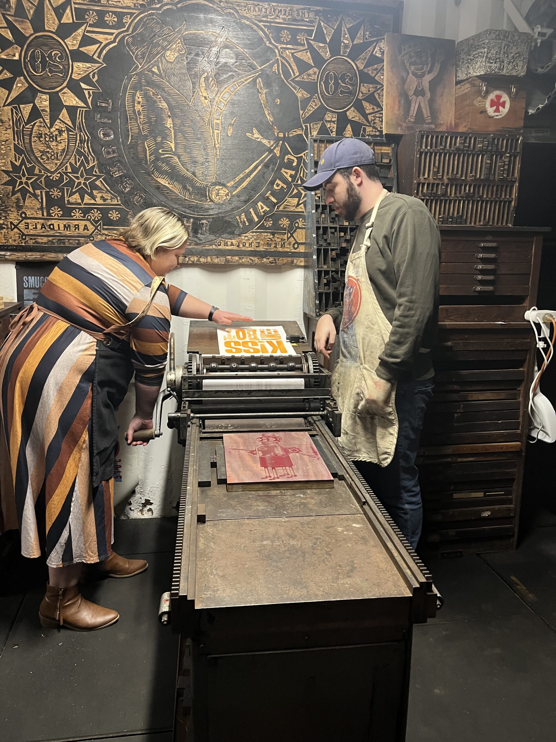
Inside the container, Clint Harvey, Mattew Lyten, Matteo Calisti and I led hands-on encounters that blended traditional handset letterpress with contemporary practice. From free daily demonstrations to our ever-popular “Ink & Drink” sessions, participants rolled ink, set type, and operated proof presses, rediscovering the visceral joy of making something with their hands.
For graphic designers and print enthusiasts, the Moveable Type Studio offered a rare chance to step away from screens and into the physical world of type. The smell of ink, the weight of wood type, the mechanical rhythm of the press; these sensations stood in stark contrast to the instant gratification of digital design. In an age of AI and automation, the studio reminded people that creativity is also about slowness, touch, and connection.
A Space for Generations
Parents and children moved fluidly between play, learning, and memory. What began as casual curiosity often grew into thoughtful conversations about history, craft, and community legacy. The studio became a space where generations met through ink and paper, where kids discovered the “language” of print and adults remembered its role in shaping culture.
This multigenerational engagement was one of the most powerful aspects of our time in Rockhampton. Families weren’t just watching, they were participating. Children rolled ink with wide-eyed wonder while parents reflected on the printed forms that shaped their own childhoods. It was a shared experience, not a commodity. Visitors weren’t there to buy, they came to connect.
Anchored in Local Legacy
Our time in Rockhampton deepened our connection to the region’s rich print heritage. We were fortunate to meet with Derek Lamb, whose imprint The Officina Athelstane and exhibition Man of Letters at the Rockhampton Museum of Art showcased works printed on an 1887 Alexandra press. His broadsides, books, and typographic posters, rooted in local history and laced with joyful satire, offered a living bridge between tradition and contemporary commentary.
We also spent time with City Print Works, a fourth-generation family-run print shop that’s still very much part of Rockhampton’s daily enterprise. It’s not just a legacy, it’s a living, working business. They’re printing everything from business cards and brochures to safety tags for local industries, schools, and creatives. The presses are still rolling, the team still knows their craft, and the place hums with quiet purpose.
Their archive is a tactile time capsule: type, woodblocks, and vintage letterpress machinery that’s not just for show, but still in use. You can feel the continuity, the same tools used decades ago are still helping people get their message out today. Being there during the Rockhampton River Festival felt like plugging into something enduring. It reminded us that print isn’t just history, it’s still here, still useful, still connecting people.
Keep the Presses Rolling
With Rockhampton River Festival wrapped and the container doors latched, the team wound down over a quiet brewski at the Oxford Hotel, though locals just call it the Ox. It was the perfect full stop before the next chapter.
Next stop: Ipswich. The container rolls into the Queensland Museum Railway Workshops for a four-week residency, where the journey continues, digging deeper into heritage, culture, and the stories we carry forward through print.
Rockhampton reminded us that letterpress isn’t just a nostalgic craft, it’s a living, breathing practice. From the hum of City Print Works to laughter echoing through our container studio, the festival affirmed that print still has the power to connect, disrupt, and delight.
As Moveable Type Studio continues its tour, we carry these stories with us, inked impressions of community, curiosity, and creative exchange. Whether you’re an educator, artist, funder, or simply someone drawn to the smell of ink and the rhythm of the press, we invite you to stay connected.
Follow our journey across regional Queensland and beyond, reach out if you see a collaboration waiting to happen, and reflect on the value of tactile creativity in a fast-moving world.
There’s something about the road, about packing up a 40-foot container full of type, ink, and possibility, and rolling it into towns where creativity waits just beneath the surface. From Mackay to Rockhampton, Moveable Type Studio didn’t just bring letterpress to the people, we brought a spark. This is a story of connection, community, and the kind of art that leaves ink on your fingers and warmth in your chest.
In July 2025, Moveable Type Studio (MTS) launched its first regional Queensland tour, made possible by the Flying Arts Alliance, the Regional Arts Fund, and our generous host, Artspace Mackay. This inaugural residency marked a milestone in our mission to bring the tactile, historic, and community-building practice of letterpress printing to regional and remote audiences.
Our arrival in Mackay aligned perfectly with two major book arts events, the Libris Awards and the ABBE (Artist Book Conference and Book Fair). Artspace Mackay was buzzing with national and local creative energy, and the freshly refurbished MTS container, repainted, reimagined, and ready, was primed to engage both seasoned book artists and curious newcomers.
I am grateful to have studied design during an era where the craft was deeply respected. The absence of instant digital creations allowed for the development of unique, emotionally resonant pieces. Thank you to Clint of Moveable Type Studio for sharing his expertise with our region. Jody Lee Euler – Redhotblue Creative Agency
Getting the Beast Ready
In the lead-up to the residency, we transformed the MTS container at The Paint Factory in Yeronga (Brisbane). Gone was the weathered purple paint, replaced with a sleek matte black finish that gave the container a bold new presence. This wasn’t just a facelift; it was a statement, breathing new life into something industrial and aged, making it relevant again.
To amplify its personality, we collaborated with Brisbane-based sign painter Jason, whose fluoro, fruit-shop-inspired signage added wit, colour, and charm. These hand-painted signs traveled inside the container and were reassembled on-site, ensuring MTS radiated the same playful energy that defines the printmaking experience.
Rolling into Mackay
On a cool Monday evening, the container was loaded onto a semi-trailer side-loader and began its journey north. Twelve hours and countless bumps later, it arrived at Artspace Mackay. I (Clint), along with Dzintra and Robert Heather, flew in late Tuesday night, buzzing with anticipation. Even the taxi ride from the airport sparked recognition, local residents had already heard about the workshops and were excited. MTS was already making waves.
By 4:30am Wednesday, I was pacing the carpark of Artspace Mackay, nerves high. The container arrived battle-scarred but structurally sound. Our original plan to install it on the grass near the gallery was thwarted by wet ground, so with the guidance (and understandable anxiety) of Artspace Director Tracy Heathwood, we repositioned to a more stable spot in the carpark. With a bit of charm and quick action, we made it work.
Print, Pour, and Play
Friday night marked our public opening with the signature “Ink & Drink” event. Around 30–40 guests, many in town for ABBE and the Libris Awards, joined us for casual printing, conversation, and drinks. We showcased traditional wood type and laser-engraved relief plates designed by Ron Monier and produced at The Edge Makerspace, State Library of Queensland.
The energy was electric. Dzintra and I sang and danced (figuratively and occasionally literally) as guests pulled prints, got inky fingers, and reconnected with the physicality of type. It wasn’t just a demo, it was a celebration of curiosity and participation.
Workshops and Awards Night
Saturday was packed with public workshops. We ran three sessions for a diverse crowd—families, regional makers, and curious passersby. A standout moment came from a Fancy Kransky sausage maker from Bowen, who saw parallels between his craft and ours: both require care, patience, and a love for the handmade.
Later, Sean from Primal Coffee Mackay dropped by, pulled a few proofs, and shared insights on slowing down, whether roasting beans or setting type. These conversations affirmed why MTS travels: to connect practices, affirm values, and make art accessible.
That evening, we attended the Libris Awards opening. With 150 attendees, it was a celebration of artists’ books from across Australia. The gallery was stunning, the works inspiring, and the speeches heartfelt. Artspace Director Tracy Heathwood honoured Robert Heather, whose legacy, founding Printbank Mackay and the Libris Awards, added deep resonance to our presence.
Hands in the Ink
Sunday shifted to structured, three-hour workshops. We hosted two sessions with eight participants each, diving into both traditional and contemporary letterpress techniques.
Using magnets on the bed of our FAG 405 Swiss proof press, we bypassed chases for faster setup while maintaining tactile engagement. Participants worked with wood type and Ron Monier’s laser-engraved collage plates, producing limited-edition prints and gaining a deeper appreciation for the process.
Legacy Meets Letterpress
Our final day in Mackay was devoted to a special workshop with Printbank Mackay, the artist collective founded by Robert Heather 19 years ago. With generous support from Traci Lietzke—former president and a driving force behind the group—we welcomed eight members for a full-day poster-making session. Most were seasoned relief printers, but for many, this was their first encounter with movable type.
Together, we explored the fundamentals: type measurement, font families, and collaborative layout strategies (a.k.a. ‘design via committee’). Working with a rich mix of Italian, French, and American wood type, the group designed and printed two-colour posters using layered overprinting techniques. The make-ready process was meticulous and hands-on, but the results—12 limited-edition prints—spoke volumes. Each piece was a testament to shared effort, creative curiosity, and a deepening appreciation for the legacy of letterpress.
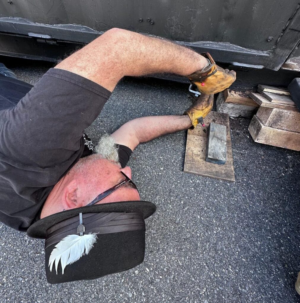
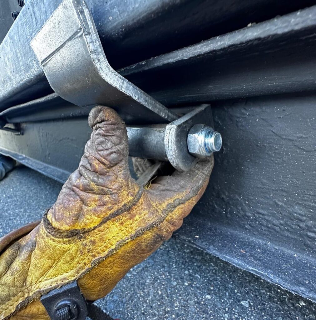
When the Hinges Give Way
Just as we caught our breath, the container reminded us of its wild side. After four days of heavy use, the fold-down door hinges gave out. Tuesday became a scramble to find a welder. An on-site fix failed, so we secured the door and arranged repairs in Rockhampton before our next stop: the Rockhampton River Festival.
This studio isn’t just a space, it’s a 40-foot beast that travels, weathers the road, and occasionally bites back. But the reward? Unforgettable engagement, powerful conversations, and deep connections with regional creatives.
What Mackay Gave Us
Mackay gave us everything we hoped for: visibility, impact, dialogue, and collaboration. The community embraced MTS with warmth and curiosity. Artspace Mackay welcomed us wholeheartedly. And the legacy of Robert Heather added rich layers of meaning.
MTS is about slowing down, honouring the process, and making space for creativity in communities often overlooked. Mackay proved that a shipping container full of type can create far more than prints, it creates connection.
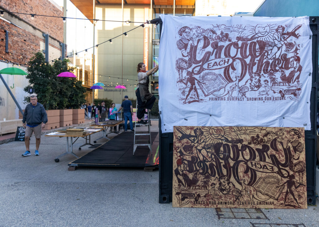
A Night of Collage, Camaraderie, and Creative Ritual with Ron Monnier and Moveable Type Studio
Several weeks on, and the scent of ink still lingers. Held at The Paint Factory in Yeronga and hosted by Movable Type Studio, this wasn’t just a workshop. It was a gathering. A chance to slow down, make something with our hands, and connect with others through shared creativity.
Why We Do This
At Movable Type Studio, we believe in three things:
• That printmaking is a ritual—a way to reconnect with the physical world.
• That manual craft helps us recover from the overload of screens and digital noise.
• That community matters, and creativity is best when shared.
INK & DRINK brought all of this to life.
Collage as Conversation
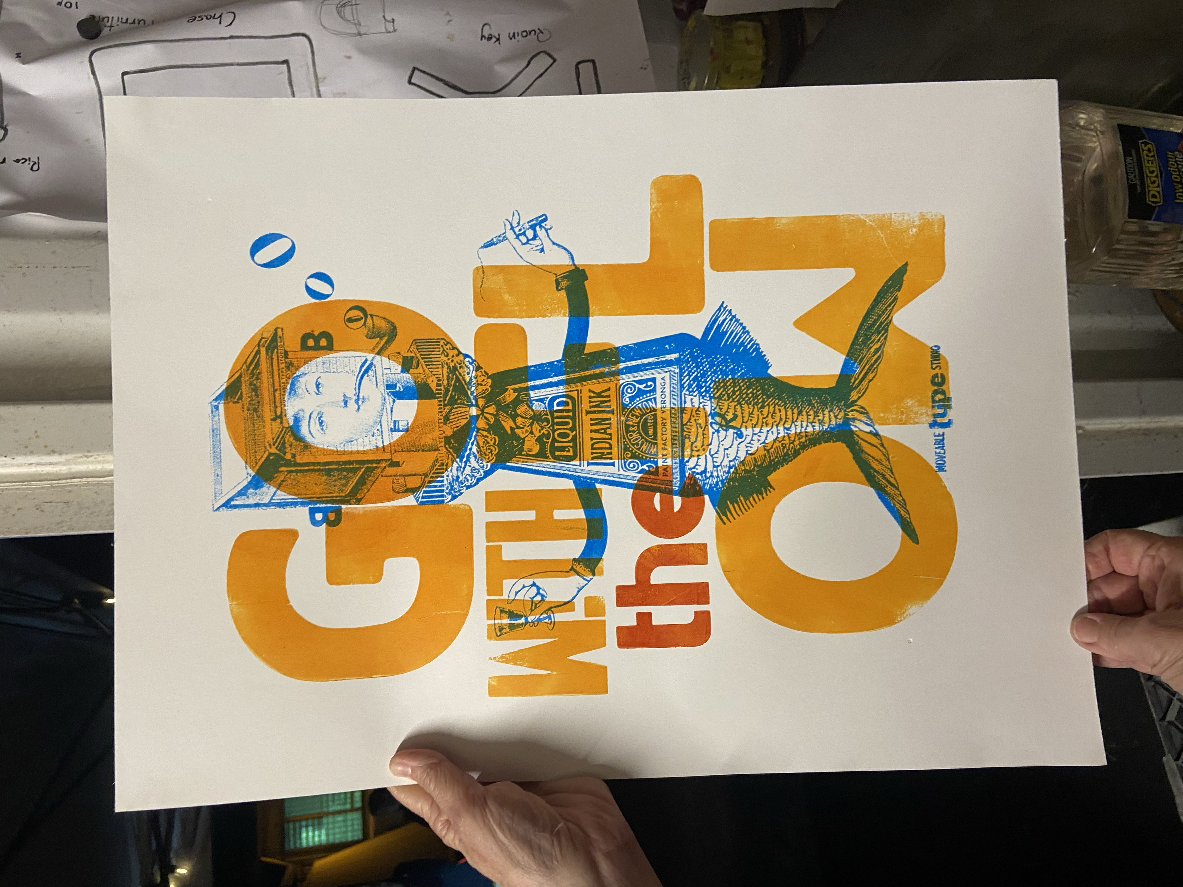
The night began with a walk through our mobile studio—a converted shipping container filled with vintage presses, wood type, and the smell of ink. Then came Ron Monnier, who skipped the formalities and got straight to the good stuff: collage.
Ron’s style is raw and playful. He invited us to cut, paste, and rearrange the world as we saw fit. No rules, just scissors, glue, and imagination. Twenty brave folks joined in—artists, teachers, curious locals—and created surreal, funny, and strangely beautiful works. Heads where legs should be. Eyes on elbows. A joyful mess.
From Cut to Press
Behind the scenes, Ron’s collages had been turned into printing plates using laser engraving. This blend of old and new—handmade art turned into press-ready plates—let us print his designs using traditional letterpress methods.
Two presses ran side by side. One printed bold wood type that read “Go With The Flow.” The other carried Ron’s custom plate, inked and pressed with care. The results weren’t just prints—they were collaborative artefacts, each one shaped by the hands and ideas of everyone involved.
What It Means to Us
INK & DRINK is part of a bigger idea: creating events that feel personal and creative, but are also open and welcoming. Whether you’re an artist, a teacher, a parent, or just someone curious about ink and paper, there’s a place for you here.
We want to make printmaking accessible, repeatable, and meaningful—not just a technique, but a way to tell stories, build community, and keep old skills alive in new ways.
Looking Ahead
Next up, we’re heading north for our Central Queensland tour. We’ll be bringing the mobile studio to towns and communities across the region. If you’re nearby—whether you’re a school, a council, a local artist, or just someone who wants to see what it’s all about—get in touch. We’d love to meet you.
And if you’re someone who wants to collaborate, support, or help us grow this work, we’re open. Let’s build something together that’s bold, tactile, and rooted in place.
Because print still matters. And so does community.
If you like your weekends with a side of ink under the fingernails and a whiff of history in the air, the 2025 Wimble’s Wayzgoose at the New England Regional Art Museum (NERAM) was the place to be.
Movable Type Studio rolled into Armidale loaded with our popup Press full of wood type, big ideas, and a research project that’s got a touch of colour. Over three packed days, we dished out hands-on printmaking, poured a few drinks, and cracked open a slice of Australian printing history that’s been sitting quietly in the archives for too long.
Ink & Drink — outdoor printing, Black Gully style
Our Ink & Drink workshop kicked things off in proper Movable Type fashion , under the open sky, deep in the Black Gully, surrounded by printmakers who know their way around a brayer. There’s nothing quite like running a press outdoors, birds overhead, a drink in hand, and ink rolling smooth. We got participants working with our laser cut experiments with a no-fuss attitude, stripping it back to ink, paper, and elbow grease. No white gloves. No glass cases. Just the joy of print and a few healthy debates in the shade with the setting sun.
NERAM and the Black Gully Printmakers made it all possible, creating a space that felt less like a museum workshop and more like a backyard gathering of serious makers. That’s how we like it.
Wimble’s Ink Reimagined — serious research, delivered our way
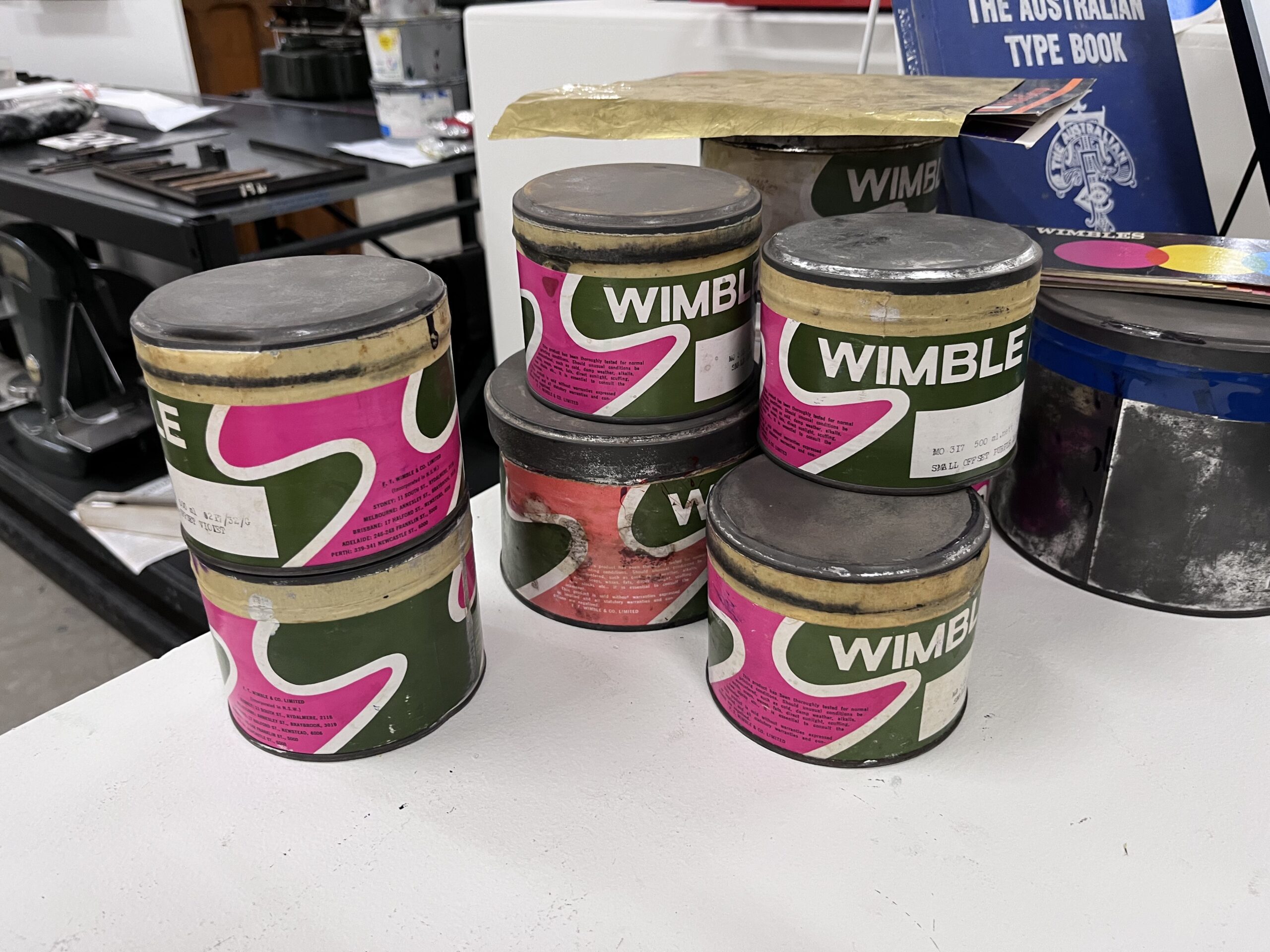
Now, let’s talk about the research – Movable Type Studio is currently deep into a prestigious research fellowship with the Powerhouse Museum Sydney, digging into the archive of none other than F.T. Wimble himself.
For those not in the know, Frederick Thomas Wimble wasn’t just Australia’s first commercial ink manufacturer, he was a rogue, a pioneer, and a man who brought colour to the colonies when black-and-white just wouldn’t do. Our presentation at the 2025 Wayzgoose was a progress report straight from the frontlines of that research. We’ve been wrist-deep in the Powerhouse’s collections: original correspondence, ink recipes, sales materials, and all the delicious ephemera that shows how Wimble shaped Australia’s printing industry.
This isn’t academic navel-gazing. Our goal is to reconnect contemporary printmakers with the materials and methods that made our industry sing 150 years ago — and to imagine how those recipes and processes could spark new ideas today. Sharing that work-in-progress at NERAM, right beside the Museum of Printing’s remarkable press collection, was more than fitting — it felt like the perfect intersection of past, present, and future.
Big Woodblocks & Even Bigger Grins
Of course, we couldn’t visit without pulling some big prints. We hauled out one of our large-format woodblocks and got the community involved in laying down some serious impressions. There’s a primal satisfaction in seeing those bold shapes hit paper — loud, physical, and unashamedly analogue. The Museum of Printing’s historic presses and type drawers standing nearby only added to the atmosphere. History wasn’t behind glass this weekend, it was inked up and getting printed.
A nod to the legends
None of it would have happened without Emily Simpson and the tireless Black Gully Printmakers, who ran the show with grit and grace. And a huge thanks to the teams at NERAM and the Museum of Printing for not just opening their doors, but handing us the keys and saying, “go for it.” We did.
We left Armidale with ink stains, frostbite, and the satisfaction that something important is bubbling up, a reconnection with Australia’s printmaking roots and a fresh spark for future experiments. That’s what Wimble’s Wayzgoose is all about.
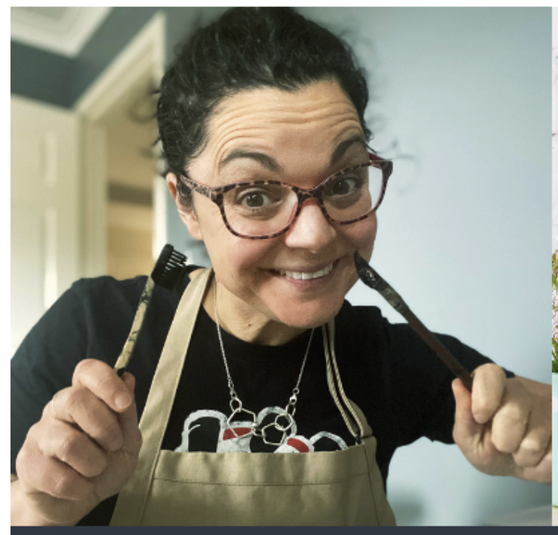
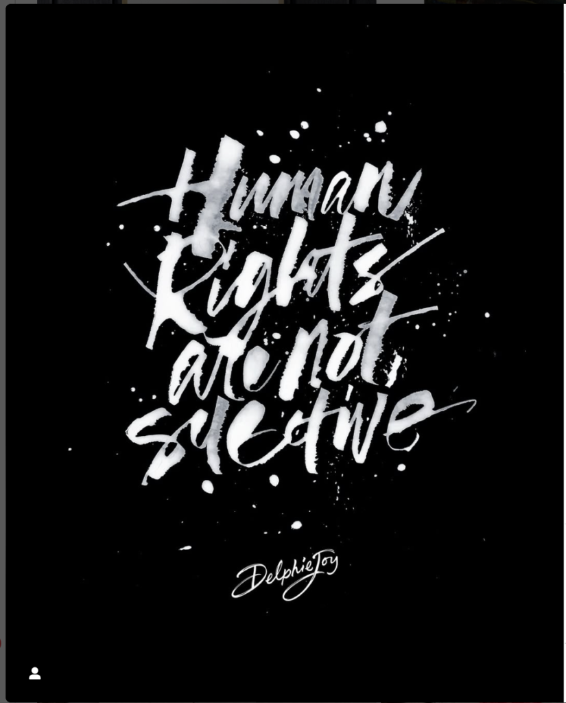
In a world that often feels dominated by the speed of technology and the pursuit of perfection, Delphie Joy stands out as a refreshing beacon of creativity and spontaneity.
Her philosophy of creative play encourages us here at the Moveable Type Studio to embrace imperfections, find joy in the process, and rediscover the unrestrained creativity we often leave behind in childhood. Her philosophy of creative play encourages us to embrace imperfections, find joy in the process, and rediscover the unrestrained creativity we often leave behind in childhood.
Challenging Perfectionism: A Pathway to Freedom
Perfectionism can stifle creativity, but Delphie Joy’s workshops offer a powerful antidote. With a multi-decade background in design, experience in creative mental health care, and the ever-evolving lessons of parenting four children, Delphie’s approach emphasizes that creativity isn’t about achieving flawlessness but about exploring, experimenting, and expressing. Her sessions encourage participants to let go of rigid expectations, make mistakes, take risks, and uncover unexpected beauty in their work.
The Magic of Handmade Tools
Delphie’s dedication to crafting her own tools is a testament to her philosophy of play and experimentation. From custom brushes to unconventional mark-making implements, she transforms ordinary materials into extraordinary tools. In her workshops, participants learn to make their own tools, fostering a deeper connection to the creative process and inviting a sense of curiosity and wonder.
Exploring New Tools at the Moveable Type Studio
At Moveable Type Studio, we embrace the art of custom tool creation through innovative techniques like laser-engraved woodblocks for letterpress plates. This fusion of modern technology with traditional methods empowers artists to take ownership of their tools and creative processes, pushing their creative boundaries further.
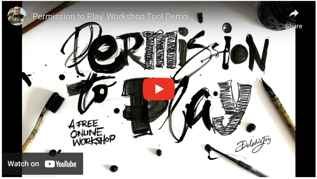
Workshops Designed to Inspire Play
Delphie Joy’s workshops are immersive experiences that offer participants “permission to play.” Whether you’re a seasoned artist or a beginner, her sessions welcome you with open arms. These workshops blend guided techniques with freeform exploration, fostering an environment where creativity flourishes. Delphie’s work celebrates joy, imperfection, and resilience, embracing the spontaneity of creative experimentation. Each piece is a reflection of her belief in art as a language for storytelling and self-discovery.
Join Us at The Paint Factory for Ink and Drink
We’re thrilled to announce that Delphie Joy will be sharing her creative play approach at our upcoming Ink and Drink event at The Paint Factory! This special evening will feature the Moveable Type Studio, where guests can experience Delphie’s inspiring methods firsthand. Through playful lettering, handmade tools, and design demonstrations, attendees will explore the joy of hands-on creativity while sipping on their favorite beverages in a vibrant, collaborative atmosphere.
Permission to Play Membership Group and Workshops
Delphie invites you to join the ‘Permission to Play’ membership group, where you can continue to explore creativity in a supportive community. Her in-person workshops offer a safe space to build your capacity to trust yourself and explore. Research shows that connecting in social spaces, exploring creativity, and holding compassion for our experiences significantly benefit our mental well-being.
Custom Lettering Work
Custom lettering is Delphie’s specialty! Her work, deeply rooted in gestural calligraphic marks and extensive creative play, reflects a profound understanding of creativity as a tool for connection and well-being. Each piece she creates is a celebration of individuality, spontaneity, and the beauty of the unexpected.
Don’t miss this chance to reconnect with your inner artist and discover the freedom of creative play. Whether you’re a curious beginner or an experienced designer, Delphie’s techniques combined with the joy of contemporary letterpress at the Moveable Type Studio are sure to leave you feeling inspired, refreshed, and ready to embrace the imperfect beauty of the creative process.
Mark your calendars and join us at The Paint Factory for an evening of creativity, connection, and, of course, plenty of play!
Our inaugural letterpress workshop at The Paint Factory in Yeronga was a resounding success, set against a backdrop that couldn’t have been more perfect. Just 15 minutes from Brisbane’s CBD, The Paint Factory provides an incredible environment for creatives, fostering collaboration and innovation within a vibrant community.
This workshop, held on a Sunday, was a true collaboration with the Brisbane Visual Arts Community (BVAC). BVAC is a dynamic collective of artists and art enthusiasts dedicated to nurturing creativity and artistic expression in Brisbane. With guilds specialising in various art forms—from painting and sculpture to textiles and ceramics—BVAC presents a rich tapestry of artistic talent. Our partnership with them offered their members a unique opportunity to delve into the traditional craft of letterpress printing, underscoring our shared commitment to enriching the local arts scene and providing valuable learning experiences.
The Moveable Type Studio residency at The Paint Factory has enabled us to engage closely with some of Australia’s most established artists. In recent years, both local and international visual artists have organically formed a community, making The Paint Factory their creative home.
The artwork created on-site has been exhibited and sold nationally and internationally, with pieces featured in prestigious collections such as the Tate Modern (UK), the Art Institute of Chicago (US), the National Gallery of Canada, and the National Gallery of Australia. The unique atmosphere of The Paint Factory inspires artists to gather, discuss, and create, while also serving as a venue for educational initiatives that attract guests from around the globe. Additionally, it has become a sought-after filming location for projects like Netflix shows and music videos, and has hosted high-profile events, including Brisbane Fashion Week and the Brisbane Festival.
Within this vibrant space, renowned resident artists such as Gordon Hookey, Judy Watson, Richard Bell, Megan Cope, and the unforgettable Pope Alice (Luke Roberts) thrive. Our workshop not only allowed participants to learn the craft of letterpress but also to engage directly with some of Australia’s most esteemed artists.
Our letterpress workshop began with the perfect blend of coffee and conversation as a diverse group of creatives gathered around the composing table. I felt like a student myself as participants shared their fascinating stories. Among the group were senior academic directors, master paper and fibre specialists, and skilled basket makers, and incredible stories were shared, including that of a parish priest whose printing collection was housed in his clergy rooms. This eclectic mix, united by a passion for print and a curiosity for the printed word created an enriching atmosphere.
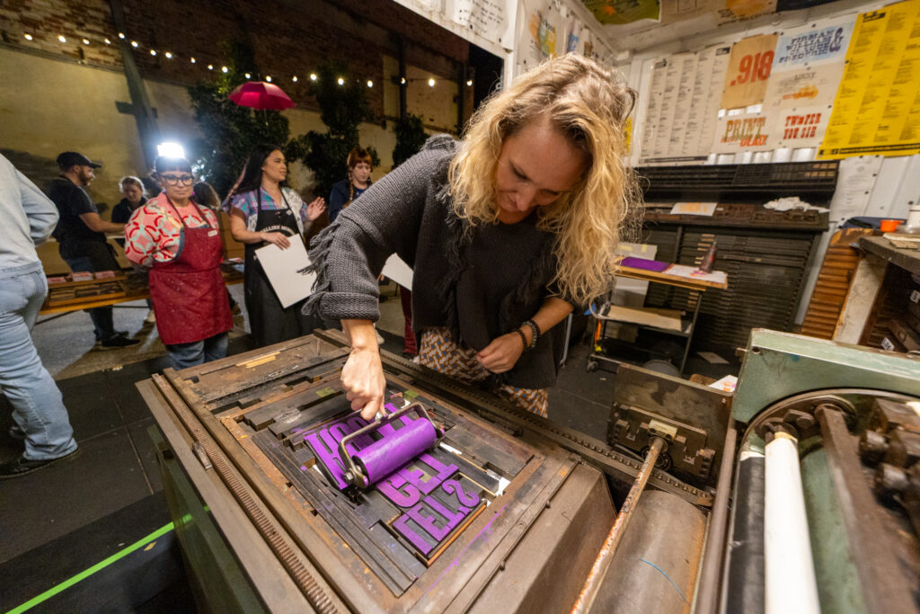
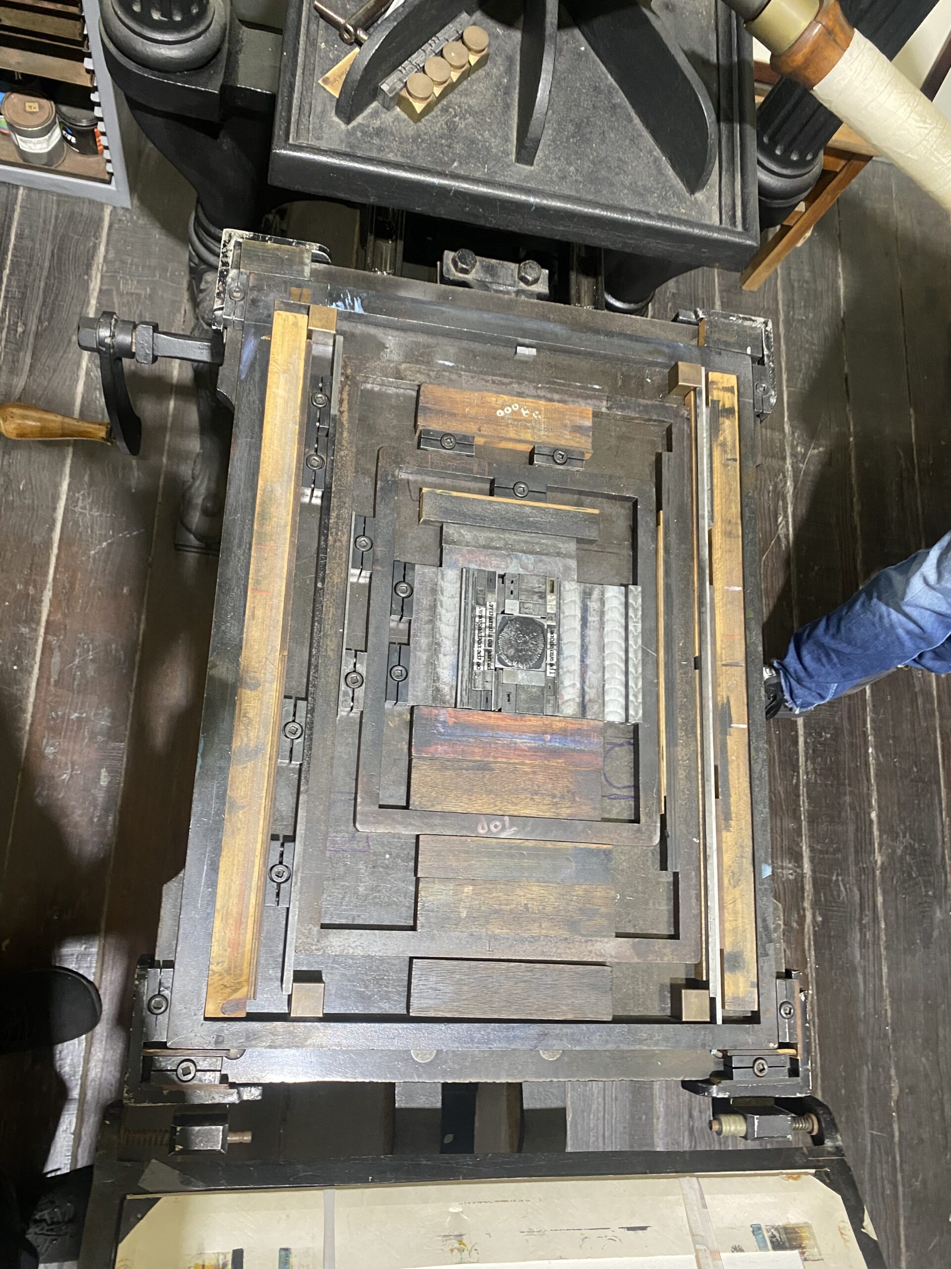
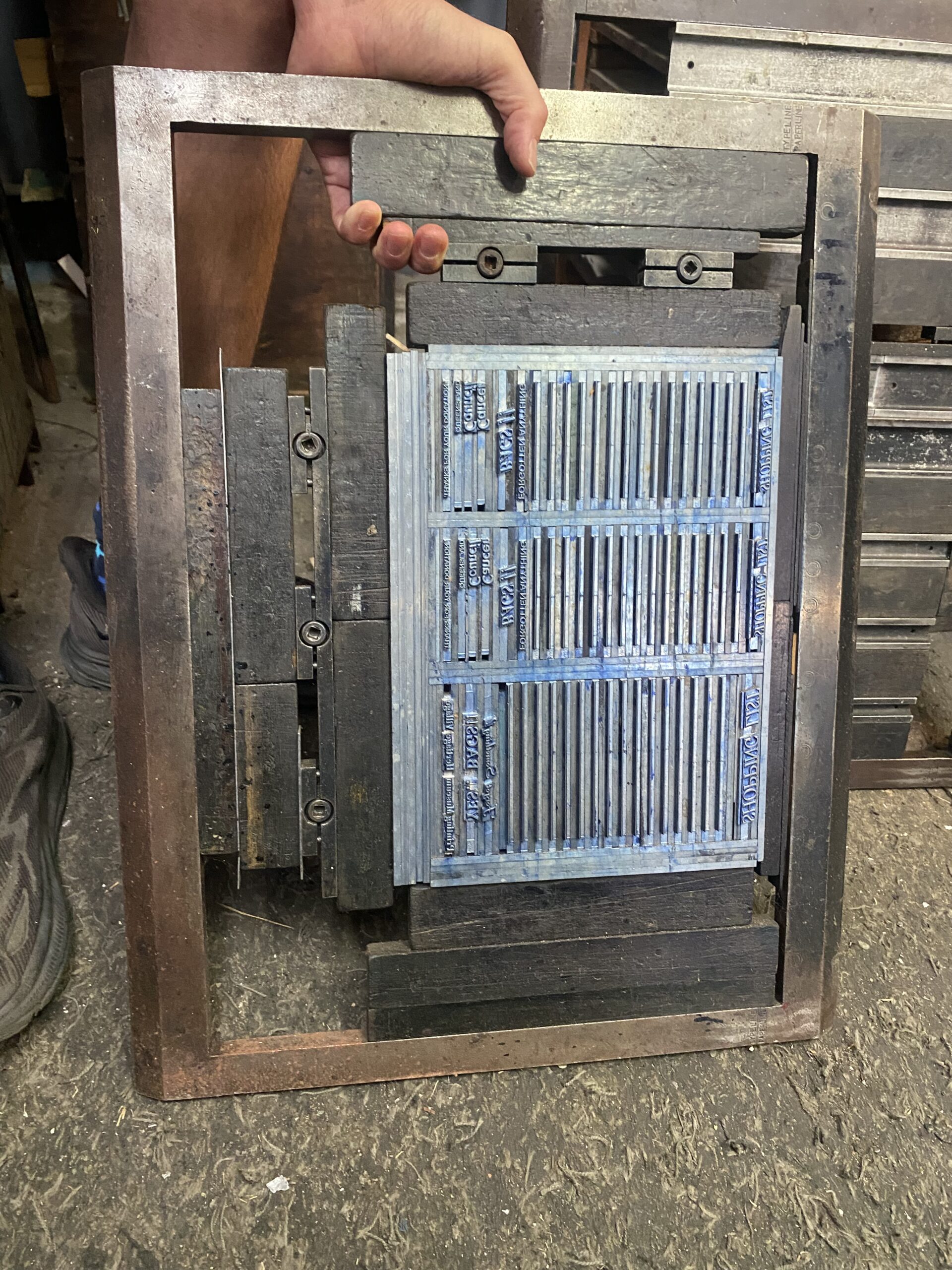
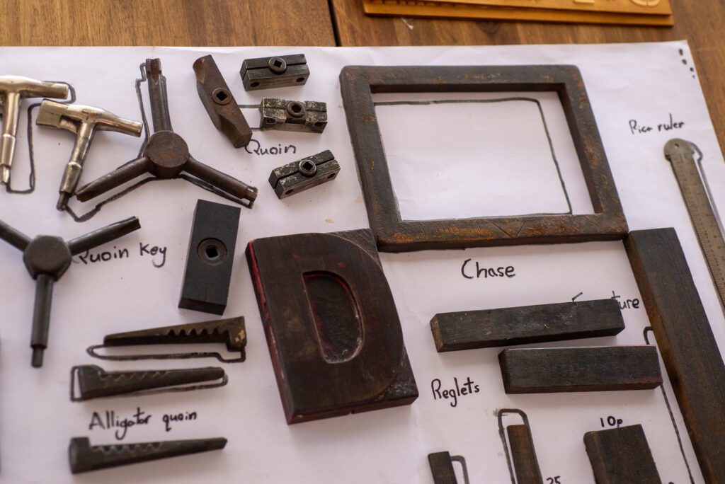
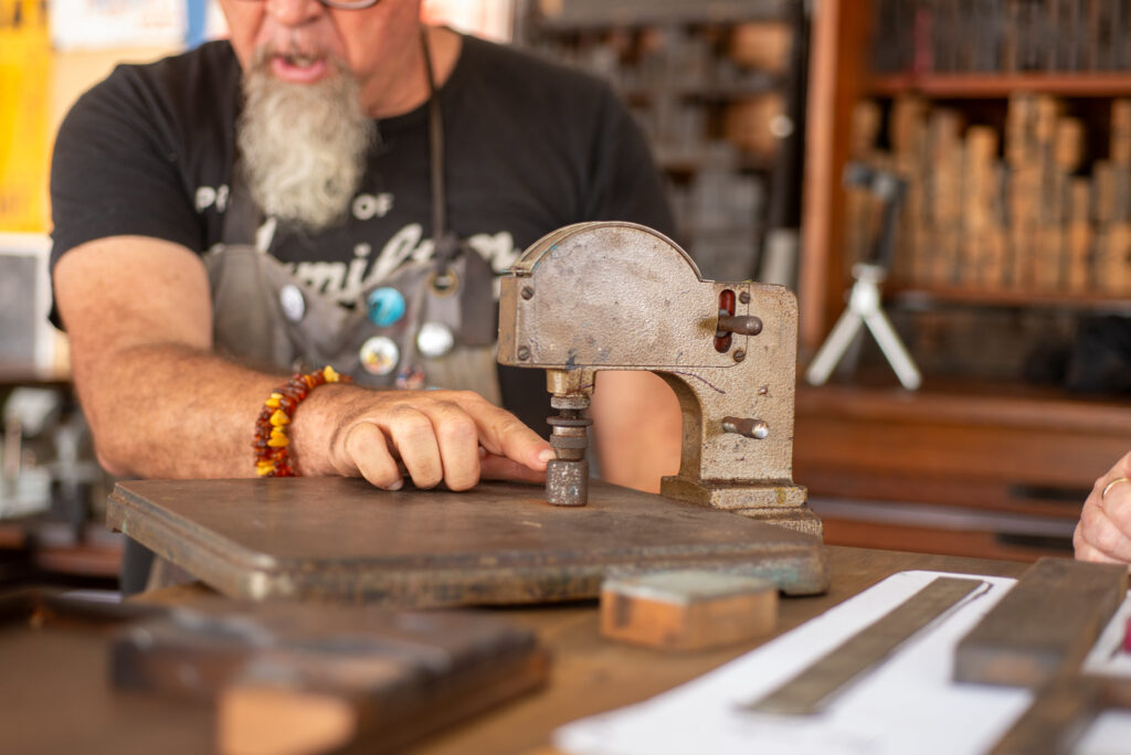
We kicked off the workshop by introducing the fundamental concept of “type high,” a crucial measurement in letterpress printing. Participants quickly immersed themselves in the tools of the trade—reglets, quoins, chases, and pica rules. Laughter and lively banter filled the room as everyone explored the Moveable Type Studio’s collection of authentic artifacts. Our discussion about type high prompted a deeper dive into international printing standards, including the 0.918-inch English and American standards and the variations in French and Italian gauges. This technical insight became essential as we prepared our compositions for printing, emphasising the multicultural history embedded within each type block—a meaningful foundation for our letterpress journey.
Next, participants embarked on the hands-on portion of the workshop by selecting a small collection of type sorts from the Moveable Type Studio collection. Armed with a type high gauge, we measured each sort, compared heights, and discussed the intricacies of printing types. This collaborative discussion guided us in selecting our final group of types as we moved on to locking up our first chase.
With reglets, furniture, and quoins at the ready, we collectively learned the essentials of lock-up—a crucial step for ensuring that the type stays firmly in place. Since we had a larger collaborative project in mind, I introduced an alternative setup using magnets on the bed of our FAG 405 proof press. This innovation allowed us to pull a preliminary proof and examine the impact of varying type heights firsthand. As participants inked up their types and tested the press, their confidence grew, and soon everyone was pulling proofs, excited for what lay ahead.
As the morning session progressed, ink was shared, and stories exchanged. We paused for a brief break, enjoying some food and each other’s company. Conversations flowed from travels in Iran to the art of painting with paper pulp. In a delightful surprise, I discovered that one of the participants was the academic director at the university where I’m currently employed! The warm Brisbane summer weather provided the perfect backdrop for laughter and inspiration before we dove into the main project of the workshop.
When we reconvened, we introduced participants to the focus of the day—a collaborative project inspired by resident artist Gordon Hookey. An Aboriginal artist renowned for his work in painting, photography, and sculpture, Gordon weaves a strong First Nations narrative into his art. Earlier in the week, he welcomed the Movable Type Studio team into his studio, a space filled with inspiration—paintings covering the walls and ceiling, vibrant with his unique commentary on culture and identity. Gordon shared a lettering piece he started during his residency at the Museum of Brisbane, where he collected words and reflections from visitors exploring a poster exhibition drawn from his personal collection.
Seeing Gordon’s work and his commitment to using lettering as a storytelling medium sparked an exciting idea. He expressed his intention for these powerful words and phrases to be shared, inviting other artists to incorporate them into their creations. From this vision, a collaboration in letters was born. Just days after our studio visit, Gordon shared his lettering files with us, and we began crafting a plan to integrate his work into our letterpress project.
Over the past 10 months, we had been working closely with The Edge, the makers space at the State Library of Queensland, where we experimented with creating relief printing plates using their laser engraver. This collaboration with Gordon presented the perfect opportunity to merge analogue lettering with modern laser-cut plates, aligning with his vision of sharing these impactful words. Energised by Gordon’s powerful voice and the potential of our collaboration, we prepared to incorporate his words into the next stages of our letterpress journey.
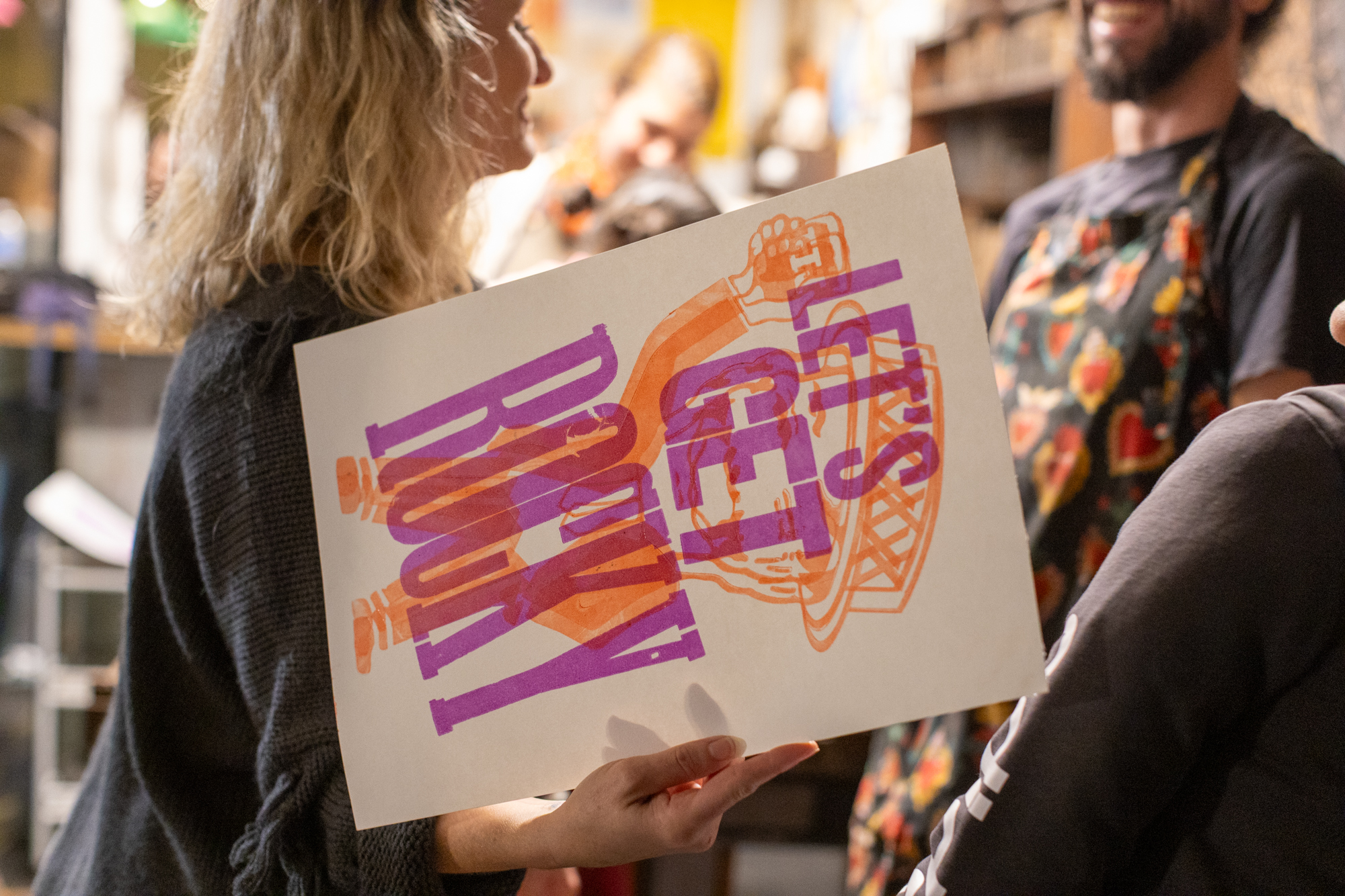
Our workshop project centred around bringing Gordon’s words to life. Each participant selected a single word from his design, setting it by hand in type, all with the shared vision of merging these words into a cohesive final composition. This process required not only technical skill but also patience and collaboration. Participants quickly recognised the challenge of uniting type from various origins—French, Italian, English, and American blocks—into one harmonious layout. There was no shortcut to sizing up fonts, adjusting kerning, or fine-tuning the tracking for each word. The group often found themselves rethinking their choices to create the strongest possible collaborative piece.
This exercise evolved into a masterclass in teamwork, communication, and diplomacy. Over the next hour and a half, participants reflected on their earlier work with type, using their knowledge to prepare each word for proofing. Our goal was to create a “collage of sorts,” where each proofed word would serve as the foundation for our collaborative lockup. Amid spirited debates, occasional arm-wrestles over creative choices, and shared laughter, we made our final selections and began the intricate process of locking up our combined type composition, setting everything in place for the ultimate test—printing this collective masterpiece.
With our collaborative lockup secured, we turned to selecting paper, only to discover that our initial choice lacked the right surface quality for our intended outcome. Fortunately, with papermakers and fibre artists in attendance, a lively discussion ensued, leading us to unearth a fifty-year-old stash of newsprint. This yellowed, moisture-depleted paper had everyone on the edge of their seats as we set up for our initial proofs. The group soon agreed that simple black ink on the creamy, vintage stock struck the perfect balance.
Then, Clint couldn’t resist sharing an inking technique from English typography master Alan Kitching, known for his expressive ink application directly onto wood type. With a palette of reds, yellows, and blacks, participants created prints that pulsed with the vibrancy of each chosen word, bringing Gordon’s powerful language to life with bold energy.
As the workshop drew to a close, we reflected on the day’s lessons, the rich conversations, and the friendships formed around the composing table. For many, this introduction to letterpress opened the door to future projects, as several participants eagerly planned to book one-on-one press time in our open studio. The Movable Type Studio offers open studio hire for those who have completed a workshop and passed our safety induction, making it the perfect next step for our budding letterpress enthusiasts. With plans laid and ink-stained fingers as souvenirs, we wrapped up, looking forward to seeing these new typographers return to bring their own creations to life.
At The Paint Factory, a vibrant creative community thrives, where collaboration, culture, and craftsmanship converge. Our workshop with Gordon Hookey—a celebrated Aboriginal artist whose work infuses First Nations voices into bold, contemporary forms—brought together a diverse group of makers and storytellers, each contributing to a shared narrative.
Here, traditional and modern print practices meet in a process that honours kinesthetic learning: a hands-on experience where participants slow down, engage deeply and feel the textures of ink and paper in real-time. In a world increasingly reliant on digital networks, this analog approach reminds us of the value of presence, of learning through doing, and of connecting with others face-to-face. It’s a space for reflection, creativity, and collaboration, fostering not only artistic skills but also meaningful connections among people dedicated to the art of making.
Ok here’s how the story goes. The Clint Harvey letterpress journey started in a dusty old 1920s small goods warehouse on Agnes Street, Fortitude Valley. The place was affectionately called The Bacon Factory – not because we made bacon, but because that’s what it once was. For eight years, this gritty little gem was home to my letterpress journey. It had character—creaky floors, cracks in the walls and a basement that would scare the shit out of your mother. The smell of ink and grease, and plenty of quirks that made it perfect for a print studio. It was here that the wheels started turning, where my plans for sharing letterpress with community began to take shape. But as with everything in the inner city, developers came sniffing around, and boom, the building got sold. And we were out on our asses on the street.
Next stop: Eagle Farm. A 1940s bearing factory that once cranked out head gaskets for the Ford Motor Company. It was further out, a lot bigger but a shit load more expensive but we had 450 square meters of letterpress heaven. And let me tell you, it was pure bliss. The smell of ink mixing with motor oil from the old machines. We had dreams bigger than the space—hoping universities and institutions would see the value of these vintage presses and come knocking. But no, they were too glued to their screens and online classrooms to give a shit about real-world printing.
But we pushed on. We threw open the doors to the public and invited everyone in—hairdressers, architects, gardeners, the people who actually keep the world spinning. Workshops ran late into the evenings and even on the Sabbath. People connected through ink and sweat, making real things with their hands. Then BAM—COVID hit. Workshops were wiped out, but the bills sure as hell didn’t stop. Rent kept coming in hot.
We scrambled. The dream was shrinking, so we downsized. I threw half the studio into two 40-foot containers and leased a shoebox-sized space in the Eagle Farm building. There we were—battered but still standing. We pivoted to online workshops, cranked up the music, drank some whisky, and carried on, refusing to let this thing die. It was a fight—a bloody good one—but still, it wasn’t enough. We were hanging by a thread.
It was time to rethink everything. Cue a Zoom call with a ragtag group of loyal supporters, some letterpress royalty, and a wild idea: a mobile studio. What the hell, right? We launched a GoFundMe campaign, and within 30 days, we had enough to make it happen. A 40-foot shipping container transformed into a letterpress studio on wheels.
Three years later, in 2024, we launched SPAM. “WTF,” a number of my close friends said, We launched this prototype mobile letterpress studio at the Atypi Typography Conference in Brisbane. The design community embraced us with open arms, and that’s when we knew we were onto something.
Now, we’ve got a new name Moveable Type Studio and a new chapter at The Paint Factory. This isn’t just some artsy fartsy joint. It’s raw. It’s real. It’s a community of creators who get their hands dirty. The building itself carries the legacy of Taubmans, a paint powerhouse. That history, of creating something solid and lasting, flows through these walls.
The folks behind The Paint Factory aren’t your typical developers in suits—they get it. They believe in creativity, they back the makers, and they understand that sometimes, the world needs people a little mad enough to push back against the norm.
Because here’s the thing: in a world that’s constantly speeding up, maybe the real revolution is to slow the fuck down. Open your eyes. Feel the ink on your hands. Smell the damn paint. Touch the world around you, because that’s where the magic happens. We’ve survived because we’ve stuck to that belief, and now, at The Paint Factory, we’ve found a place where creativity and madness go hand in hand.
This isn’t the end of the journey—it’s just the next step up the mountain.